The “distressed” look has been fairly popular for a while now, and some of that look is easily accomplished using the various features of CorelDRAW and Corel Photo-Paint. I hope here to share some of the ways one can create the distressed look on any project that lends itself to the concept. It is a fun way to use the program features and, at the same time, a valuable way to learn many aspects of the CorelDRAW Graphics Suite.
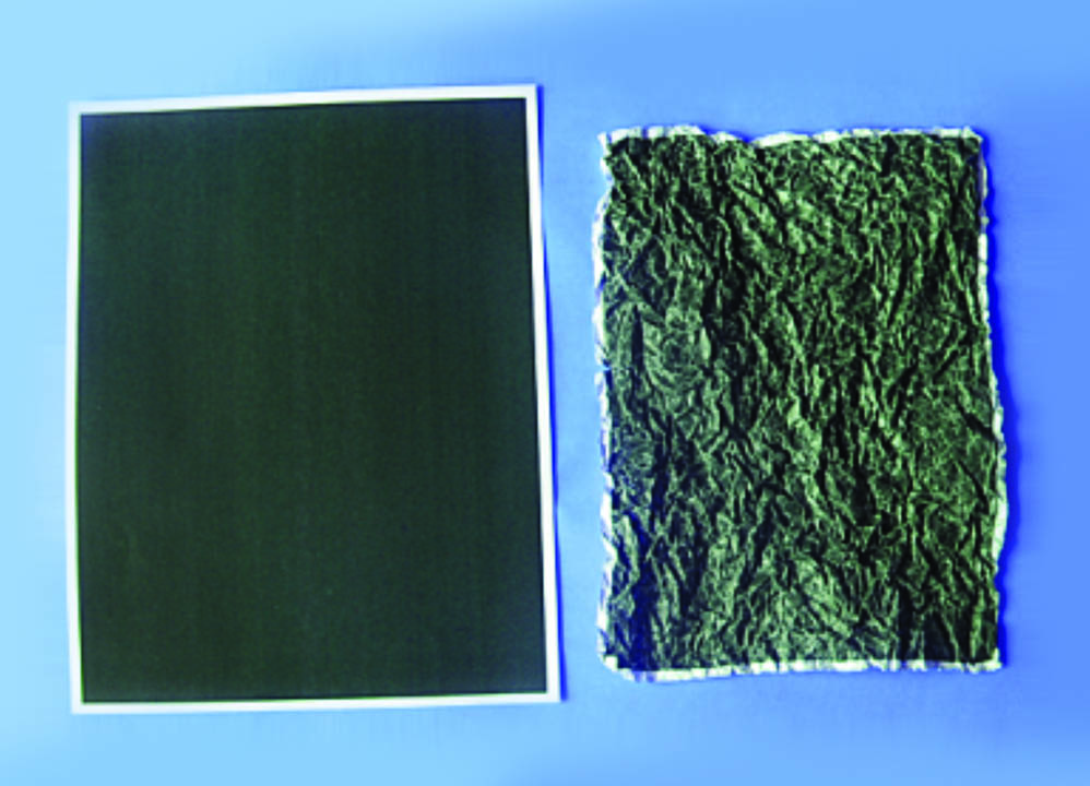
To begin, print a rectangle filled with black. Wad up the paper several times, unfold it, and put it in your scanner. Scan the image at 600 dpi using the grayscale option. Fig. 1 shows, on the left, a black rectangle, and on the right, the new scan of the wadded-up image. We now need to make some modifications to the image in Photo-Paint. With the image selected, press the Edit bitmap button and, after a few seconds the image opens in Photo-Paint.
Since the image is mostly black, we want to invert the colors. In Photo-Paint, choose Image > Transform > Invert and the colors are reversed. Next, we can adjust the density of the colors by choosing Image > Transform > Threshold which allows us to adjust the intensity of the colors. Under the pictogram (Fig. 2) is a small arrow that can be dragged left to right to adjust intensity of colors. To the left trends to white and to the right brings up the black.
The idea is to get a somewhat subtle amount of dark and light colors, but you don’t want the amount to be too intense. Lastly, we want to convert the grayscale image to a monochrome (black and white) image, so we choose Image > Convert to Black and White. We are now done modifying the image, so choose Finish editing, then Save, and close Photo-Paint. The image now returns to CorelDRAW.
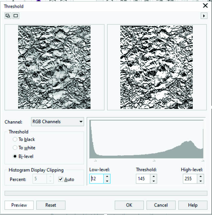
We now have a black and white (monochrome) image, something similar to that depicted in Fig. 3, depending on the adjustments you chose in Photo-Paint. The Threshold adjustment is probably the most important one to achieve the best image for this purpose.
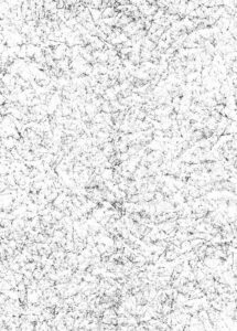
Once back in CorelDRAW, it is important to know that monochrome bitmaps are treated differently than other bitmaps, so we can select the bitmap, and, in the color palette, click on the “no color” well to remove the white. It is now transparent, resulting in a bitmap of, essentially, a single color, only showing the black elements. Also, the image color can be changed by right-clicking a color in the palette, so the black can be filled with any color of your choice. Experiment with the possibilities to see what can be done.
Fig. 4 is an example of using the distressed bitmap created earlier, power-clipped into an existing design. Note that the lettering uses the black image for the distressed look, while the shape behind it has the color changed to a light green color.
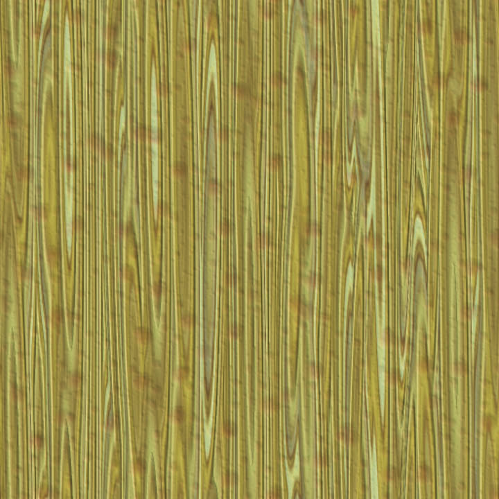
So far, we have looked at using bitmap images to create distress patterns, but there are times you may want a vector pattern to use as a distress. We’ll begin with a rectangle filled with a wood-grain bitmap pattern as in Fig. 5. First, convert it to grayscale, then, once again, open it in Photo-Paint and go through the procedures we used previously.
When it is returned to CorelDRAW, we will trace the image using power trace. With the bitmap selected, click on the power trace icon and the tracing dialog opens.
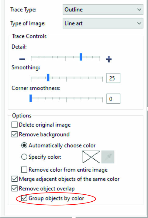
There are several settings available and, for this project, the Outline trace is probably the best choice and Line art works best for this operation. In the dialog box, I have found it helpful to check the Group by color option as Fig. 6 indicates. There are some things to take notice of here: First, the lines in the image are in a vertical orientation, so can be rotated 90 degrees in Photo-Paint (Image > Transform > Rotate) or in CorelDRAW after tracing as needed. Secondly, depending on your computer resources and choices chosen, it may take some time to complete the trace. One must be patient for the processes to finish.
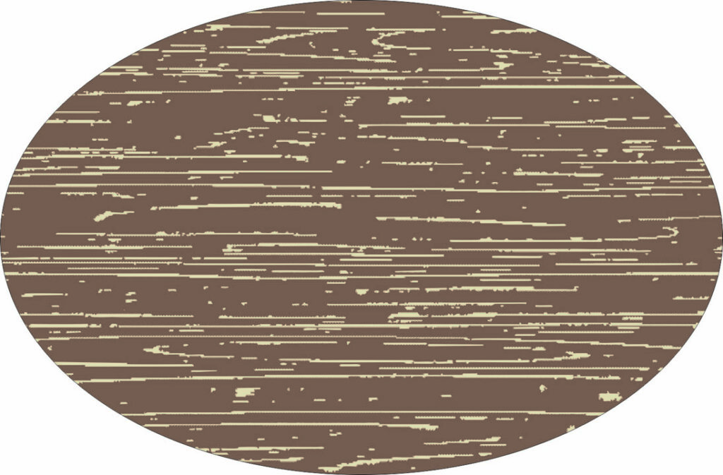
Fig. 7 shows the results of my traced distress image power-clipped into an ellipse image which was filled with a brown color and the distress image in an ivory color.
The distressed look may not be something that is used often, but it can be a valuable addition to some projects. I have shared some fairly easy ways to create and use the concept using the abilities of the CorelDRAW Graphics Suite, but I have only scratched the surface. One could easily take these concepts to a whole new level — your imagination is your only limitation!