Creating Eye-Catching Art
Don't just take orders, help your clients create great T-shirts they want to wear.
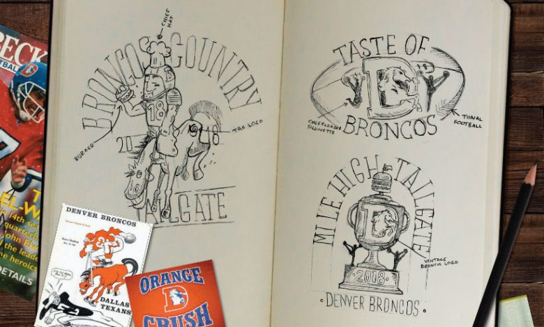
Have you been to a thrift store lately? It has become a graveyard for fundraiser and 5k T-shirts.
We have all received (or produced) a fundraiser T-shirt that would never win any awards or even be worn. For some reason, the promo or fundraiser T has become a billboard for all the sponsor’s logos, and no one knows why. There has yet to be any data to show that the sponsor or the cause benefits from this. As apparel producers, we should be talking clients off this proverbial ledge. Instead, let’s help them make great T-shirts, not just take orders.
Apparel is meant to be worn and not just seen as a tchotchke that gets donated or put to the back of the closet never to see the light of day again. Our mission should be to help make the most significant impact and create a shirt that’s worn for years. Let’s use a real-life example of how we can put this practice into play.
The Taste of the Broncos, which is a fundraiser put on by the Denver Broncos to support Food Bank of the Rockies, commissioned us to make, design, and print the annual event T-shirt. The following is our creative process that delivered a design that everyone loved and made for happy clients.
INGREDIENTS FOR A GREAT DESIGNWe start every custom design by asking the client three leading questions to help our creative team design something that falls in line with the client’s brand but will also have retail appeal so it will actually get worn.
1. What is the occasion? Purpose? Goal? In the general sense, do they want to sell, give away, or use the shirts in conjunction with a promotional campaign? We like to be politely opinionated when discussing their goal, saying that one of the main goals of the shirt is that it is worn. While it sounds obvious, this pushes the client to really think of the T-shirt as more than just a business card or flyer.
2. What vibe/style do you want? This is where a lot of shops miss the mark. You want to know if this shirt were to be sold at retail, what store would it be found in? What style makes the most sense? Most clients do not know how to articulate what they want. Having them describe things in the best way they know how is vital to filter and narrow down the desired look. Ask them, “Do you like this or that?”
3. What demographic are you marketing to? Who is your audience? It is so important to truly know the audience that will be attending, buying, or wearing the shirt. Is it for moms, dads, grandparents, and the kids? Or is it for tweens or college students? Knowing this upfront can save design revision time and give the client a smoother experience.
Once these three questions are gathered, we meet with the design team to begin the process of the actual art creation.
THREE STEPS TO THE PERFECT DESIGN1. Market research and ideation. It all starts with a mood board. It is vital to understand the past, present, and future to create an authentic look,. For this design, we wanted to integrate three eras of Broncos mascot to create a unique and licensed T-shirt design. We are big fans of worn-in distressed textures and aimed to find T-shirts that could inspire the design.
2. Concept sketch. This is where we provide the client with a “rough” rendering of the potential plan. It is much easier to edit a sketch than to create a fully digital design that gets turned down or has so many tweaks that it will take twice as long to rework. For this project, we pitched three different layouts integrating elements from the event and Broncos heritage. The client liked elements of each of the designs, so we decided to take their requests and went to the design phase.
3. Digital design. Digital designs take the project to the next step. This not only makes the approval process quicker and easier, but it gets the graphics ready for printing.
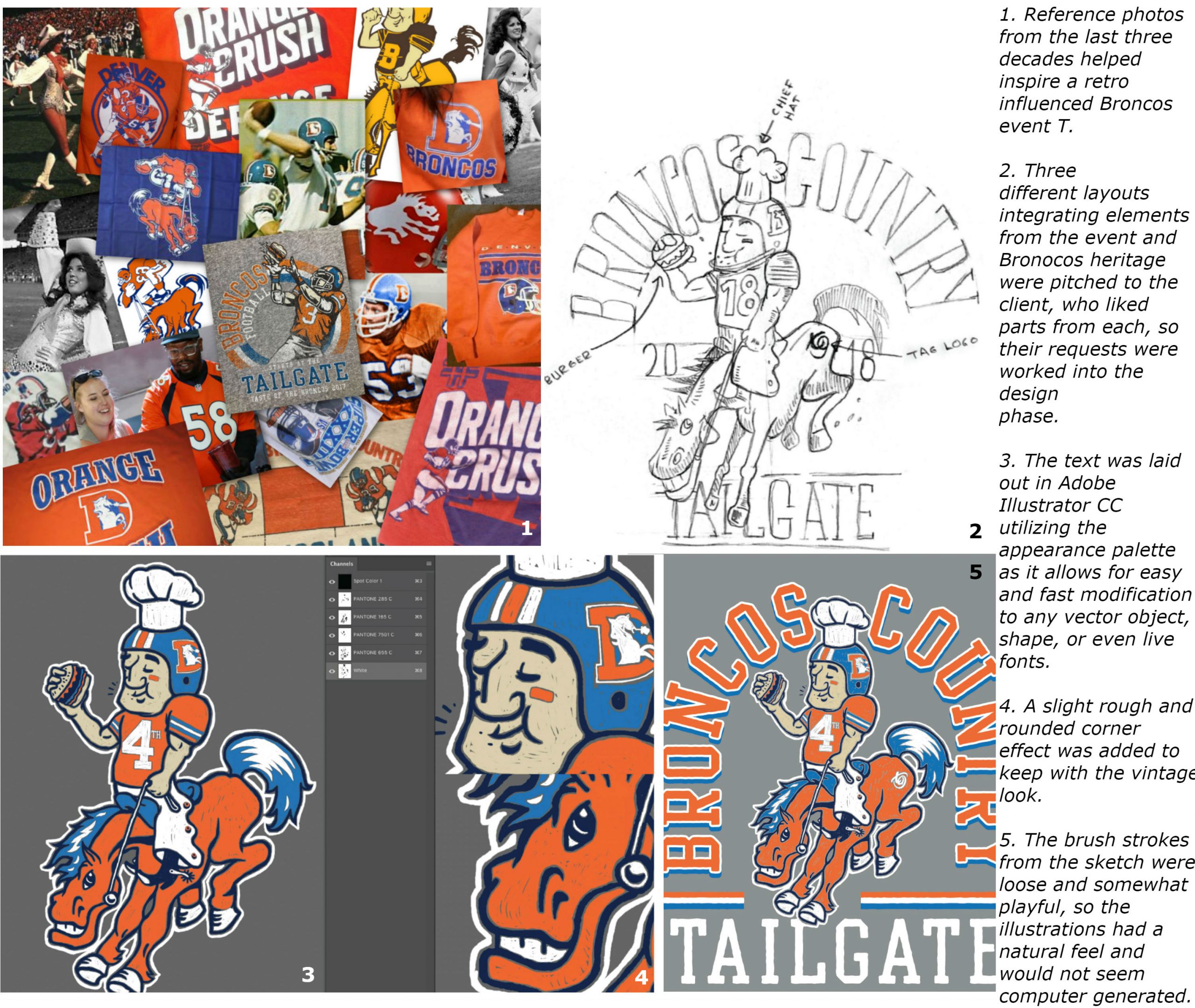 (All images courtesy the author)
We draw in channels as much as possible to quickly and easily make separations. In this project, we used Adobe Photoshop CC to draw the Broncos Icon Mascot. By using a round brush with a small jitter and a dual charcoal brush, we achieved the vintage look we wanted. The brush strokes were loose and somewhat playful, so the illustrations have a natural feel.
The text was laid out in Adobe Illustrator CC utilizing the appearance palette. It allows easy and fast modification to any vector object, shape, or even live fonts. We added a slightly roughened and round corner effect to keep with the vintage look. Then, the type was exported to Photoshop and assigned to the corresponding channels. We used a variant crackle distress texture and smaller texture spots to fade specific points of interest for that unique, natural, and weathered look.
For the final product, we ended up omitting a base as the color of the shirt lent itself well to the textures we created. Instead, we used a single white screen with a choked impression for the rest of the colors to help give the opacity a little push. Soft hand plastisol and high mesh 255-300 was used to provide the print with a great hand. The result was a classic vintage look with a print that looked like it came from the 70s or 80s.
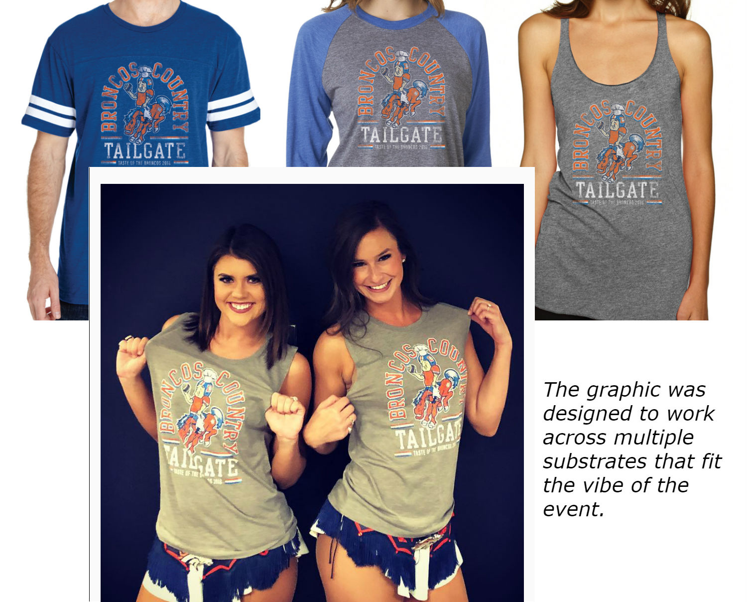
We have many producers that outsource their design work to us to help give their clients something more than their in-house designer can achieve or has the time to do. For shops that don’t design in-house, be careful who you recommend to your clients for design work. Make sure they understand design for apparel decoration and have a pulse on today’s culture. This will not only make your life easier when you quote and print, but a better design will result in your customer selling more and their shirt getting worn over and over again. You also get to help their cause and hopefully get yourself some more business in the process.

