Create Signage Using the Good, Better, Best Sales Strategy
Providing three sign designs is a great place to start for demonstrating sign-making project options.
About this Sponsored Content
Johnson Plastics Plus, headquartered in Burnsville, Minnesota, has been a leading supplier to the engraving and sign making industry since 1970. Our Johnson Plastics Plus commitment to serving the needs of the engraving, sublimation and sign making customers remains our primary focus. Visit www.jpplus.com for more information.
We all love choices, but sometimes too many choices lead to confusion and indecision. Today’s sign maker has a lot of options when it comes to laser and engraving material, hardware, color and finish options to create signs, awards and recognition plaques. Imagine how staggering this may be for your customer trying to confidently make buying decisions for their business to meet their budget.
With a little preparation, you can make buying decisions easy for your customers and avoid “option overload.” Simplify their signage options by visually showing a few completed signage designs at different price points. By providing direction and serving as an educational resource, you’ll quickly strengthen your client’s confidence in your abilities when they see your creativity, knowledge and experience. Providing three sign designs is a great place to start for demonstrating sign-making project options.
Try sharing a basic “Good” option for simple requirements and projects, a “Better” option with some design enhancement, and a “Best” option that showcases your best design work. This concept is called the Good, Better, Best (GBB) methodology.
What is the Good, Better, Best (GBB) methodology?
Good, Better, Best (GBB) is a well-known comparison model that many of us use when researching all types of products or services. Think about choosing the brand for your new car. It’s similar to categorizing your options from Economy to Standard to Premium. Now apply the same concept to sign-making. Provide three different sign design options at three different price points, each a little more impressive and interesting than the previous one. Using the Good, Better, Best model helps educate your customers and move them through the buying process because they better understand their options for their project… and budget.
Applying Good, Better, Best to Signage Design
Sign-making is a visual business. It’s always helpful to see the finalized sign sample or project before you can visualize it yourself. Good, Better, Best is well-suited to sign-making, as it allows the sign maker to “show and tell.” Talking about the options isn’t always enough to grab attention, but taking the extra step to educate customers and show them what they can get at different price points is effective. Many people don’t choose the best option at first, but when able to compare the best with the good and mediocre… it has the power to sway them.?
Design elements of Good vs. Better vs. Best Signs
When design enhancements, dimension or architectural hardware are added to dress up a basic sign, it may be surprising to see how quickly the sign can easily go from Good to Better to Best with minimal work.
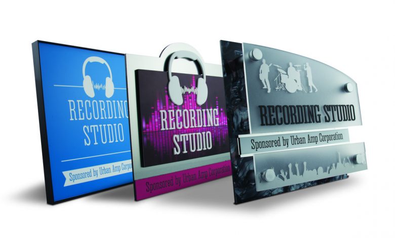
1. Good (far left). This sign features one simple two-ply plastic substrate with basic text, minimal graphics, and no layers, raised elements or decorative/mounting hardware. The design is completed with a standard black metal frame.
2. Better (middle). This sign features a more eye-catching design with a splash of color that was digitally printed and layered on a brushed metal acrylic. The eye is instantly drawn to the sign because the artwork used “breaks” the standard square box. It is also features several layers cut in different sizes to create visual interest, and the headphones offer a more dimensional look as they “hang off” the front substrate layer to overlap the base sign substrate.
3. Best (right). This creative double-panel sign features many different visual elements. Both substrates on the first and second layers are cut in a unique curved shape. The top acrylic substrate is frosted and semi-translucent to allow for the core substrate color to show through and bring the elements into a cohesive design. To create a more textural appearance, a unique sheet resembling a marble or stone was used for the core, and the text and graphics are raised for dimension. To bring it all together, the sign is enhanced with a desk plate to allow for interchangeable information, making the sign design easy to update or reuse. The standard square frame is not only not possible for this sign based on its shape, but it’s not necessary. If a client sees this sign design in a sign maker’s showroom next to the Good and Better options, which one would he find most impressive?
As the signage market grows and evolves, sign makers have a tremendous opportunity to take advantage of all the products, materials and hardware available to them… and create truly unique and memorable signage to suit any price point.