Bringing New Life to Old Designs
So, you want to talk about something new that pops? Well, here you go!
How many of you have had a customer come to you and ask “Can we do something new with our logo?” or “I like this design, but it’s missing something. Can you make it pop more?” We then turn to the customer and say “Do you have something in mind? If not, I have a couple of suggestions.” Well, here are a few ideas I have pitched in the past that we are all familiar with by now. Vintage (no underbase soft printing), distressed (makes the design look old and worn in), water-based, discharge, and puff (going super old school). Most often our customers tell us to try a vintage feel or see how distressing the design turns out.
It’s not that often that we as printers get the chance to pitch any specialty inks. As a whole, printers tend to get excited about new products. We show printed plastisol samples to our customers; the customers get excited about how cool it looks; we show them the price, and that’s the end of the conversation. With the advances in water-based inks and their low cost in comparison to plastisol, there is no longer any reason to not offer them, and they print just as easy as any other water-based color. So, you want to talk about something new that pops? Well, here you go!
Now, let’s take that design and set it up with water-based inks for that super soft, vintage feel we mentioned. What’s even better, we can drop the base white from the design, and we can charge more.
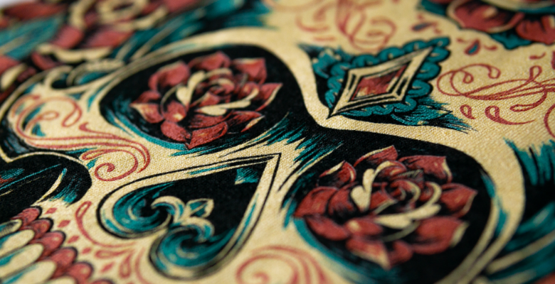
So let’s use the below design as an example:

Initially, this was designed with everything underbased (except black) and printed in plastisol. Colors were bright. The print was clean. Everyone was happy, but it was time to freshen up the design.
We started by taking stock of which inks we wanted to use. We wanted a white/clear/pearlescent ink for the nice luster once cured, as well as some silver flare to give it a little more pop. We settled on the skull color as the pearlescent with a touch of orange fusion pigment and a drop of scarlet fusion pigment to give it that light bone look. Next, we took a 50/50 mix of pearlescent and silver flare and added 10 percent green fusion pigment with a couple of drops of yellow for the leaves. Last we used a gold metallic, pearlescent ink and added 10 percent scarlet fusion pigment. Alright, time to start printing!
The hand is soft, the colors are muted, and it looks vintage, but it didn’t have as much pop as we hoped. To remedy this, we underbased the skull to give it some good separation from the vintage background colors. This changed how the mixed colors looked and gave the impression we used more colors than we did. We added back in the base white, just under the skull and we came up with this:

The skull pops off the shirt; the colors have high shine and luster. The final design was five screens, just like the original plastisol design, but now its freshened up and new! For those curious about the mesh counts and print order, we used a white water-based HSA ink for our base through a 156-mesh screen. We did print-flash-print. The black water-based HSA ink was up next, through a 230-mesh. The bone, green, and red followed, all through 156-mesh.


Happy Printing!