When you fly into Denver, it’s hard to ignore the big blue horse that rears up in power and rebellion at the airport. The 32-foot-tall fiberglass sculpture towers over Denver International Airport’s main highway in and out. Its eyes glow red with a menacing stare at the cars racing by.
Us locals refer to this mighty equine as Blucifer. Some love it, some hate it, some love to hate it, and visitors are curious about it. Officially, the artwork’s name is Mustang, and the piece is a point of pride for the airport.
This fierce blue mustang is kind of a protector of travelers and guards the airport. Denver International Airport (DIA) is full of intrigue and rumor. There are plenty of conspiracy theories. The horse seems very Colorado, yet it takes a hard left turn with the red eyes and the blue physique.
New Mexico artist Luis Jiménez created the stallion that was his ultimate demise. Jimenez died in 2006, after a part of Mustang came loose and fell on his leg, severing an artery while he was working on it in his studio. Jiménez’s studio later completed Mustang and installed it more than 15 years after it was commissioned in 2008.
Those red eyes that people point to as evidence of Mustang’s demonic nature are actually a tribute to the artist’s father, who worked in a neon sign shop. Mustang is defiant and an expression of identity, having a place, standing strong, being fiery, and being gigantic.
The striking blue color and glowing red eyes were controversial from the start. There was even a Facebook page called DIA’s Heinous Blue Mustang Has Got to Go. The sculpture has not only withstood public scrutiny, but it’s also had to hold up against Colorado’s intense weather and extreme environment.
Incorporating mustang
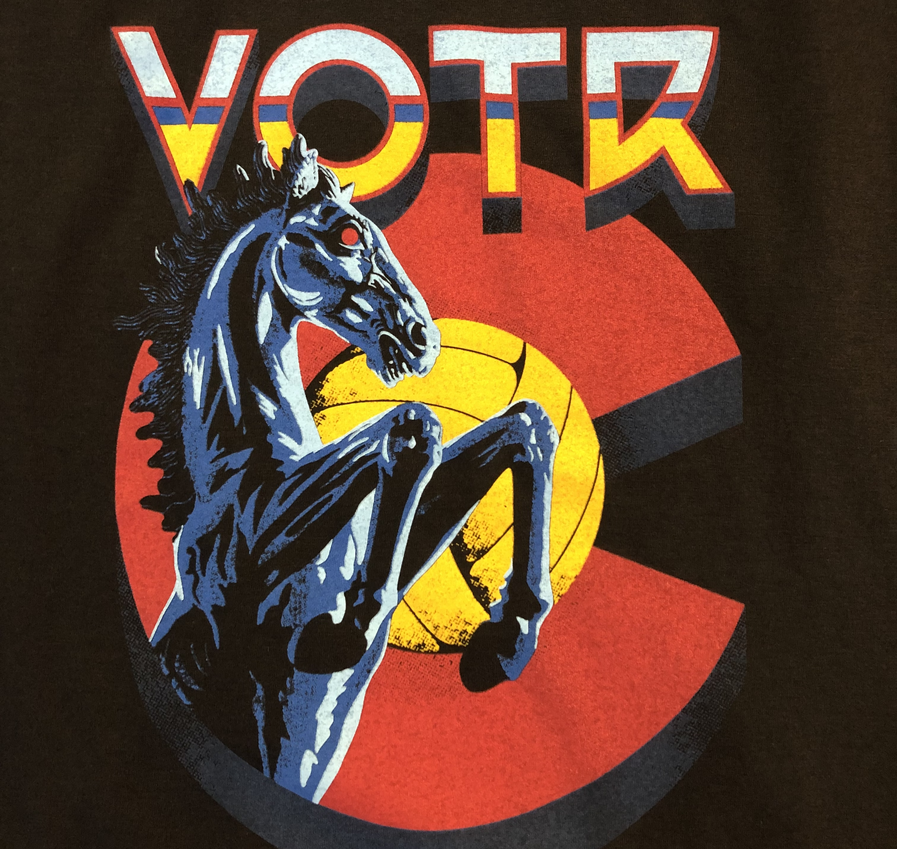
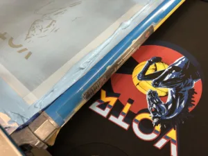
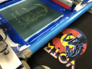
Speaking of Colorado weather, it’s beginning to warm up a bit, so time to get the outdoor spring grass volleyball leagues going again. So, our most recent project for Volleyball of the Rockies (VOTR) was a design featuring, wait for it… Blucifer/Mustang.
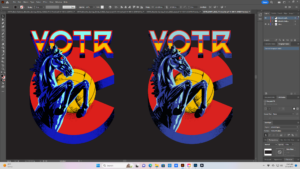
The big blue Mustang’s head under the type solution for VOTR next to the Colorado flag C with a golden volleyball for the sun. Clever, eh? Probably couldn’t say Colorado any more than that! Full front with matching back featuring all the parks they will be playing in; sort of a rock-n-roll tour shirt feel.
Both sides were straightforward designs. This client provided portions of art that were built layer upon layer as they are not concerned about the separations at the creative stage. There was art hiding behind other art and mystery paths intersecting that would require some work.
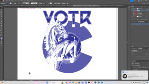
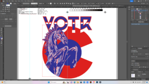
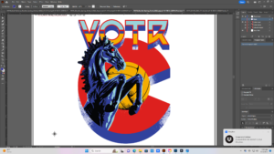
We worked in Adobe Illustrator in vector format. For a workable file and to turn all the strokes into paths, we selected the art, pulled down Object and flattened transparency. Using Pathfinder, we merged what we needed and cut the parts we did not. After grouping colors appropriately and separating on sublayers we made them spot colors. Here we were able to isolate areas and remove the unwanted noise.
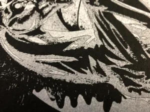
Using the Trace feature, we brought in rasterized photos of Mustang and traced out the elements using the black and white option. This removed all the transitional tones and left us with just general shapes all in vector format. The texture, however, left random objects and bits of image floating out along the edges of the circle. We used the Circle Object to select and Divide Objects in the Pathfinder Tool to remove them. Once divided, we manually selected the pieces and parts to be used and or deleted.
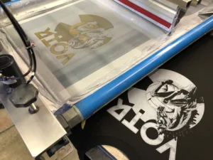
For the white printer or base plate, we applied a .35 point stroke with rounded corners on the inner path for an overall choke and a gutter between all the colors to keep everything clean and the white from peaking.
We also chose to use an 80 percent halftone under the red and a 60 under the blue to give the inks a place to go. All this was to facilitate maximum wet-on-wet printing with as few flashes as possible. This would also minimize smearing, buildup, and screen cleaning during production. Because we would be printing on royal as well as black we had to add a black plate. The highlight white would also change to a light blue.
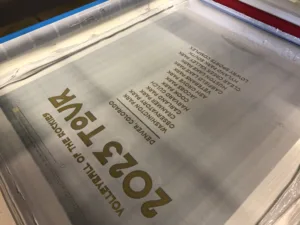
Now for some additional back deets… VOTR has a logo or icon we print on the back of everything we decorate, a silhouette jumping up to hit a volleyball, which is kinda their Nike Swoosh. We call him the little dude. We have printed him hundreds of thousands, maybe millions of times. We snuck him in on the lower back. We also would get clever with the layout of TOUR. Notice how it’s using the same letters from the front VOTR in a different order?
Once seps were completed, we output to screen on CTS. We ran black first for the royal shirts on a high mesh and then the white printer or base plate on N-166 stretched and work-hardened at 45 N/cm2 using a 65/90/65 triple-ply duel durometer squeegee.
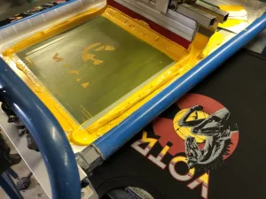
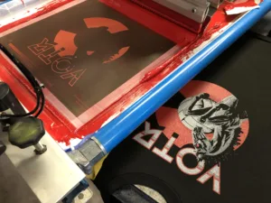
We followed that up with a flash and then a Teflon screen with a heated iron for smoothing. Finally, the balance of the colors and the highlight — darkest to lightest, and least coverage to most — all printed wet on wet on N-272’s all at the same tension using 75/90/75’s.
The prints matched proof almost perfectly. It ran great on royal and black with 5,000 pieces for this one. Volleyball is a big deal here on the Front Range.
Commissioned for $300,000, the city of Denver ended up paying $650,000 for the sculpture. A 2007 appraisal performed just prior the statue’s completion valued the work at over $2 million.
