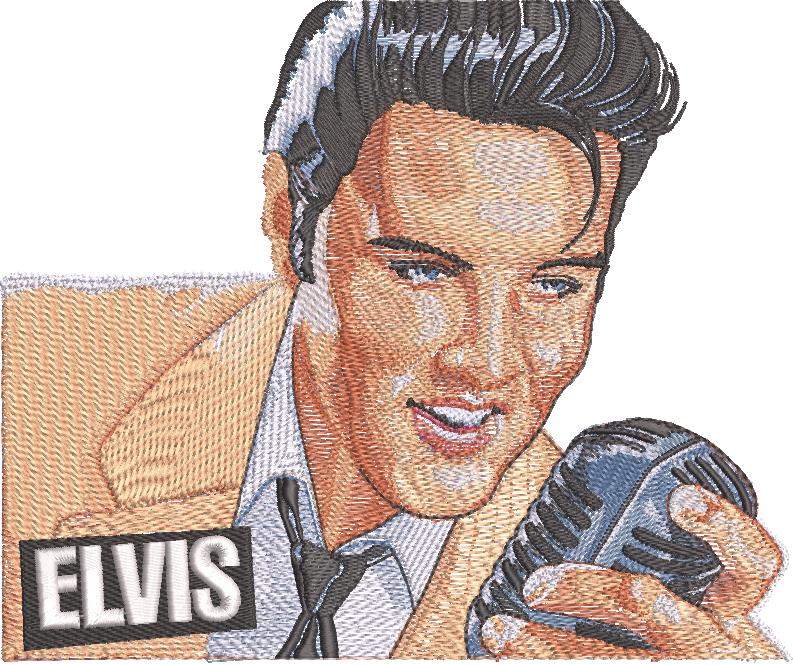
When my brother and I made the transition from screen printing to embroidery in 1987, we were told by the “experts” that you couldn’t blend thread colors. In ’92 when we created the Elvis Presley stamp as a full-color blend using only six colors of thread, we proved them wrong.
In screen printing, we had fallen in love with what was called a “fountain” at the time, and then we found that we could create more precise blends using half tones by creating a screen for each of our colors. Knowing that, and being restricted to “cartoons” (again, by the experts), our transition into embroidery seemed to be a large step backward.
It was looking at DPIs (dots per inch) and equating them to stitches per inch (density and length) that opened the door to programming, or digitizing blends in embroidery. From there, shading became nothing more than finding the full light, the half tones, the shadows, the reflected light, and the cast shadow. Essentially, all the information that you find in the JPEG that you are using for your art.
However, the color separations are done by eye in embroidery, it is not as easy as doing your color separations with your computer, and the stitches tend to pull in, while your ink can expand.
In embroidery, you will not be able to use CMYK, or RGB as thread colors, but will find variations that work for each individual design. You will find that your eye blends your thread colors, and you will be applying light transparent densities of each color that will allow two colors to blend to create a third.
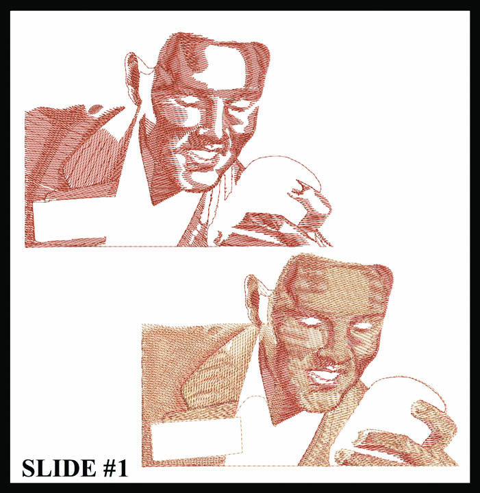
Although this may sound complicated, with a background in printing, you already have an advantage. You have printed a halftone screen and Fig. 1 is something that is familiar, even though it is stitches, not ink.
We have three basic stitches in embroidery: the running stitch, the column or satin stitch, and the fill or Tatami. I like to say that once you master the three, you have mastered digitizing. Normally, we would go stitch by stitch, with blending and shading being an advanced version of your fill or Tatami stitches. However, I am excited to jump ahead in this article and give you the tools I have been asked for most.
How it’s done
To begin, look at your art. Six or eight colors should jump out at you. In the Elvis stamp, you have black, white, cream, burnt orange, blue gray, and magenta. These colors, mixed together, will give you every shade that you see in the stamp. To be able to mix these colors, you cannot use 100% density. Your color cannot be opaque when blending. When you are laying down stitches you need to allow room for each stitch, and each of your colors. I have found that the most consistent answer is to reduce your density to one-third and shorten your stitches by 15%.
This means that if you create a fill that is one 1″ X 1″ and the total stitch count is 1,500 stitches, then you need to reduce the “density” or “spacing” to a number that gives you 500 stitches for the same area. This, as you see in Fig. 2, is wide open and two to three colors will blend nicely.
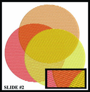
Your needle does not like to put a stitch on top of another stitch. This is to your advantage. When all your fill stitches run at the same angle, your needle is flexible and will find the voids between the lines. Three layers of stitches that are one-third density will give you a full or opaque fill. Each of those three layers can be a different color. The number of layers you use for each color will determine the shade of that color you get.
As a simple exercise (Fig. 3), let’s start with a circle and, through blending and shading, create a sphere or ball.
First, using your darker color, create a half moon of dark fill on the lefthand side of the circle using your fill or Tatami at one-third density, and the stitch length that is 85% of the default. In the Wilcom program, this is 1.2 density or spacing, and 3.5 stitch length. Your fill should be set at zero degrees, or horizontal. Next, duplicate that half-moon and extend it into the void area of the circle.
Keep it simple and the same density, then stitch length and same angle. This will give you two layers of the dark fill on the left-hand side, with one layer extending into the void area. Next, using a light color, fill the void area of the circle. Same density, same length, same angle. Next, duplicate this light color fill and extend it to the left so that it covers the lighter part of the second dark fill and butts up against the first dark fill.
This gives you a consistent two layers of fill on the ball, two layers of dark on the left, one layer of dark and one layer of light in the halftone area, and two layers of light on the right side, (your full light). Now, cover the entire circle with the light density fill in either the dark color, or the light color, or a third color. That third color can be silver metallic thread for glitz if you like. Again, same density, same stitch length and the same angle to have it blend.

This simple exercise will give dimension and form to your ball. Feel free to play with different colors. You have now done your first embroidery design with dimension through blending and shading! Digitizing can be easy when your instructor wants you to learn, and, with a graphics background, you are more than halfway there!
