Applying Distress Textures in Screen Printing
When creating authentic-looking vintage designs, this is where the real magic happens
When creating authentic-looking vintage designs, this is where the real magic happens. This step is where the differentiation between a good and great design becomes clear. It’s where you need to think through the entire design process, from screen printing to the customer wearing the T-shirt.
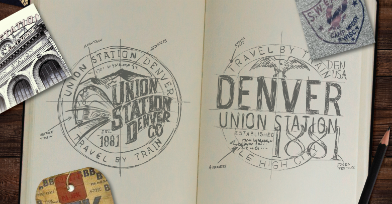
Think about how the ink from a vintage T is worn out and the spots where the ink comes off. For example, how did the natural elements affect a sign from an old building? Think as a sign painter on a window and how the brush strokes are part of the design. The non-uniformity and flow of being analog give more interest and a handmade element.
Don’t just use stock fonts! While there are plenty of “vintage fonts” available, the goal is to create the most authentic piece for your customer. By taking a stock font and then manipulating it, your design will have idiosyncrasies in line with the quirks of the past. My art director, Angelo Montiel, starts by taking the font and applying roughen, round corners, and offset paths. These additions begin to change the font and give it more edge and uniqueness.
(All images courtesy Jeremy Picker)
We hand draw the main fonts for some designs, but with this design, we started with hard-edged shapes. We begin to build up the design in areas and then take away coverage that utilizes the garment color, which starts to give the natural weathered look. We combined four to six different textured brushes to make up one vintage design. We also want to distress it enough so the end print won’t be a dense blob of ink.
On some of the vintage T-shirts we analyzed, the top layer of ink peeled away to reveal the original underbase that gives that show-through look. We kept the core shape of the elements intact to provide some structure and depth. We usually keep the bottom print tonal to the garment or keep the top layer a darker color and the eroded print white.
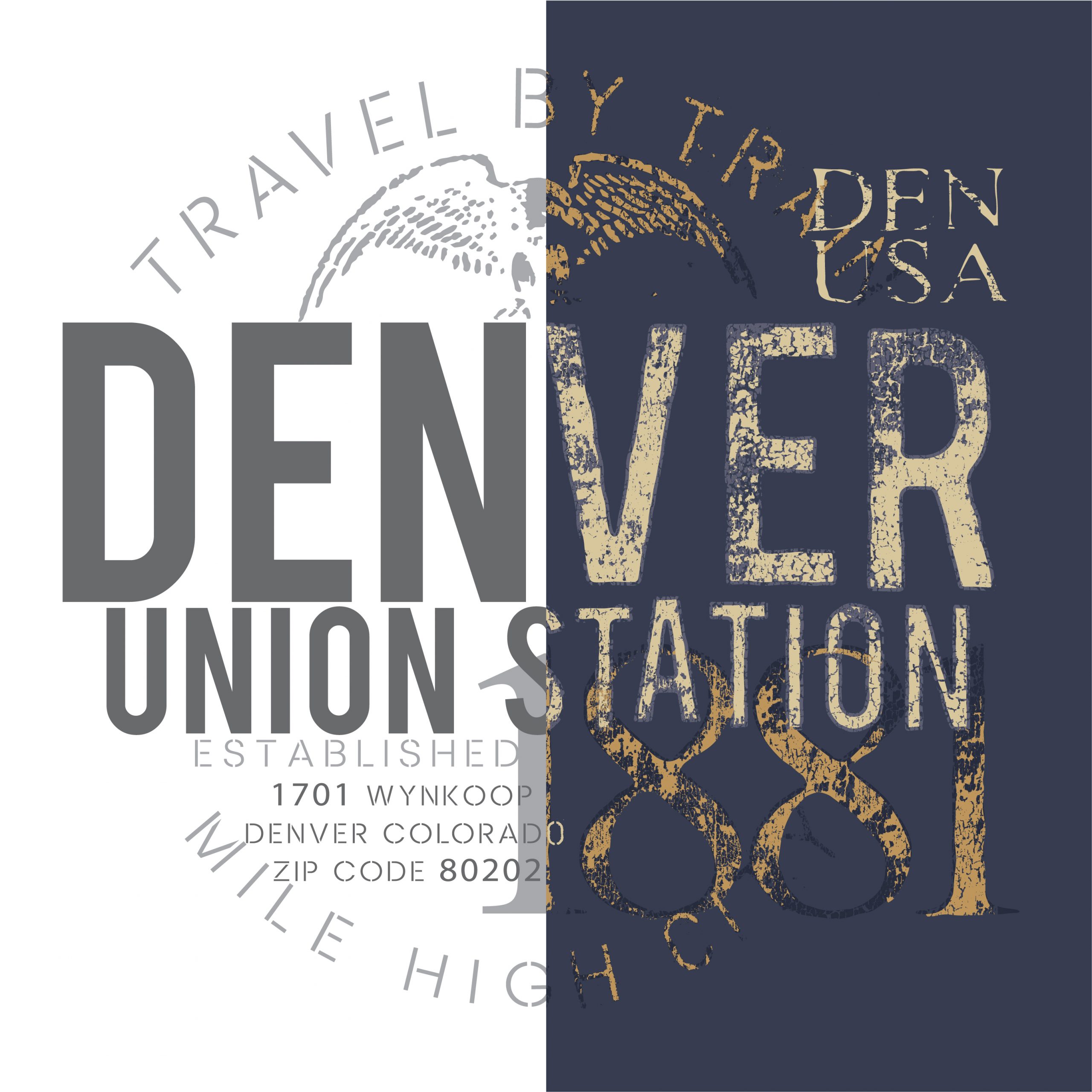
Since Montiel and I love integrating specialty inks in our T-shirts, we wanted to bring in the element of crackle ink to give the distressed vintage design even more aging. Crackle is an excellent way to make the print look like it has been through the wash a thousand times. You can see how the beginning structure is still visible, but now it has variations of wear and distress. Color brings it to life.
Now we are almost there. The moment you start to turn it from the computer screen to screen printing screens. Montiel started his career as a screen washer, moving to press operator to production artist and then to an art director and understands how the design will come out in production. While it could take some experimentation, you want to make sure the print does the design justice. Think about how you can mix screen mesh, squeegee pressure, print sequence, ink type, and garment/fabric type. I know you can’t always take the time to R & D, but I encourage you to find what works with your design and production teams to solidify that what is on screen translates to the print. When done right, an authentic-looking vintage T-shirt will become a favorite in the end wearer’s closet.