An Ode to the Gear Tree
Conference room environmental graphics project gets the gears turning
We are often presented with unique challenges from clients to produce something a little different than what’s normally found in our wheelhouse. I recently had a client visit with such a request. What resulted was a unique project that not only combined various design strategies, but high-tech fabrication and good old-fashioned painting and sculpting techniques.
I always strive to utilize the best of what today’s technology has to offer, while adding a unique touch of crafted processes learned along the way. When combined with branded and themed environments you have a large and growing market for traditional sign makers and printers to work on projects a little out of the norm yet utilizing the same knowledge and talent.
Large corporate and even medium to small companies are re-imagining the workspace and introducing designs and elements outside traditional signage and printing. Logos, colors, typography, and slogans have not been lost but are now complemented with inspiring and calming graphics and inspirational copy.
First gear
My client owns a family business that goes back a generation or two in the textile industry, making – and now servicing – print machines. She was renovating a smaller old conference room and wanted to do something whimsical yet themed with some historic tie-ins with the business. She’s into the steampunk look and handed me this poem that she wanted later to be carved into a large conference table.
Oh, gear tree, mechanical wonder of our time, turning cogs and sprockets, making gears align. With your intricate branches, and metal leaves so bright. You bring movement to life, with your mechanical might.
In factories and machines, you’re a vital part, helping wheels to turn, and power to start. With every rotation, you prove your worth. A symbol of progress, and man’s mastery of earth.
So here’s to the gear tree, a marvel to behold, a testament to man’s ingenuity, strong and bold. May your gears keep turning, for a long time to come. A shining example, of the power of human invention done.
That was it. She trusted I could come up with something and she would find some old tooling and machine parts and gears to finish off the background of the conference feature wall.
I had a lot of work in front of me, so I shifted into high gear to do some research. I was surprised at what I found. It appears my client’s appreciation of art was not unique, and I found several sources of inspiration. But I sat in front of my blank canvas frozen; it was like having writer’s block. I needed to create a sign (or something) that would not include a provided logo, a branding manual of fonts or even corporate PMS colors to adhere to.
Perchance to dream
Focus was needed to see my tree through the client’s forest. I literally had to keep my design to just the tree and let the client and her interior designer work out the rest. In order to plant the seed of inspiration, it was decided to turn to the internet and do a little research.
Much to my surprise, the gear tree is not a unicorn of steampunk lore. There was actually a plethora of information out there to throw together a quick mood board to review for the initial design. You can’t always trust what you find on the internet, but if you did you’d swear there were forests of these trees somewhere up North in Gearland!
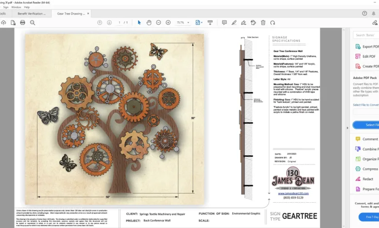
It was decided to use a more organic tree trunk and branches and feature various gears as leaves, beginning with drawing out a tree outline and scanning it. In CorelDRAW a quick vector trace was done and cleaned up. The same research was done, various mechanical gears were found, and a few made-up whimsical gears were created for the leaves. The rendering shows the concept and upon approval, the art was separated into production files to cut the HDU and acrylic.
Second gear
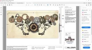
After reviewing and approving the main piece, the client wanted another large statement at the other end of the conference room that would include a clock and tie-in with the theme. Leaving the tree piece behind, it was time to branch off and put a little design thought into the other wall graphic with the supplied steampunk timepiece.
The same gears as on the tree were used for a tie-in to the tree and added a simple Victorian-influenced flourish in vinyl as a background. The gears and clock would come forward with some dimension from it.
With a quick go-ahead, these gears were added to the acrylic fabrication files and a file to cut the matte black vinyl flourish as created.
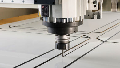
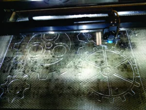
The acrylic gears were cut out of 1/8” and 1/4” acrylic for dimension on the laser. The tree was cut out of a sheet of 1” 18-lb. HDU on the CNC router.
The tree was stark and lacked character. A quick breath of life was sculpted into the HDU by sanding away the harsh edges and adding the bark texture with a wire brush.
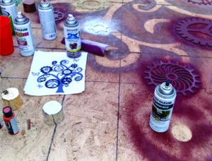
All pieces were sanded and prepared for a quick coat of primer. Once the primer coats dried a base coat was added. For the tree, a brown color was selected and for the gears it was a variety of metallic finishes. This piece was indoors so paints were chosen for ease of adding later faux effects rather than handling the elements of an exterior application.
For the tree, a variety of various browns were painted on and wiped, then some highlight colors and other low light that would fall into the carved bark textures. Darker shadow colors were used in areas to help pull out added dimension.
For the acrylic gears, some patina examples were found and printed for reference. The painted acrylic was Scotch Pad scuffed and using a sponge as a brush. Various acrylic paint colors were used to create the faux patina look.
Final gear
With all our components complete, it was time to head out and install this project. Everything was first carefully laid out on the floor and reviewed with the client for final approval. This was marked and photographed and the gears were strategically separated and VHB taped was applied to the areas of contact on the back.
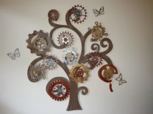
The tree was prepared for stud mounting and a pattern was taped to the wall, approved for location and then drilled. The tree also had several dollops of silicon on some of the branch areas for added stability and the piece was adhered to the wall with masking tape as the silicone set.
Once set, the next step was to hang the gears. Using the photo taken earlier for reference the gears were installed using the VHB tape and carefully located dollops of silicone.
For the time piece the matte black vinyl was centered and applied to the wall. The vinyl included the outlines of the gears. This provided a fantastic surface to VHB the gears into place; the areas where gears were on top of each other were done the same way and a little silicone was added for assurance.
The client’s facility manager caught wind of our project during the design phase and the client encouraged him to put together some steam punk pipe accenting and lighting together to the top and sides of our piece. All in all it turned out well and it is always a pleasure to involve a client and their team in a cool company project like this.
Projects of this type are always a refreshing challenge. This was a reminder of the blossoming opportunities involved with environmental and themed graphics. Branch out of your comfort zone and explore the possibilities. Who knows, you may also find that profits can grow on trees!
