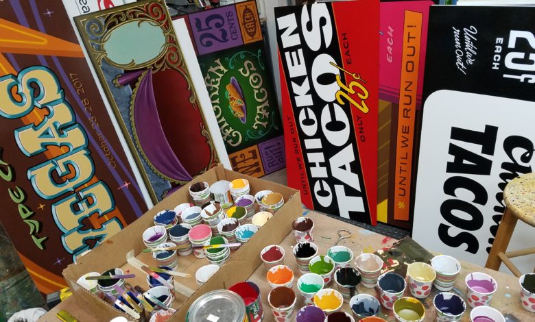
In 2017, I was an instructor at a week-long workshop dedicated to the craft of sign painting and sign design. Instruction was given in all the steps and processes involved in traditional signmaking, and the seminar began with a session on sign layout and design.
I asked them to imagine a typical job: A restaurant owner comes into the shop to order a sign. It must be horizontal, measure 2′ X 4′ to fit in a window facing a parking lot, and advertise a sale of chicken tacos. The tacos are $.25 each until they are gone. You write down the copy for approval: “CHICKEN TACOS. ONLY 25 CENTS. UNTIL WE RUN OUT.”
You agree on a price and a delivery date, and before the customer leaves, ask a clarifying question: “Which is most important; the tacos, the price, or the limited offer?” “They’re all equally important,” the client responds. “You figure it out, you’re the expert.”
Before the workshop, I made a collection of traditional-style signs in preparation: eight hand-lettered panels, each featuring the identical chicken taco message, but handled in a markedly different manner and meant to illustrate a different point or problem.
See them below with my comments. Analyze their relative effectiveness, and be on the lookout for a few design terms (rendered in italics).
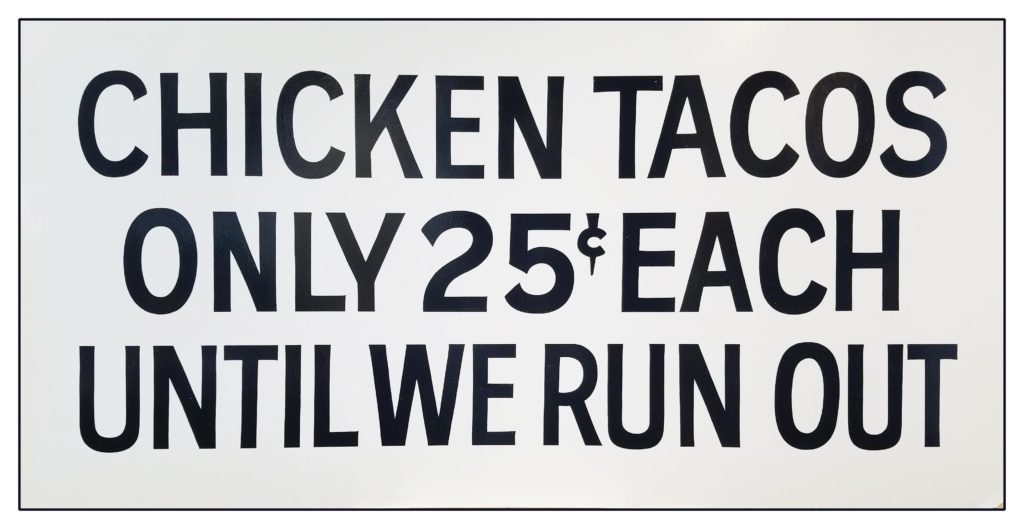
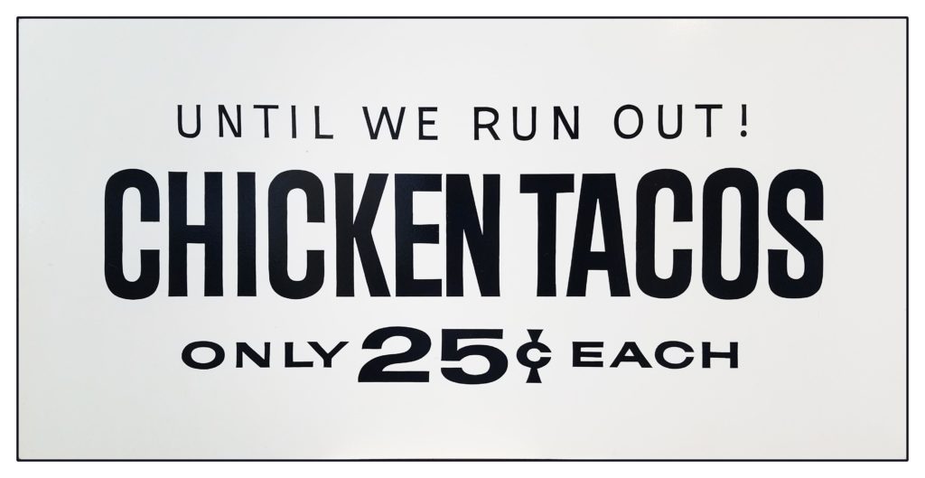
Sign No. 1
This sign fulfills the customer’s instructions perfectly. All elements are given precisely the same emphasis and equal importance. The characters are all about the same height, weight, style, and color.
It was executed quickly and exactly as the work order was written. Plain letters are placed as close to the edge as possible. In other words: boring.
Though it tries to deliver its message clearly, this composition has the opposite effect. The eye can’t land easily anywhere. There is little contrast and no focal point. The monotonous spaces between the letters and lines of copy make reading this sign a chore, and a failure of taco salesmanship. You begin to consider that the client’s instructions may need adjustment. What can you do to make the sign read more easily?
Sign No. 2
Things are improving. Notice that the same plain letters from the first sign are used here, but to better effect. A hierarchy is established: The bold, condensed taco letters are prominent, followed by the price and then the limited offer. The strength of each line is reinforced by the weight of its letter strokes. The light, wider-spaced letters are of lesser importance. This is due to variations in line value.
See how there is more negative space (air) around the lettering? This helps to hold the composition together. The area around this group of words is sometimes called its silhouette. Glance back at #1 for comparison.
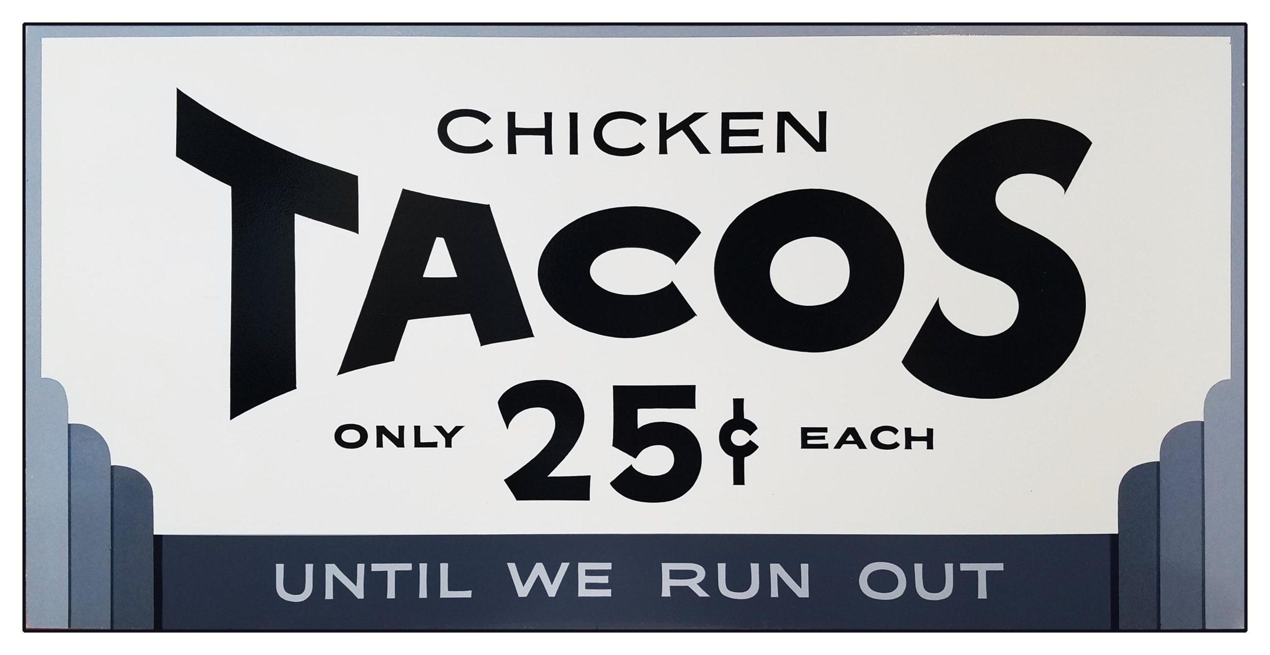
Sign No. 3
Since our course covered many historic periods in the evolution of sign design, this panel was given an art deco feel. But its style is secondary to its progression in the layout lesson. Study the copy silhouette here. The word tacos is large and takes top billing, followed in size by the price. Notice how the words exist easily in view, supported by the space around them.
The shape of the sign is its format; in this case, it is horizontal, with a one-to-two ratio. We can also observe sub-formats. The word chicken has its own. It nestles with comfortable legibility between the panel edge and the word beneath it. The letters on this panel are the same simple style as those found on #1 and #2 but given various sizes and weights.
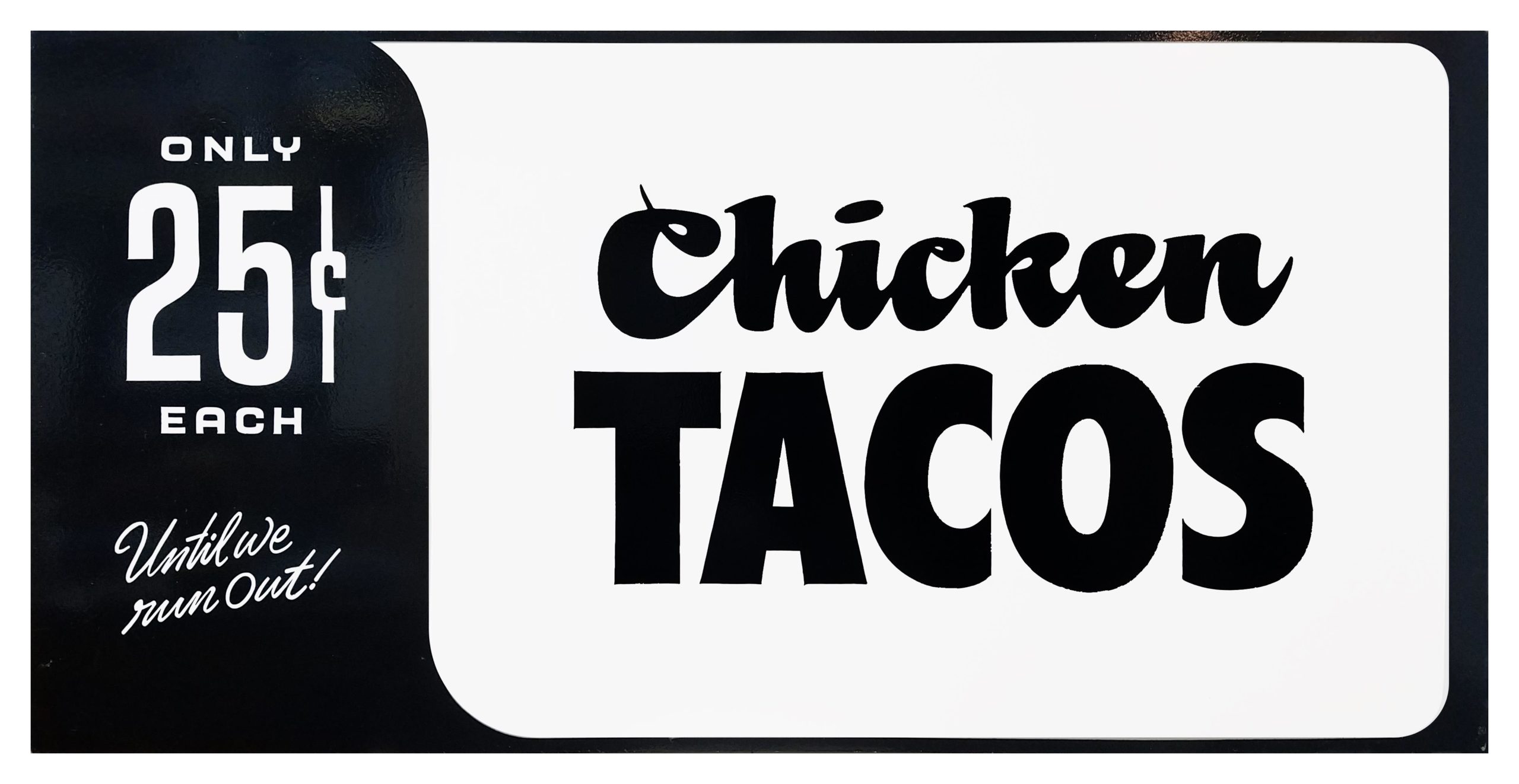
 Sign No. 4
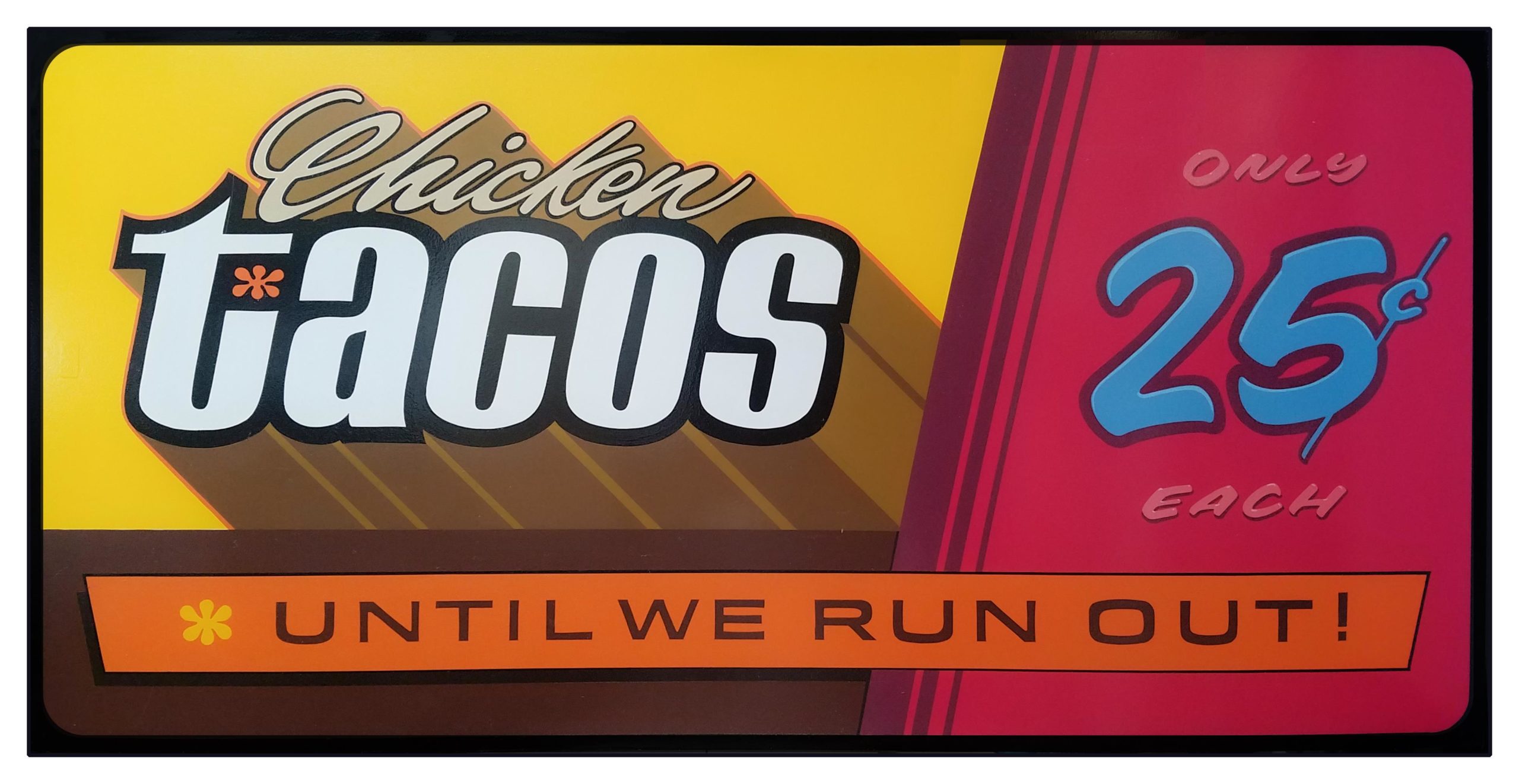
Things are getting more interesting. The plain sans serif lettering is now joined by a few lines of script for emphasis. Chicken has plenty of room to work because the uniform bottoms of its lowercase characters balance well on top of the bold capital letters beneath it.
This sign is divided into positive and negative (black and white) backgrounds, which affords an additional chance for idea groups to interact. Here comes an important new term: compulsive graphic relativity. This refers to the relationship of each part of a design to every other part. In some compositions, these relationships are successful, in others, less so. The central axis of the previous three panels has given way to an asymmetrical layout. The design may be the better for it.
Sign No. 5
A sign painting mentor of mine said, “If it’s gonna’ be READ, it’s gotta’ be RED.” I figured it was time to depart from the black-and-white scheme of the previous four panels and bring in some additional punch. Here the primary copy overwhelms the limits of the format and bleeds over into supergraphics territory. The eye travels through the design by a brand-new route.
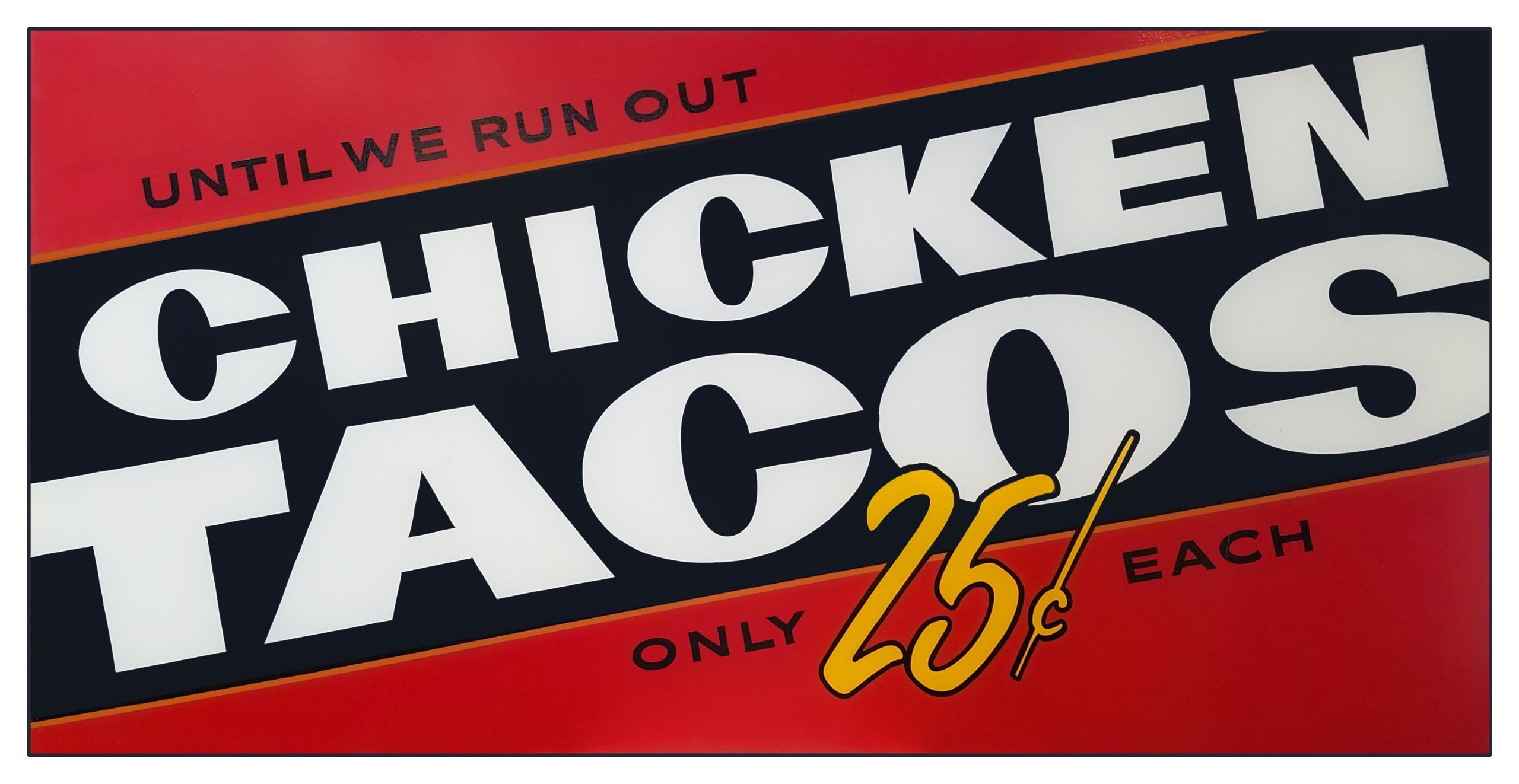
 Sign No. 6
This layout is in honor of the seasoned pros in the audience. It is an overwrought bells-and-whistles homage to the sign painters who came of age in the 1960s. In rebellion against the dry conformity of the work shown in Sign #1, they sought to show the extent of their talents — even on the simplest of signs.
Sub-formats are certainly in evidence here. Each element has its own panel filled with unique alphabet choices, colors, and effects, and in angular collision with its neighbors. Taken separately, there are intriguing aspects to every region of the sign. Viewed together, they add up to a study in disharmony and a reminder that the assignment is to help your customer sell his tacos. The artist’s creative preferences are of little importance and can work counter to the main objective.
 Sign No. 7
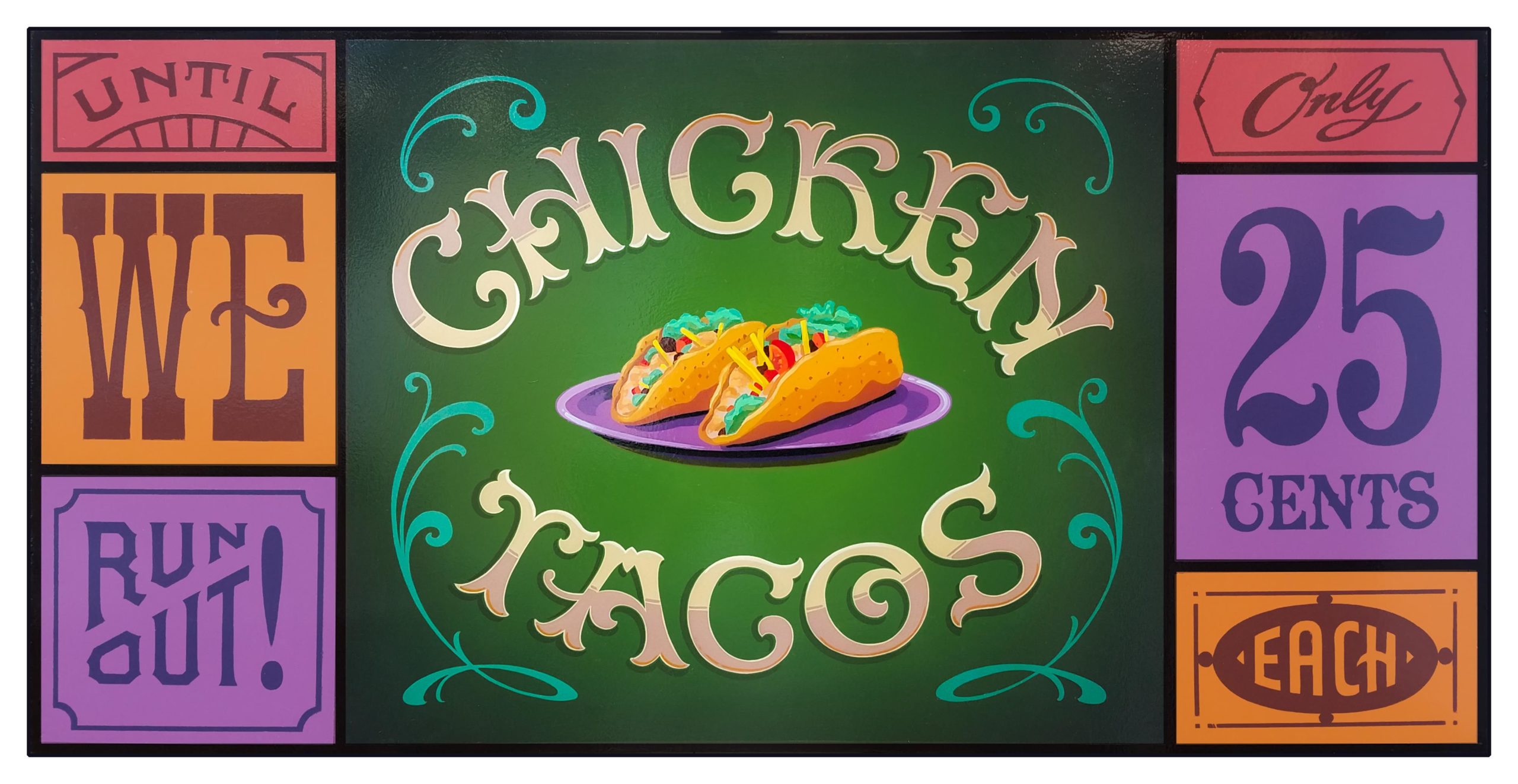
As a demonstration of enthusiasm, this example stands alongside the previous one; the sign painter is clearly having fun. A pictorial is introduced (always a nice addition), and the sign takes on a symmetrical fine art aesthetic. We can study this sign culturally or graphically.
Here, the viewer is asked to slow down and enjoy the visual experience. The idea groups disconnect completely and rest ornamentally in their own charming compartments. This is a celebration of detailed letters, which are interesting to decipher but low in legibility.
Are there times when the appeal of a sign is found in its decorative character rather than in its strictly commercial function? Certainly, but this is probably the wrong occasion. This sign might work beautifully as framed decor within the restaurant, but it is too complex to advertise tacos quickly.
 Sign No. 8
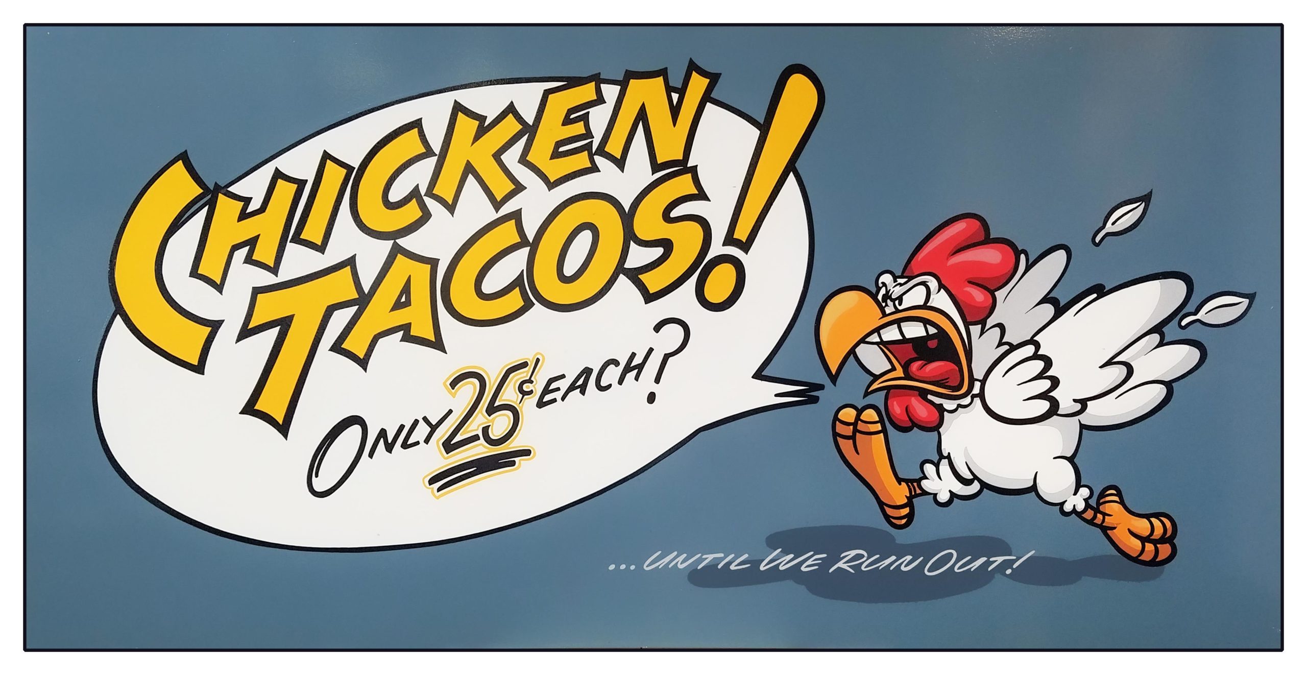
When in doubt, let an angry chicken deliver the message. The design of this panel borrows principles described previously. It takes on a cultural and a graphic appeal; it uses the device of a cartoon panel, but the overall design is clear and simple.
The cartoon concept is reinforced by the active pictorial and loud lettering, which is given greater authority as it violates the boundary of its balloon. There is harmony in the composition (along with a bit of added punctuation) and leaves no doubt of its purpose.
Sign design
This comparative study demonstrates that there is more than one way to advertise a sale on tacos, and some of those ways are more effective than others. The real purpose of the exercise is to show that sign design can be dissected, examined, and explained. We can study our work with an educated eye and begin to make solid improvements.
 Sign No. 4
 Sign No. 6
 Sign No. 7
 Sign No. 8