To coin a phrase from Nickelback, the most polarizing rock band in history, “Don’t we all want to be rockstars?” While the black T-shirt has always been rock-band cool, it’s enjoyed even more of a recent resurgence across more markets, including streetwear. Most industries, schools, and sports teams want their own version of the “cool black T.”
Lots of screen printers think dark shirts are harder to print. However, once you learn the process, the black T will be your new best friend—and your customers will probably prefer a black T for standout designs. You’ll find that you can use the shirt as a neutral substrate for shadow—the impact is tremendous on black vs. any other color because there’s so much high contrast.
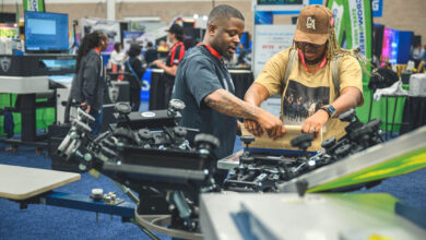
Here are seven key tips for printing on dark Ts that I’ve learned during my 25 years of screen printing.
1. Garbage in, garbage out
While we’re doing a little Captain Obvious here, this always bears repeating: Poor artwork will never result in a good T-shirt print. It’s on you as the screen printer to explain to a customer why you can’t use that 72 dpi art that looks good on their phone. Work with a great screen printing artist to ensure that the design you start with will yield the most stunning output.
2. Choose the smoothest print surface possible
That ideal printing surface will be on a higher price-point shirt made from 40 singles combed and ring-spun cotton. The key? Show your customer the difference. For example, when you print a 12-color photographic image on different black Ts, it’s easy for a customer to literally see the varying results. Say, “This will be your final output on a higher-priced T and how it looks on a lower-priced T.”
Using the good-better-best scenario works, and people will often choose a shirt at the middle price point. We also take pre-press steps (and even when the shirt is on the press) to smooth out the surface. There’s been a trend toward super-soft shirts, but these rough fabric fibers are often super-hard to print, and you’ll always get some fibrillating.
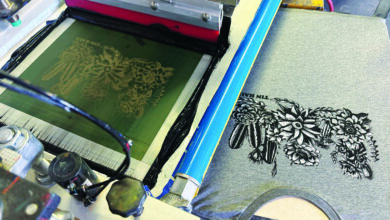
3. Use the dark canvas to your advantage
Don’t bury the garment under a wall of ink. Instead, use the T-shirt’s black base to create your design’s shadows and intensity. Think of it as using the shirt’s “negative space” to define your artwork’s shadows.
You might remember an exercise in your junior high art class: Your teacher set up a bunch of 3D shapes backed by a light source on one side. When you drew the shapes in pencil or charcoal, you used stark blacks on the shadowed side and a sliver or splash of bright light on the other. If you look at the best prints on black, there are lots of dark shadowed areas and minimal bright areas—but those brights hit you hard visually.
If you think of it as having to print a bright full moon vs. a bright crescent moon, shoot for the crescent. Use the garment’s black base and grayscale to transition from black to dark gray to light gray to white.
Pro tip: Don’t overwork your image. Lots of us will blow up a nickel-size area to develop the detail. We’ll work on the inside of an eyeball, so you see the reflection of a stadium, for example. However, people may never notice that detail. With black shirts, your design should make a heavy impact from 10 or 20 feet away.
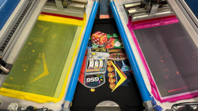
4. Master your grayscale
The beauty of these designs is that the black base influences grayscale art for a big impact. I’ll advise screen printers to first work on their underbase skills and then grayscale. Then work into full color. You can add in metallic and glitter inks, which pop with high contrast against a black shirt.
5. If you control the screen, then you control the process
So many of us become magicians at the press. We pull the squeegee sideways to make a job work, and so we can ship it out. When it’s time for a reorder, it’s tough to match what we did originally. One thing that all the best printers have in common is that we make great screens. While we use different tensions or line frequencies, our screens meet the expectations we have for our designs.
6. Try the print-flash-print technique
Try this method when you want to print white as a single vibrant color on a dark garment. (I’d only recommend this technique for 144 pieces or less on an automatic.) This process allows the second layer of ink to sit on top of the first layer to stand out better. The registration will be perfect, unlike when you have to chase around two whites when variables like mesh tension are off. The only time you’d try this technique on a manual might be when you have fine detail on one mesh and the base on a lower mesh. We call that splitting screens, where you put detail on a higher mesh count and opacity on a lower mesh count.
7. Learn to master the whole printing process
Then, you can learn to manipulate it. There are millions of variables in screen printing, and you’ll never control all of them. That’s why you need a handle on the basic process so you can move in different directions.
There’s also a balance between science and art in our business. You need to know your squeegee pressure, your tension, and your speed. You measure and control those variables. Once you know how to control your more measurable variables, you can work on the creative portion.
When I work with screen printers, I take the trepidation out of printing on black T-shirts. With today’s software and equipment, you can learn 70% of what you need to know in a weekend. As I’ve explained, it’s getting control of more and more of the process and learning how to handle variables.
But don’t ever pigeonhole yourself into a place where you say, “We only use this tension or this mesh count for this type of artwork.” Don’t take the creativity out of this process because that’s where the real magic happens.
For more information, be sure to visit Board of Decorators, created by Gildan to be a resource that provides invaluable business-related insight through thought-provoking, inspiring and educational content created for decorators by decorators.