Ever wonder why your color looks so different on screen than when you sublimate? Think about the last time you noticed TV screens on sale at your local retailer — did they all look the same? Probably not, since resolution, brightness, clarity, and other factors vary by model. When comparing your monitor colors to those on your sublimated product, there are many reasons why colors are dramatically different.
Color and sublimation
Let’s talk about how color works when sublimating. When you prepare an image to sublimate, you use RGB color mode (red, green, blue) to print with CMYK inks (cyan, magenta, yellow, black). Your monitor displays in RGB, but the color gamut (array) you can see on the monitor is limited. When printing, your settings determine what color formulas are used in RGB mode to work with your CMYK printer to produce color. Your printer’s dye-sublimation inks also have a wider gamut of colors they can print, opposed to what the eye can see on screen. Sound confusing? Don’t worry! Assuming other ingredient factors like your printer, inks, sublimation paper, design software, and press aren’t the culprits for your color being off, consider color management software with profiles that can dramatically improve your sublimation printing results.
Color management software
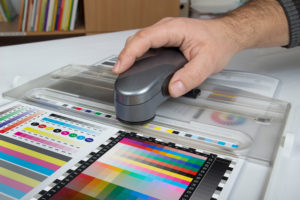
Color management software is an essential component of sublimation printing. It acts as a translator for how the dots in images on your computer print, using certain inks and paper on a particular substrate. Common terms referring to color management are “ICC profile” and “imaging configurations,” depending on the software you use. A color profile works with the software to produce the best results for your printed substrate, helping you match colors to create rich and vibrant products. It’s like having that perfect recipe to bake in some color using your specific ingredients.
Some sublimation printers have print management and color profiles built-in and use their own branded sublimation ink sets. If you have this type of printer and you’re matching a logo’s Pantone color, for example, you can select the substrate, use the color formula for your logo, print, then sublimate the product to get a match. Other printers work well with color management software that can be purchased from vendors like Wasatch and Ergosoft. Both have specific profiles that work with different substrates.
For better color results and matching, I recommend the following items:
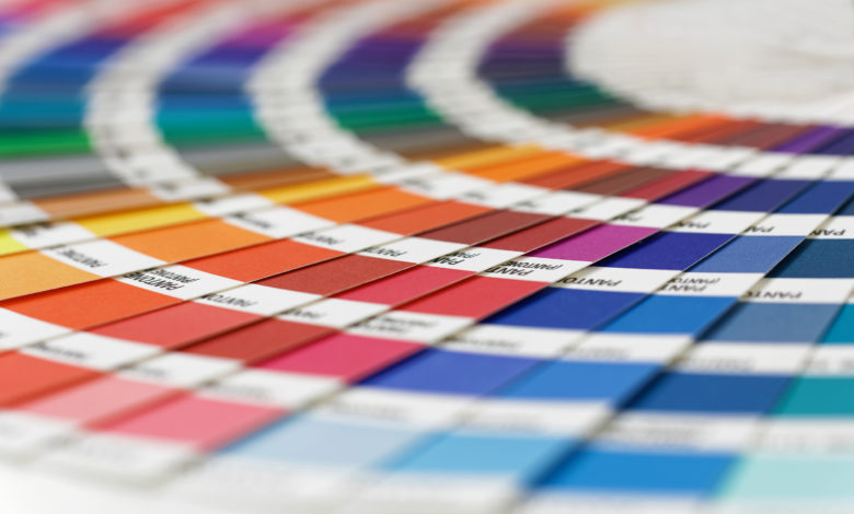
- Printed color reference charts so you can match specific RGB values with Pantone colors
- Color management software
- The right color profile for your substrate, inks, and paper
- Sublimated samples on the substrate you’re using to optimize your color
If you still experience color issues, reach out to your distributor and ask what color software and profiles are available depending on what you’re sublimating. Starttosublimate.com has downloadable color profiles and information for Unisub and ChromaLuxe hard surface substrates.
Learn more: Tips for Troubleshooting Color-Matching Challenges in Sublimation


