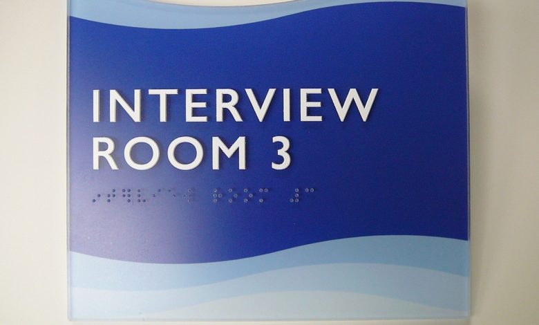
I recommend the use of the California standard font, even if you are not in California, that way your signs are legal everywhere, and California spacing is easier for beginning Braille readers, as well as for people with diabetic neuropathy.
In 2010, the federal government adopted the revised signage rules we wrote back in 1998, so be sure that your fonts and spacing comply if you want your signs to be readable. For raised characters, you must use sans serif fonts, all uppercase, and make sure to maintain at least 1/8-inch space between the closest sections of any two characters. You can read about the rules and watch an “animation” on signs on the government website, www.access-board.gov.