Printing vehicle graphics is as easy as just hitting the print button, right? Don’t we wish? If you’re just getting started in the vehicle wrap industry, there are some things you should know about color management.
Color management and your monitor
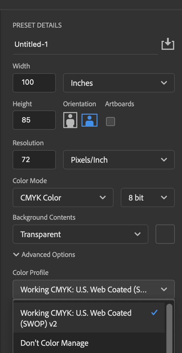
What is color management? Glad you asked. I’m no color expert, so I’ll be using lamens terms and keeping this straightforward — far from an in-depth look.
To start, you want to ensure that your monitors (each one used for design through to production) are calibrated the same way. All monitors and graphics cards are not created equal.
You must be sure your screens all match; otherwise, a gray may look green on one screen versus another. However, sometimes the color differences are so minimal on-screen that you don’t notice until it’s printed, and you wonder, “What in the world is going on here?” You can purchase a calibration tool on Amazon for under $200.
Once your monitors have been calibrated, be sure you’re using the proper profile in your Adobe products. You also want to be sure you’re using CMYK for most of your design/production files.
It is much easier to color match using four colors than millions of colors in the RGB spectrum, especially when printing for fleet accounts.
This means starting with the designer, choosing the proper profile (once set, it should go to default), converting any files to CMYK, then saving them for production once designed.
Color management in the production room
Now, moving into the production room. The production person running the RIP software should also have their monitor using the same profile calibration and opening the files in the RIP and ensuring they are CMYK.
If there is a color sample to match, then a sample should be printed at this time for comparison. We like to run multiple samples with slight percentage variations if we’re trying to “hit” a certain CMYK color.
Note: We do not guarantee PMS color matches. The only guarantees we make are within 5% of any CMYK color.
As I’m sure you already know, choosing the proper printer/production profile for whatever material you’re printing on is also extremely important. I won’t be going into detail on this step as there are many different materials, RIP software, etc., to choose from.
Just be certain when you’re printing for fleet accounts, you are always using the same profiles on the same materials. You should also note the inside and outside room temperatures and humidity, which will always affect your print outputs.
Color matching for vehicle graphics
Now when it comes to the actual “matching” of colors, as noted above, we like to print off several colors in whatever color range we’re looking to have matched.
If we’re trying to match a yellow with CMYK values of 9, 0, 100, and 0 (we don’t know that yet), we’ll start with a base yellow color we think might be the closest. Then, go left and right from them (meaning slight percentage changes up, then down) using small 2” squares.
Once printed, we have a starting point to compare to. We’ll run those samples, laminate them and compare them to the actual color sample we have.
Pro tip: You must laminate your sample prints as the lamination will alter the printed color considerably, depending on what film you’re printing on. Also, depending on the laminate, it sometimes will add a slightly “yellowish” tone. So you must account for this when setting up your colors.
This step will usually take some time and a bit of material to ensure you nail the right color.
Pro tip: Take the printed and laminated sample outside in the daylight. Since the color will always be seen outside (presuming you’re printing vehicle graphics), it’s super important to compare in the proper environment. Relying solely on the lighting in your print room is never a good idea.
If you have a 3M Sun Lamp, you could use that to get started, but nothing replaces the sun’s natural light for optimal results.
