Easy-to-Read ADA Signage
Understand how visual and tactile needs differ
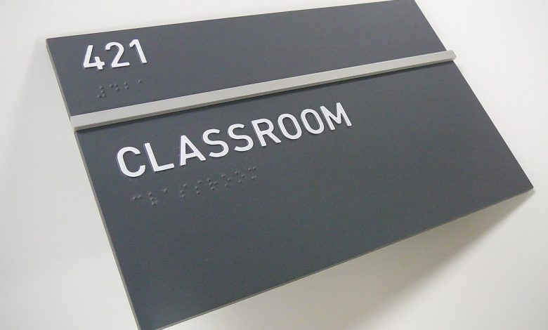
When creating ADA signage, it’s important to understand how the needs of tactile and visual readers differ. You can check it out yourself by testing out some tactile signs text the next time you are in a public space with ADA signs. The easiest raised characters to read have a beveled or rounded profile and are clearly separated from each other. The base of the character that is adhered to the sign plaque or molded from the plaque is wider than the top surface of the character so there is a clear profile.
Keep reading: Finish Standards for ADA Signage