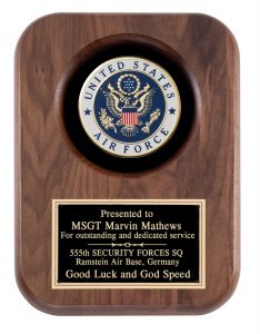
Design Your Plaques with the Message in Mind
It may prove beneficial to have a basic understanding of typography

A company decides what words they want to have included on a plaque, and it’s your job to decide where to put them on it; how big to make them; what they should look like (font choice); what color they should be; whether to capitalize, italicize, or make them heavy or light; and on and on. Your job is not to have the viewer say, “Look at those nifty letters on that plaque,” but rather to admire the great work that the named employee did at their job.
When all the choices you have to make are done well, the message gets delivered. Our job as designers is to communicate through this complex interaction between words and images. Typography is the skill that needs to be developed in order to draw viewers in and have the message read and understood. Images provide us with another means of communication, and when words and images are combined, the possibilities for sharing ideas are endless.