Consider the Meaning Behind These 8 Colors When Crafting Designs
Psychology plays a huge role into how people (and customers) view and react to different colors.
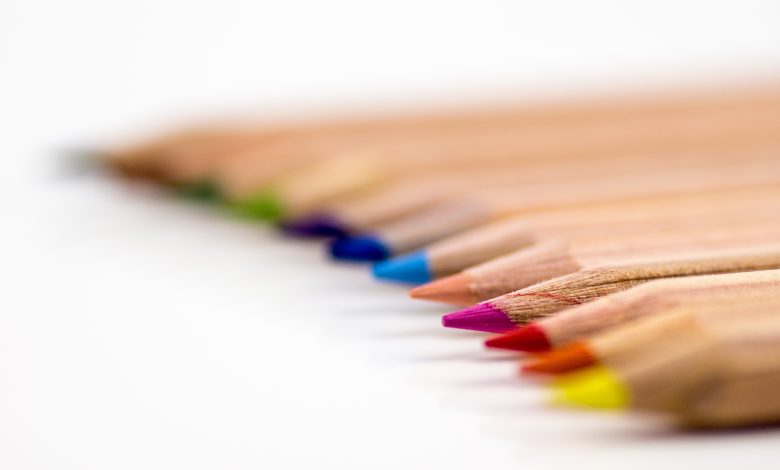
Psychology plays a huge role into how people (and customers) view and react to different colors. Every person may have a different response to certain colors based on their own memories or personal experiences, therefore it’s important to be aware of the significance of certain colors when designing a logo or product for not only your business, but also your customer. Here are some of the emotional responses a person may have when looking at a certain color:
- Red often relays warmth, love, and strength.
- Blue can symbolize professionalism, loyalty, and stability.
- Yellow evokes a feeling of comfort, happiness, and intellect.
- Black often conveys sophistication, power, and elegance.
- White illustrates purity, peace, and cleanliness.
- Green suggests durability, safety and honesty.
- Purple signifies power, luxury, and elegance.
- Orange evokes responses of cheerfulness, enthusiasm, and affordability.
Some things to keep in mind when creating any designs and considering which colors to use: what messages do you want to portray about your company, and what does your company stand for? What emotional response or message is your customer seeking to evoke or reflect in the product? Once you can answer these questions, it will become easier to craft designs that match your values and brand image, as well as your customer’s needs with a well-planned and perceptive design.