Have you ever passed by a banner and had no idea what it was advertising? It doesn’t matter if a banner features beautiful graphics, eye-catching colors, and clever slogans; if the audience doesn’t know what to do with what they see, it’s a moot point.
Of course, the opposite can also be true. A banner with a clear written message but is all text with little to no graphics will not grab the audience’s attention. Generally speaking, following the “keep it simple” rule is good practice, but if the banner is too simple, it becomes ineffective. So, how do you design an attention-grabbing banner that accomplishes what you want it to do? Here are some useful tips.
Before you start designing your banner, try to answer a few basic questions about the application:
- Where will this banner be viewed from – indoors, outdoors, at a distance, up close, from a moving vehicle?
- What size should the banner be?
- How long will this banner be displayed?
- Will it be reused?
Once you have the application questions answered, then answer some questions about the design:
- Who is your target audience? Youth or adults? Professionals or retirees?
- What is your message?
- What is the call to action?
- Are there specific branding elements and/or color schemes that you should incorporate?
- Will the banner be reused?
First, let’s unwrap the application questions and discuss why they are being asked.
Banner applications
Why is the location of the banner important?
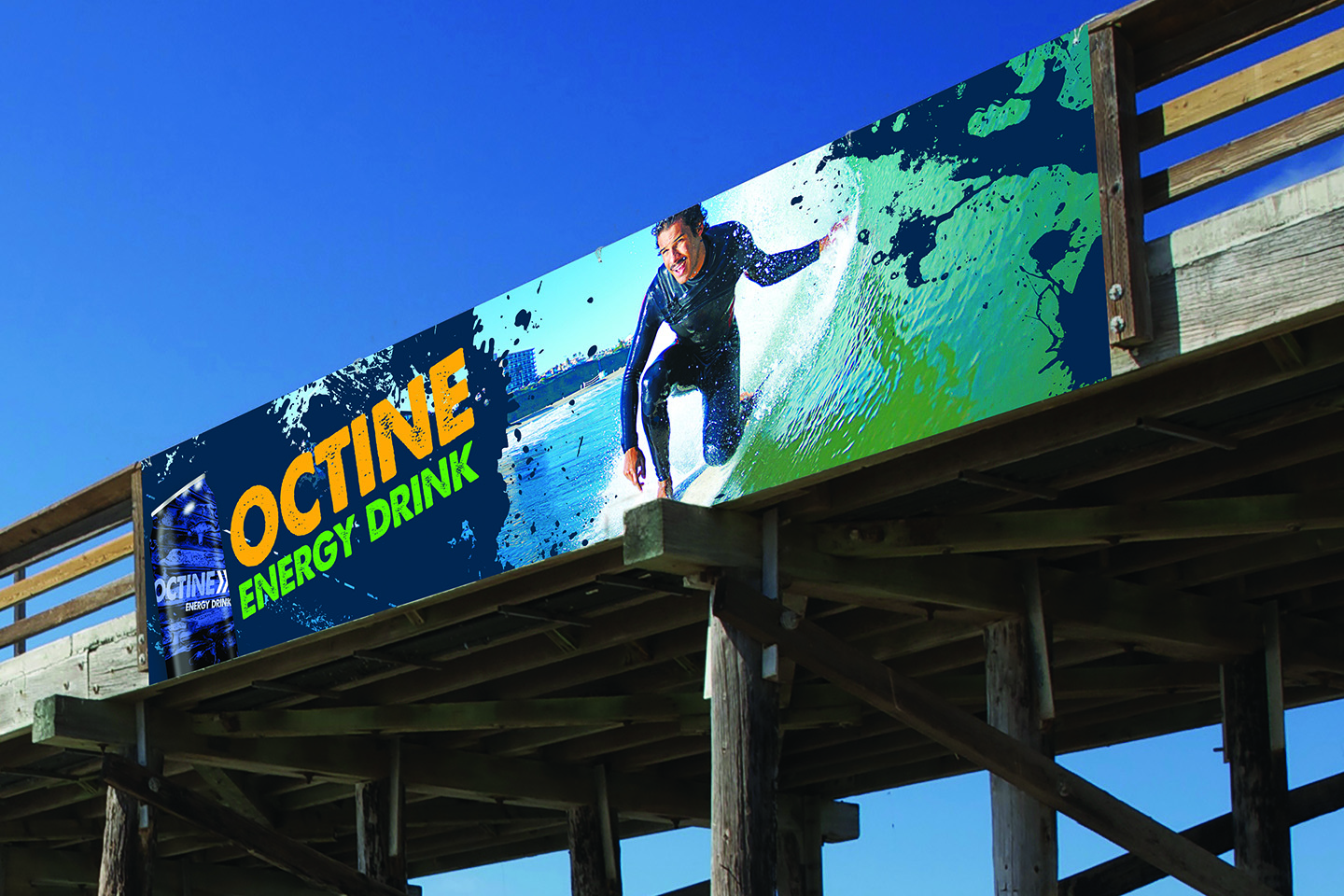
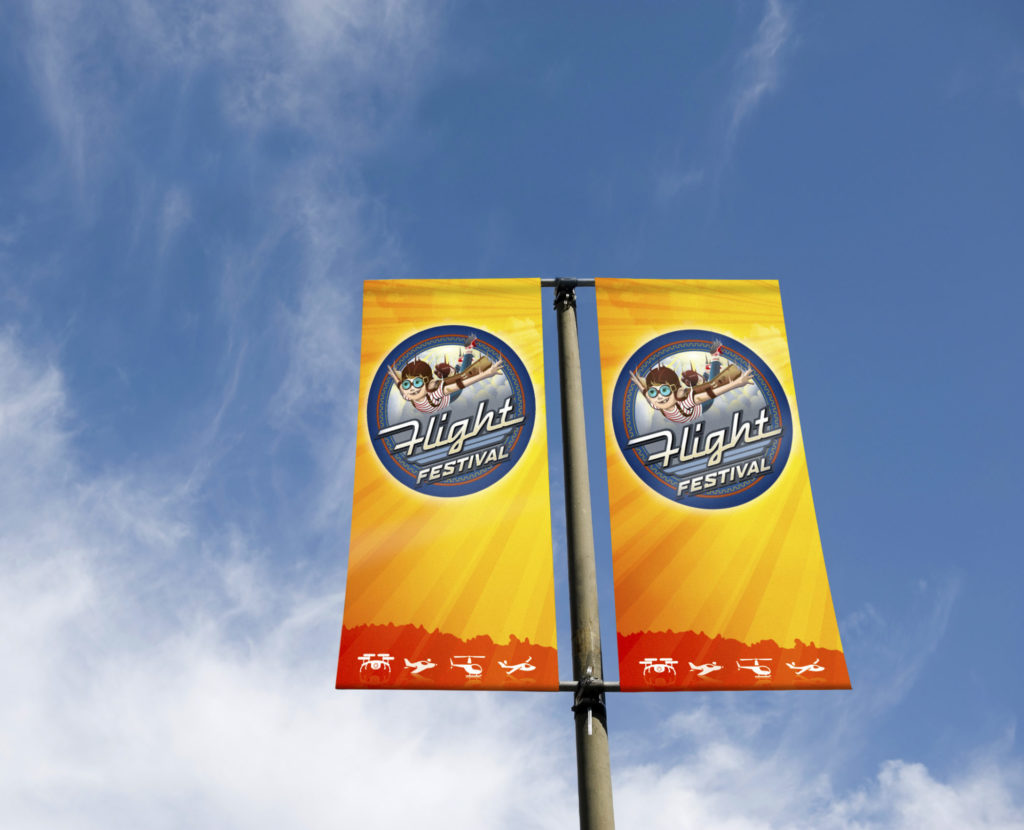
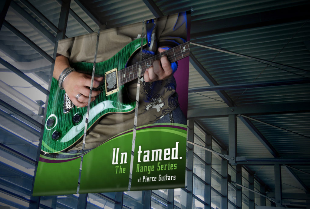
This affects both the design and banner media selection. There are quite a few banner media available to choose from, ranging from traditional PVC banners to paper banners to fabric/soft signage. For example, an indoor banner designed to be viewed up close may require a higher quality, super-smooth PVC or fabric banner. These types of banners can also add a certain upscale look and feel to the surrounding environment. When it comes to the actual graphic design, you can incorporate specific details and effects, or use certain fonts and font sizes, to achieve the desired appearance. However, keep in mind that it’s still best to keep things simple and stick with no more than two different fonts and sizes.
However, these same design elements are not the best if the banner will be viewed at a distance or from a moving vehicle. There is a short window of opportunity for an audience to view the banner in these situations, so the message must be clear and easy to read. Also, an outdoor banner or a pole banner will require heavier material to stand up to the elements. The last thing you want is to use the wrong type of media that can be easily destroyed by the environment. The location of your banner will also help you choose the correct banner size. Sizes will vary, but choosing something too large or too small for the space can potentially make your banner an eyesore. Also, just because you’ve decided to go with a bigger banner doesn’t necessarily mean you should add more text and graphics. Remember, the design must always have a purpose – a clear message and a clear call to action.
Why do you need to know how long the banner will be displayed?
This will affect banner choice. Short-term banners can be low-cost banners, while long-term or reusable banners should be higher-quality banners. Also, if the banner will be reused, keep in mind that it’s best to choose media that can be easily stored and “refreshed.”
Design aspects of a banner
Who are you trying to reach, and what response does your customer want?
As previously mentioned (and it’s worth repeating), keep the design simple. However, a simple banner can still be pleasing to the eyes and appropriate for the target audience. The banner must resonate with those you are trying to reach, so choosing the appropriate image(s) and the right words is imperative. Don’t overload your banner with too much information and text that can cause confusion. The focal point should be a message with a clear call to action that creates a sense of urgency, combined with graphics that help attract attention.
 Examples of clear and precise calls to action include:
- Donate here
- Come inside and SAVE!
- Call us now at 555-555-5555
- Volunteer with us today
- Sale on NOW!
- Enroll here
- Talk to us today
Is there branding and/or color schemes that you need to incorporate?
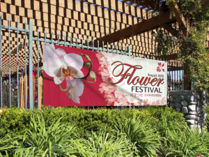
Choose the right color schemes based on the location of the banner. The banner should stand out because the design is eye-catching, not because it’s too busy. Incorporate branding and corporate color schemes as needed. If the banner will go indoors, choose colors and design elements that complement the interior decor.
Will the banner be reused?
If banners are reused, then the message should not include specific dates. You can, however, refer to the season or time of year, like “Summer Cook-Off” or “Winter Festival.” The call to action has to be clear, and the information must be accurate. Reusing a banner can save money, but I generally don’t recommend reusing a banner more than once. It’s always best to change things up and introduce a banner with a fresh new design.
Now take this information and execute effective banners for your customers!