Here are four extremely challenging projects that were each conceived by a graphic designer that expected the final product to match their digital mock-up exactly. I’d like to show how it is possible to take on jobs like these that I call Technical Sign Murals. In each case, there was an implied leap of faith that “a sign painter” would be able to figure out how to accomplish the client’s next-to-impossible design goals. The problem was that none of them fall neatly within the comfort zones of graphic design print artists, traditional paint muralists or your average non-painting sign shop. If I were truly “looking for trouble,” these projects could be considered a grand opportunity.
These were tough projects. One should think twice about how to proceed if they thought this is what they wanted to do for a living. I learned a few things in the process: First: the artist/sign painter etc. has to get along with the designer, and really believe in their project. Second: the final product has to stand alone as “perfect.” The resulting masterpiece has to look “just right” without any caveats or excuses that imply that a different artisan with a different skill set should have been chosen for the project. Third but not least: Lobby, plead, whine and educate the designer so that they can have some mercy and begin to understand that there are limits to what can be done by any analog artist.
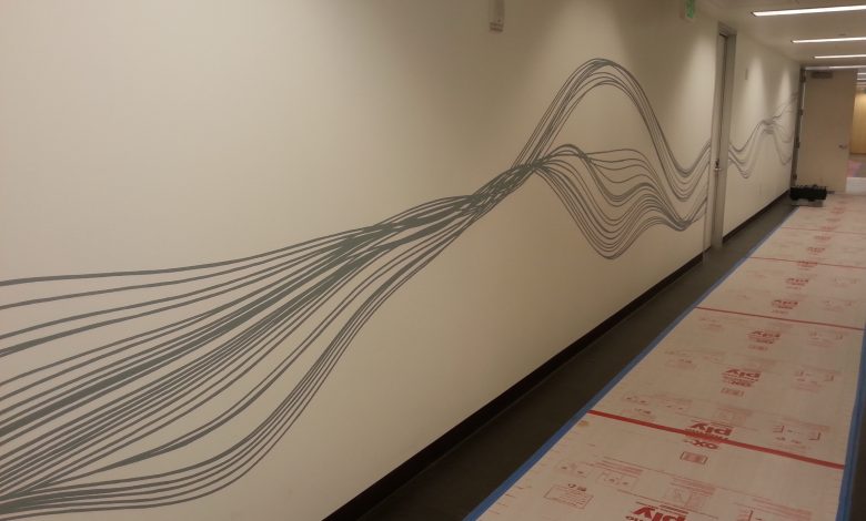
Silk thread mural
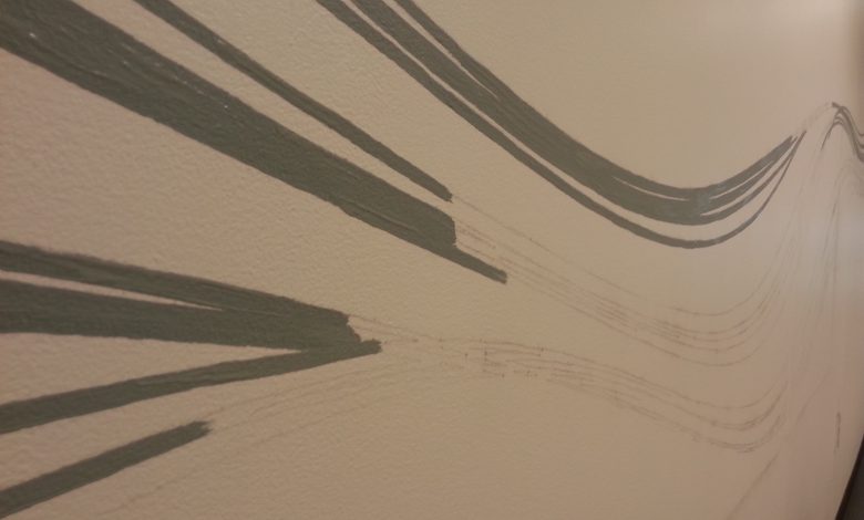
The wavy lines represent silk threads that are created via a bio-tech breakthrough that involves manufacturing real silk threads without the worms! There were four of these walls that added up to painting thousands of linear feet of very exact thin lines. The designer specified that they had to be done with great consistency and grace using a matte PMS color. Sound fun? It would have been nice to do them in 1Shot oil enamel, perhaps with a flattener, but that would have affected the opacity and flow of the paint and likely dripped a lot and required two coats. I first pleaded to change the line width from ~3/16th” to something slightly exceeding ~1/4″ that obviously could still present quite a challenge.
I was able to use flat latex applied with an old ¼” fitch that was so stiff from previous work so that it was more like using a calligraphy pen than a paintbrush. In this way I could press down onto the wall with a consistent thick line stroke that left a tight mark without dripping. I felt ok for a few thousand feet until I heard that the designer had issues with occasionally spotty opacity, wobbles here and there and even paint ridges that were forming with the thick paint line. Yikes! The pressure could really start to build if I wasn’t able to plead my case for some allowance for the nature of hand work, while also making some adjustments that helped me approach the designer’s standard. I was able to do a bit of double coating, some line-adjusting via “back cutting” with background color and lastly I was able to cut down some paint ridges with a razor blade. It was a character building challenge. If I had to do it again I would have taken more time researching paint mixtures, flow additives and different compatible brushes to see what could have made the work a bit cleaner.
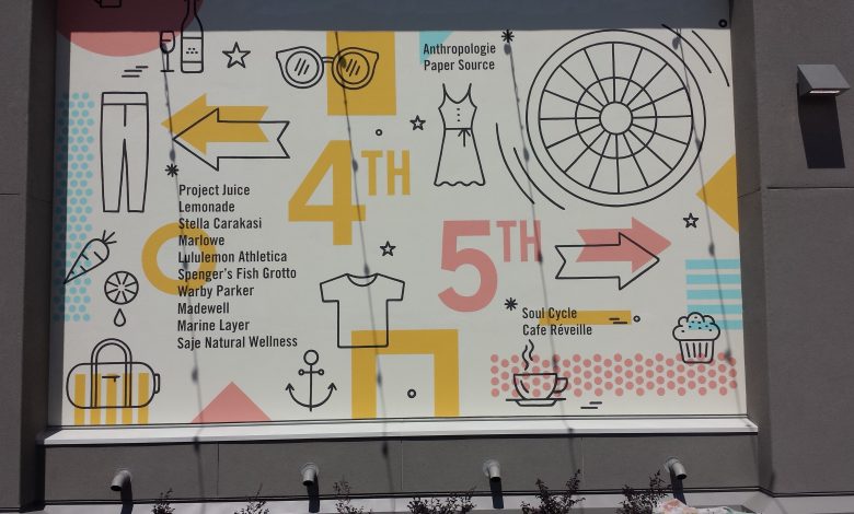
4th St mural
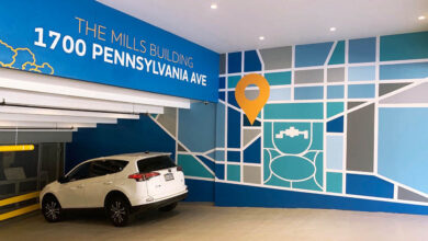
The designer sent me the complicated vector file as a huge collage. If you stop reading now and reflect on how you would organize this project you might get a sense of the many options and head-scratching, round-about thoughts that are unavoidable on a huge “coloring-book” project like this. I decided to plot the entire design onto 28″ horizontal strips that would fit on my plotter. I like to break up the tiles myself with the cleaver tool rather than let the sign software overlap the tiles automatically so that I always know how the artwork overlaps and registers. For the graphic shapes I pounced everything for hand painting. As for the text blocks, which could have been very time-consuming and very difficult to do exactly, I built guidelines into my pounce pattern so I could position multiple paint masks.
Tips for doing for making my paint mask system go smoothly.
1. Use a high-tack paint mask such as Platinum/Hexis Labrican.
2. Gain control of the background color by painting it yourself or acquiring the actual wall paint used in a fairly recent (non-faded or chalking) paint job. A clear-coat can also be used as a pre-bleed if necessary.
3. Pre-bleed the mask by painting over the whole stencil with background color. Two coats of pre-bleed are almost always better than just one.
4. Roll on two coats of letter color. It is ok to put up to 4 coats of latex over the mask in rapid succession but the crucial step is to wait a good while after the last coat before peeling it up. With oil enamel on glass you want to peel up the mask right away or it will tear. It is the opposite with latex; it takes a while for the individual layers to stick to each other so you can yank on the mask. Do not use a strong bonding primer for the bleed-coat because it can stick to the mask and likely not peel cleanly.
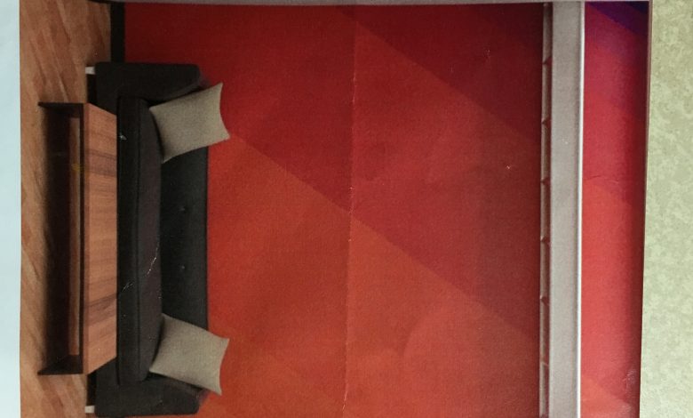
XYZ agency
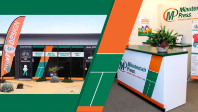
It would be tough to overestimate the challenge of generating nine matching logo colors to their paint equivalents in the lobby of a world-class design firm, but gosh, that is what I had to do. The reality is that designers are not always responsible for determining color tagging for every application. In this case, paint usage and spot Pantone equivalents did not fall within the job description of this in house project. XYZ designers routinely select exact colors for major international brands; but strictly for printing (using CMYK ink in millions of colors) and for the web (using millions of colors built with monitor light). It was my job to closely match their 9 colors with paint pigments that have a completely different purpose from the digital applications. The first part of the project was small, so I matched the nine colors with six acrylic paint colors. Once the logo was completed the client told me they wanted the same color stripes blown up large on the opposite wall. To adapt to these realities I used colors from a house paint pallet because they come in large quantities and they can be purchased in a uniform sheen. For reference, I had my original print-out but they also set me up with headgear and digital-gloves so I could see the design in their state-of-the-art virtual 3D rendering studio! Now wasn’t that some science fiction stuff! I would say that goes beyond the province of “looking for trouble” into the realm of Looking to be Committed.
Tips for matching colors by eye.
1. It’s great if the client can provide specific PMS color numbers that can be a helpful bridge for determining paint matches with 1Shot, for example. In any case some hints are called for, so if they don’t have the numbers then have them print out an approved proof and get them to validate the color “intention.”
2. Trust your eye. There are only so many paint pigment types out there that are suitable for paint mixing. Look very closely at the types of pre-mixed paints that can be a starting point. In this case I had to scrutinize the possibilities for magenta and purple acrylic paint that were available. It can be anybody’s guess how to intermix the colors that fell between magenta and dark red. You just have to accept that a .400 batting average is considered great, and have faith that you can hit on something close enough to be acceptable.
3. I didn’t try to buy every color. I bought a limited number of unique paint colors that I could intermix to create bridged blends
4. Keeping track of this many colors can get very confusing. Do wet-on-wet tests by dripping one mixed color directly into another to see the contrast. If you can’t see the difference that is as close as you’re going to get.
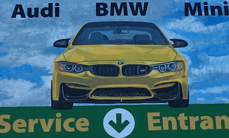
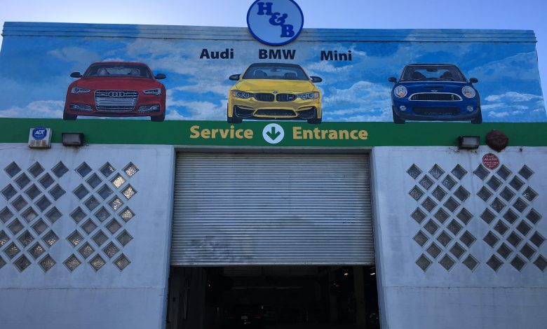
H&B car mural
This incredibly challenging project sheds light on the possible gap between vector-oriented “sign painting” techniques and “mural painting” which is closer to studio oil painting. I asked the designer to generate high-resolution proofs that could be used to convert some of the art into a vector form via an overhead projector. At some point something similar has to happen before a studio painting is started. The artist has to break down the vision into a line form no matter what. Once the main elements of the art were transferred as lines to the wall, the more cloudy details and subtle shading had to be done by eye similar to creating a painted portrait.
