Placket shirts are one of the most common staples for any embroiderer. Whether it’s the standard polo or a long-sleeve button-up, these tips will help you avoid hang-ups when stitching logos on these ubiquitous selections.
1. Placement
The temptation many decorators face, particularly if they are establishing placement without the aid of a guided hooping station, is to lay the shirt flat and establish the horizontal placement by centering the hoop between the placket edge and the side seam. This two-dimensional perfection will often make the logo look very off-center once the piece is inhabited by a very three-dimensional person. Though there is a range of measurements you’ll see touted in guides, the one constant is that the center of your logo should align with the spot where the collar seam meets the shoulder seam. Once you have that, the vertical placement is usually 6.5-7.5″ down from the shoulder seam. I prefer a slightly higher placement, and whenever I’ve been without a means of measuring and stuck hooping manually on a flat table, I will usually align the logo around the vertical center of the curved seam where the sleeve is inset. When in doubt, mark your center without hooping, place a shirt on an adequately sized person or mannequin, and give it a look. This can help you establish the proper positioning.
Bonus Tip: To check your hooping for alignment to the garment construction, grab the points where the shoulder seams meet the top of the armhole seams between your thumb and forefinger on either side of the shirt and hold it in front of you at arm’s length. It’s not a perfect judge of construction, but it gives you an idea of how the shirt will naturally hang and a line between these two points by which to judge your alignment to the garment.
2. Pocket Problems
Many placket shirts will force you to embroider above a pocket. When doing so, the age-old question is, “Do I make sure the hoop is level to the shirt seams, or should I align the logo to the top of the pocket?” In my opinion, you should align the logo to the pocket unless the pocket is somehow deliberately angled and/or so poorly aligned to the shirt that it would look extremely slanted when worn.
3. Stable, not Stiff
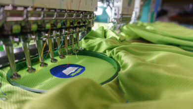
Placket shirts are often made of thin materials, no matter if you have a performance polo or a breezy business-casual button-down. The last thing you want is a large, heavy design area to distort and drag down the garment. When stitching on thin materials, use only the amount of stabilizer necessary to get a good result. With careful hooping and digitizing that is meant for light materials, having structural underlay and the least amount of density necessary to get complete coverage, you should likely never need more than a single sheet of medium cutaway for almost any design. Thinner and more dimensionally solid stabilizers like no-show mesh or performance wear-specific stabilizers offer a lighter, more flexible hand while avoiding distortion. Adjust your hoop tension, don’t overstretch or under secure the garment, and use the lightest stabilizer you can. Be careful when cutting away excess stabilizer, and don’t leave a rough square of stabilizer behind. Cut it away in a more organic shape that follows the logo to avoid the dreaded visible stabilizer line when the garment is worn.