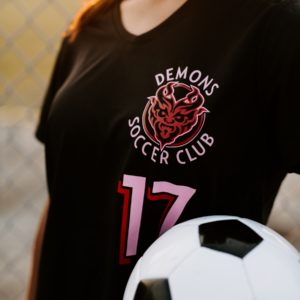
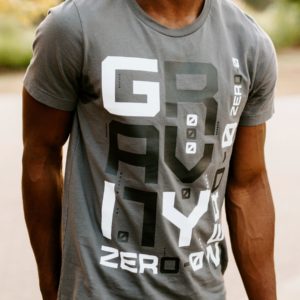
Learn tips and tricks for creating effective artwork designs for screen printed heat transfers.

Count your colors
Traditional spot color screen printed heat transfers will become more costly as you add more colors to your design because each color in your artwork will require an additional screen. Keep this in mind when you create your artwork.
Limiting the number of colors in your design will keep your costs down and your profits up.
Line weight matters
You’ll want to be sure all of your line weights meet your supplier’s minimum requirements for a successful print. Each transfer supplier will have their own set of artwork requirements when it comes to minimum line weight. If the information isn’t readily available on their website, ask your sales rep for guidelines.

Knock it out
Another trick to keeping costs down while making a big impact is strategically using the shirt color in your design. Use areas of “knockout” to add dimension.
When done right, this can make a simple two-color design appear more like a three-color design. Again, you’ll want to check your supplier’s art requirements for minimum gaps allowed for successful printing.
Gap it, trap it, or back it up
Talk with your transfer supplier about how they prefer you to set up your multi-color artwork. The better understanding you have of their process, the better your end product will turn out. Some main setup methods are: gapping, trapping, and backing up.

Gapping means no two ink colors are touching. There is shirt or knockout area in-between the colors.
Trapping is a technique used to compensate for any possible misregistration. Essentially, one color will overlap another color.
A backup is used primarily for a screen printed transfer with powder adhesive to ensure the entire design is backed. This is when one color is backing the whole design.
Consider your kerning
Kerning is a typography term for adjusting the space between characters in a proportional font to make them visually correct. Not all fonts (especially those free ones!) will look visually pleasing as typed. You may need to adjust your kerning to account for extra spacing needed between specific letters.

Utilize halftones
A favorite trick for creating the illusion of a multi-color design while keeping costs down is to utilize halftones.
In your artwork, use a tint or transparency to represent a specific percentage of a color. You can even use multiple percentages or a gradient effect. These percentages will be converted to a series of variously sized dots of ink during the production process. The size of the dot will depend on the percentage of color depicted in your art file.


