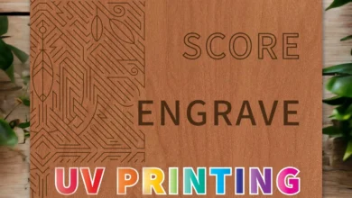
When creating a sign for yourself or your customer, keep these tips in mind:
- Have a clear message. Make sure you let your customer know what you do. Adding descriptive words under a logo or name can help with this. For example, if a company’s name is John’s Laser Engraving, you might want to include words underneath like “Personal & Promotional Gifts.” This gives the customer more information and a better idea of what the company does.
- Choose a legible font style. When it comes to fonts, there are a lot of options. You might find a unique font that you love, but legibility is key. If the sign cannot be read at a glance, it becomes essentially ineffective. The number of fonts in a sign should be limited as well. Too many variations of fonts in a sign can create clutter and confusion. Try staying within the two-font range.
- Color combinations go a long way when trying to make a sign stand out. Try using colors that contrast each other. There is actually a color science when it comes to color combinations and why certain colors look good next to another. To make it simple, I like to reference sports teams and the color combinations they choose for their franchise brand. You can use this as a kind of mental color pallet of combinations.


