7 Design Tips for Text
Here are some guidelines that will provide a solid foundation to get started on working with text

Working with text can seem like a daunting task for those that aren’t designers. Here are some guidelines that will provide a solid foundation to get started.
The message
With all the options out there, it can be overwhelming to choose the right fonts for your design. The easiest way to start narrowing down font options is by asking, “What am I trying to say”? This allows you to choose fonts that match the personality of your design. Are you trying to convey whimsy, a vintage feel, or professionalism? Identifying the purpose of your design will guide you in selecting a font that will send the right message.
Inspiration
Once you know what your message is, it’s easier to find inspiration for your design. Use Google, Pinterest, or design blogs to get inspiration from current trends, fonts, and color combinations. Don’t limit yourself to the online world. There are compelling graphics all around that you can draw inspiration from.

Font pairing
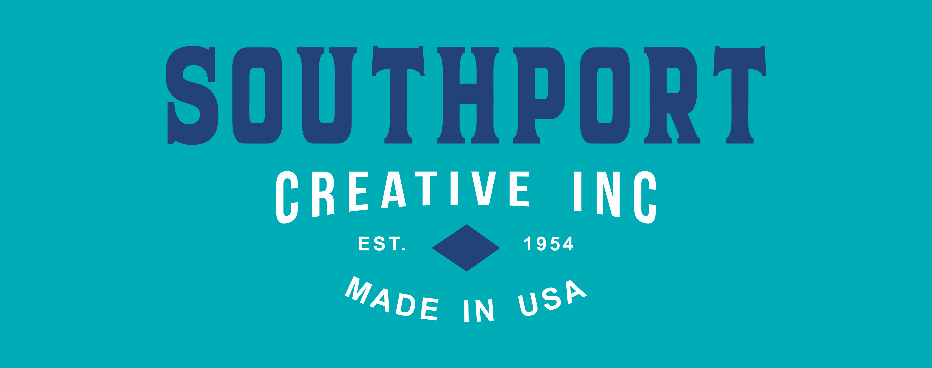
Proper font pairing will help with the readability of your design. You want to use fonts that complement each other. Creating contrast will give your design visual interest. Some examples would be a Serif and Sans Serif font, a Script and Modern font, or combining a thick font with a thin one.
Visual hierarchy
Visual hierarchy draws the eye to the focus of your design. One way to do this is by having different size text. This will stress the significance of certain lines of text as opposed to others. Hierarchy can also be achieved by adjusting letter spacing, font thickness, and color.

Font limit
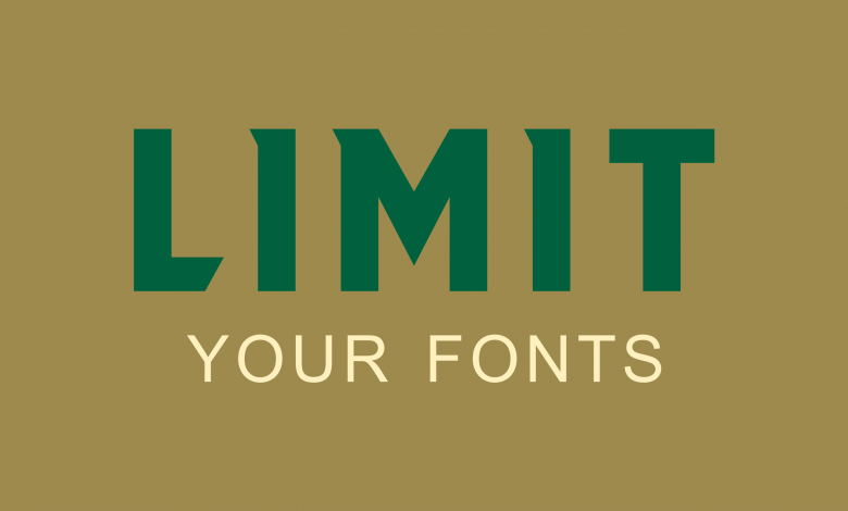
The goal is to create a clean and legible design. Choosing too many fonts will make it harder to convey your message, leaving the design looking muddled. Ideally, you want to choose two fonts; three would be the maximum.

Readability
Make sure people can easily read your message. The text should be large enough so that it’s legible from a distance. When choosing colors, make sure the text will stand out against the background. Capitalization can also affect readability. For example, making a script font in all uppercase will make it very difficult to read.

These guidelines will give you a great foundation to develop your typography skills. With a little bit of practice, these skills will become second nature!