Utilizing Halftones as a Design Element
Push a design in a slightly different direction

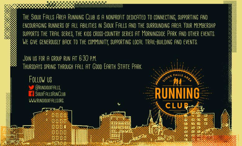
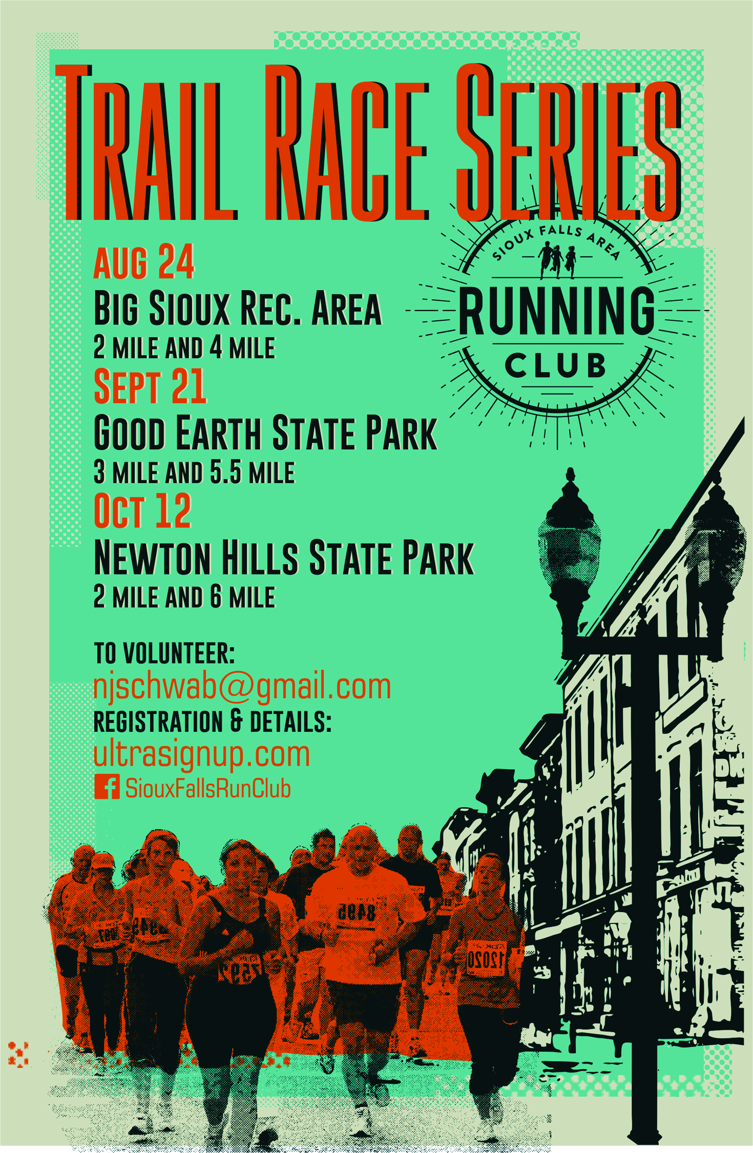
In some designs I have created, halftones have been used purely as a design element. Both images represent two postcard flyer examples I created for a local running club. In these designs, blocks of gray were converted to halftones with various LRI values and then cropped into different rectangle shapes. Placed between the two background colors of the flyers, these shapes acted as transition pieces. Other design elements were also used as halftones with larger dot patterns, such as the cityscape design and the image of the runners.

By pushing a design in a slightly different direction using halftones, the artwork gains a unique look that separates it from other designs.
Learn more about making a halftone image using Corel PHOTO-PAINT.