Featured Project: Egan Sign Chosen by Farm and Home Supply Store for Exterior Signage
Before Egan Sign arrived, this farm and home retail chain's signage was inconsistent across its network of stores.
Wyomissing, Pennsylvania-based Egan Sign, a national sign company specializing in branding and rebranding, was chosen by Moberly, Missouri’s Orscheln Farm & Home as the new supplier for all of its exterior signage.
Orscheln Farm & Home started in 1960 and has grown into a significant-sized retail chain, with more than 160 locations in nine Midwestern states and with plans to open more.
According to Egan Sign, many of the chain’s internal shareholders were not happy with their signage, as it was inconsistent both in design and quality due to the company using multiple vendors and having no set guidelines for design or materials.
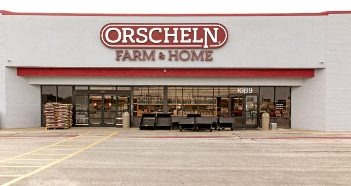
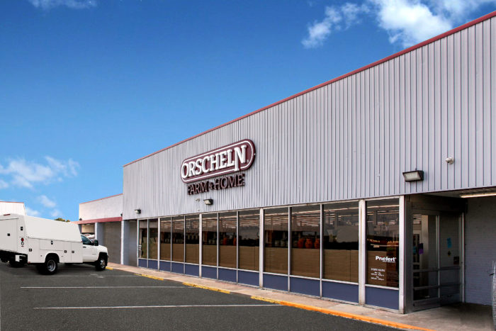
Aside from eliminating the inconsistency, the shareholders also wanted to improve on two things of critical importance: the visibility and readability of the signage. For one thing, many of their locations were set back well away from the nearest roadway. Also, their storefront building materials varied greatly depending on the location. The signs needed to be large enough to be seen and read from the road and have high contrast against the façade-no matter what materials that was made of.
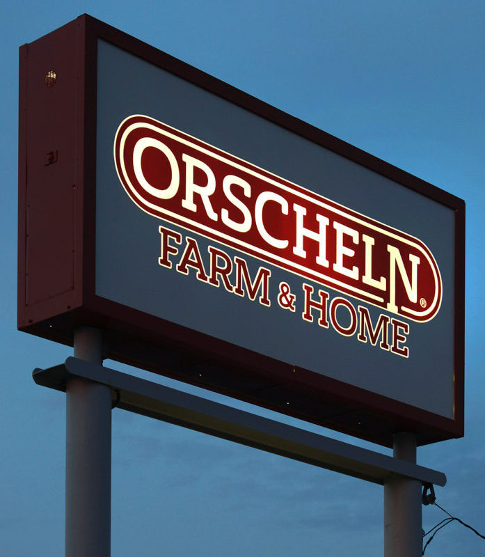
Consistency and quality of lighting was also an issue for the retailer, specifically as it related to the pylon sign design. The company’s pill-shaped logo inside a rectangular sign cabinet resulted in an excessive amount of white space that, when lit, overpowered the logo.
The Orscheln visual merchandising department, led by Amanda Scott and Ron Volske, knew it was time for an upgrade, and contacted Egan Sign, which dispatched a team to see Orscheln that include representatives from its project management, graphic design, engineering, strategic sourcing and account management departments.
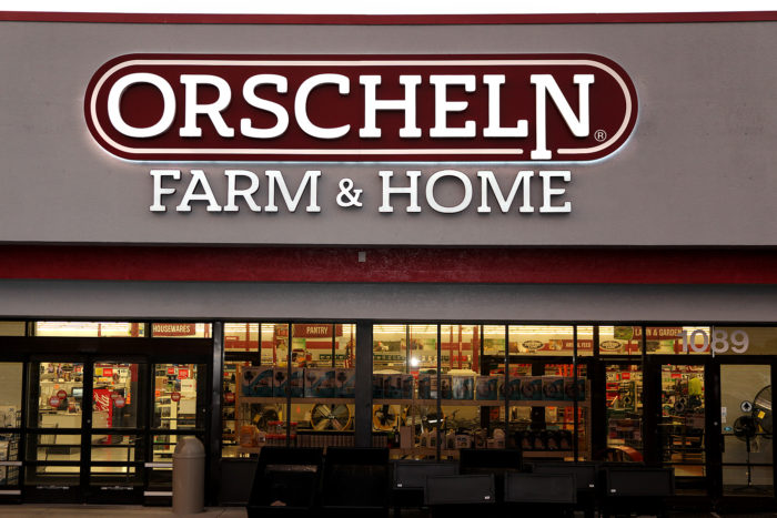
The design package that was decided upon reversed the logo colors to achieve maximum illumination of the company’s logo and also added a contrasting backer to address the various building materials and ensure visibility and readability. To address the white space on the pylon sign, Egan Sign recommended using a blockout vinyl on the second surface of the flex face. This allowed for illumination strictly of the logo area and eliminated the overwhelming amount of white light.
Egan Sign also developed a design control document, which Orscheln had never had before, which outlines approved sign types, materials, colors, sizes, and manufacturing methods.
Egan Sign continues to serve Orscheln with all their ongoing signage needs.


