Indoor Signage Solutions

What is the most efficient, cost-effective way to get visitors entering a building to their desired destinations from a room to the right-wing using the right amount of wayfinding signage?
“Depending on how complex the building is will dictate the type and how much signage is needed when you walk in,” says John Herren, general manager of Arris Sign Systems, a subsidiary company that sells signage and wayfinding systems to other sign companies. “With traffic in the front door and multiple wings, then you would need to have more complex signs in that area because you have more going on in the facility. … The facility would dictate the budget as far as the complexity of it.”
Wayfinding signs also are an important part of building a brand, making the visual appearance of them key, says Cliff Apter, owner of Signarama DTC and DTC Signs & Graphics in Centennial, Colorado. They save time and headaches for visitors, provide them with a more positive experience and add to the story about the place they’re visiting, he says.
“However, the cost of some materials is sometimes more than the budget allows. There are options of using alternative materials but still maintaining a similar appearance,” Apter says.
One of DTC Sign & Graphics clients, a large telecommunications company with multiple offices in the Denver area, wanted brushed silver wayfinding signs but did not have a budget that allowed for thick aluminum. Instead, DTC Sign & Graphics, which focuses on custom, handcrafted signs, built the signs out of black polyvinyl chloride, or PVC, with brushed aluminum faces.
“This provided a very similar appearance but reduced the cost of each sign by approximately 30%, Apter says.
Affordable options
Sign shops can offer companies on a budget several materials and options in wayfinding signage that are affordable and a good value, whether for directional, informational identification or regulatory purposes. The shops likely wouldn’t recommend newer, trendier digital signs that carry a higher price point due to the screens and interior components, though they carry the benefits of flexibility for programming message updates and creating a more interactive experience for visitors.
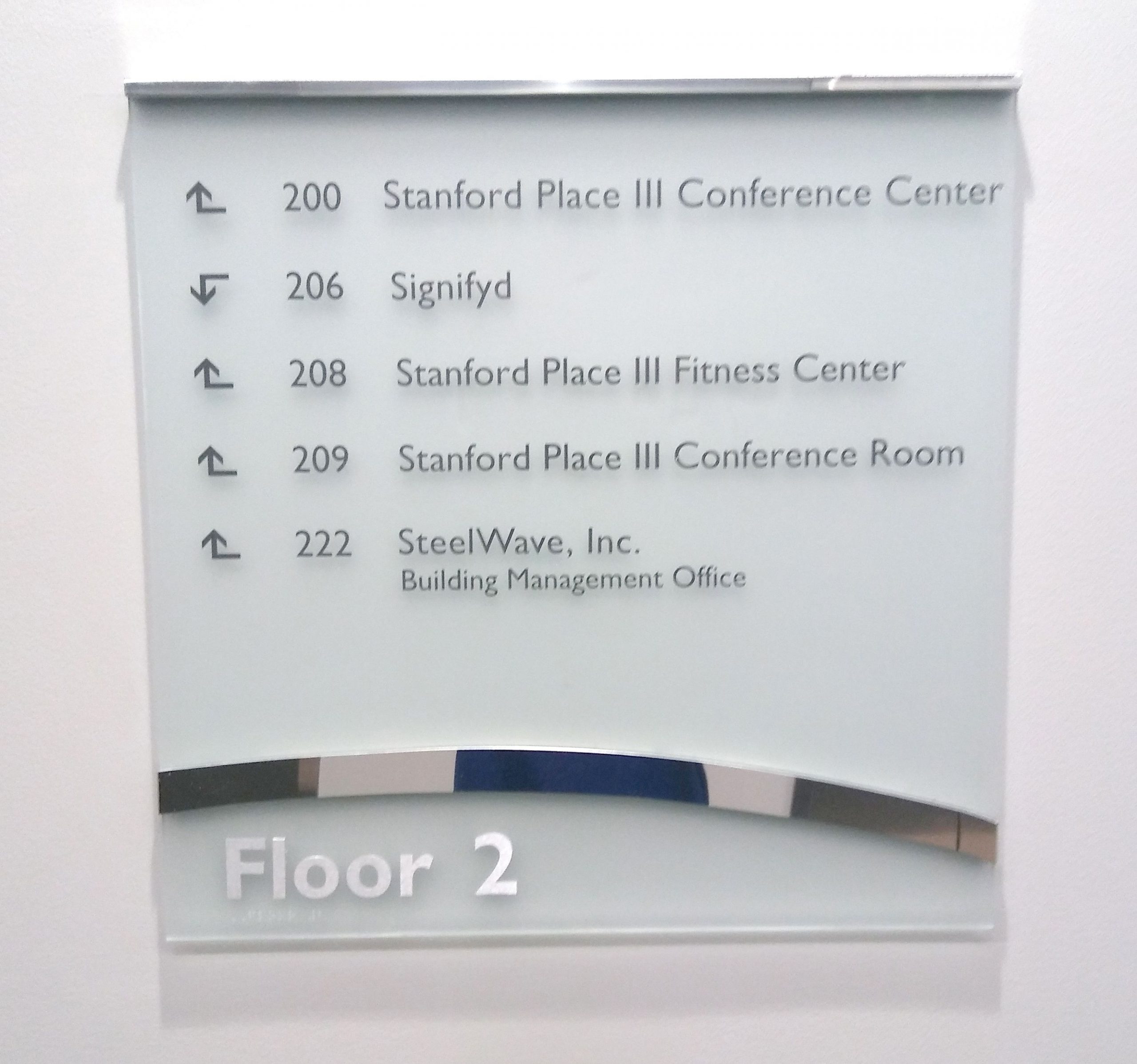
Instead, the shops might opt for traditional or static signs that, as the name suggests, are stationary and simpler to read and quickly get the message. The messages can vary from providing directions to different parts of the building; displaying building directories and personnel and tenant lists of the occupants; marking entrances, rooms and floors; and indicating stairwells, emergency exits, and restrooms.
Static signs work best in areas where key intersections and endpoint locations do not change. The signs also work when the messaging needs to be updated or frequently changed out, such as for personnel and tenant moves and various events in a room throughout the day or week. To do this, the sign would need to be replaced in its entirety or the message manually replaced each time on interchangeable materials such as vinyl graphic or paper inserts.

“When you say affordable, you have to take into account the use of it,” says Alon Bar, chief executive officer of Vista System LLC, a manufacturer of wayfinding signs and aluminum sign frames based in Sarasota, Florida. “Is this sign going to stay unchanged, or will the content be subject to frequent changes?”
Directories often have changes in the content, while signs at schools and office buildings might be changed less frequently, Bar says.
“In these cases, you want to have a frame and an insert that you can easily change,” Bar says. “Although the frame might be more expensive than a plaque sign, the first time you change the insert makes it worth it. … If the content will not change (restroom signs for example), acrylic signs will be easy to secure and a lower cost to the customer.”
The signs end up having different price points based, in part, on the material used to create them. They primarily are made out of aluminum, plastic and wood, from hardwood to plywood, covered in laminate. Other metals can include acrylic, vinyl, stainless steel, zinc and brass and manmade materials such as avonite and nevamar.
Going with acrylic
The material options are many, but Howard Industries, a wholesale architectural signage manufacturer, recommends acrylic signage as the most affordable for interior uses.
“Acrylic is attractive, affordable, high-quality and easy to maintain,” says Jeffrey Stewart, vice president of sales for Howard Industries. “Acrylic is a relatively affordable material that can be finished for the high-quality look (and) presents a remarkably professional appearance.”
Acrylic has other advantages, such as being versatile for custom shapes, polished edges, and accenting with custom colors or mountings to match a corporate brand, Stewart says. It’s also lightweight and durable for indoor signage and can be adapted for Americans With Disabilities Act or ADA-compliant designs, he says.
“The benefits of acrylic signage are their ease of installation, durability, sleek appearance, vast functionality, and professional impact on building décor,” says Stewart. “Acrylic signage can be customized to fit any situation or business need. The only drawback would be the inability to create freestanding signage if there is a lack of wall space nearby.”
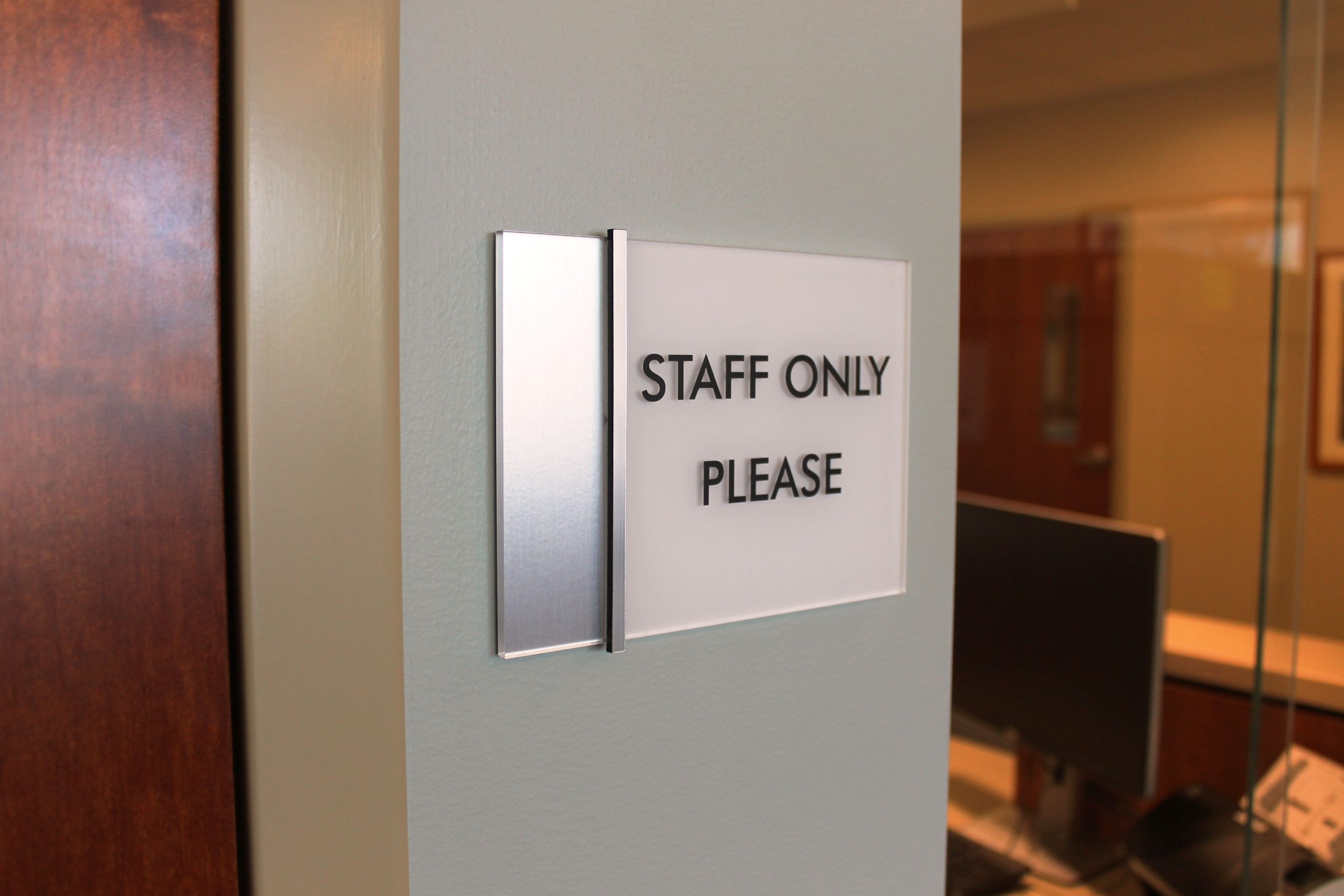
Howard Industries offers a standard acrylic signage series with several color combinations and shapes that can be used throughout an entire building for the use of wayfinding, room identification and directions, while also enhancing the building’s branding, Stewart says.
“With proper care and maintenance, the durability of these signs creates exceptional value that customers are after,” Stewart adds.
Trying out aluminum
Arris Signs sells an aluminum frame with room for a paper insert that allows companies to make their own custom signs and update messaging. If a name, room number or usage needs to be changed, the customer can print out the new information and insert the paper into the sign, which helps save on cost, Herren says.
“We try to keep in mind modularity,” Herren says. “With the advent of printers, they’ve gotten so good, you can make pretty decent paper inserts.”
Using aluminum for the frame presents a nice appearance and is durable and recyclable, while something like an acrylic plague, though not expensive, would need to be replaced for any alterations to the content, Herren says.
“Because it’s aluminum, it still has the look of a custom sign,” Herren says. “It allows you to make custom-looking signs but make them modular as well so they’re updatable.”
The frame is constructed to allow for different sizes, since it is built around an adjustable plastic backer. The customer specifies the dimensions, and Arris cuts the backer to fit the desired size of the messaging. A clear lens is flexed into the frame and placed over the insert for protection, and, if desired, graphics can be etched directly onto the lens.
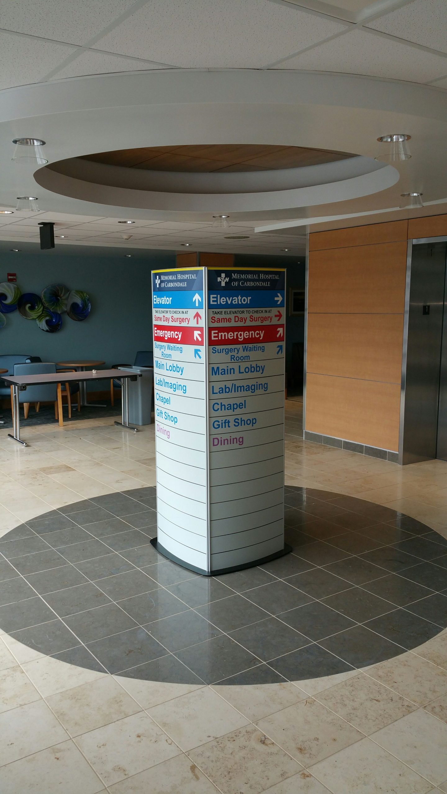
The paper inserts can be quickly replaced for changing needs, but there are some drawbacks, too, such as trying to adhere to company or building standards in looks, colors, fonts and type justification, Herren says. The end user can establish the standards, but then there needs to be follow-through, which could be more difficult with changes in staff or building occupants, he says.
“You start losing a little bit of the consistency throughout,” Herren says.
Both the acrylic and frame options give users many options, Bar says.
“With framed, you can change the insert and you end up with a modular system that looks like a custom awesome solution that is not very expensive,” Bar says. “With acrylic, you have more design freedom.”
The acrylic and frame options can be minimalistic in look from frameless, where the frame isn’t visible, to a more dominant frame that can be easily seen, Bar says.
“The other aspect is you can have it curved or flat,” Bar says. “Whether you choose minimalistic, flat, or curved, you will have an entire system that will have the same look from a door sign and directory all the way to suspended signs and pylons, all with the same look.”
Placing the signs
Directories and other wayfinding signs that get the most views are at building entrances and elevators, which frequently are high traffic areas.
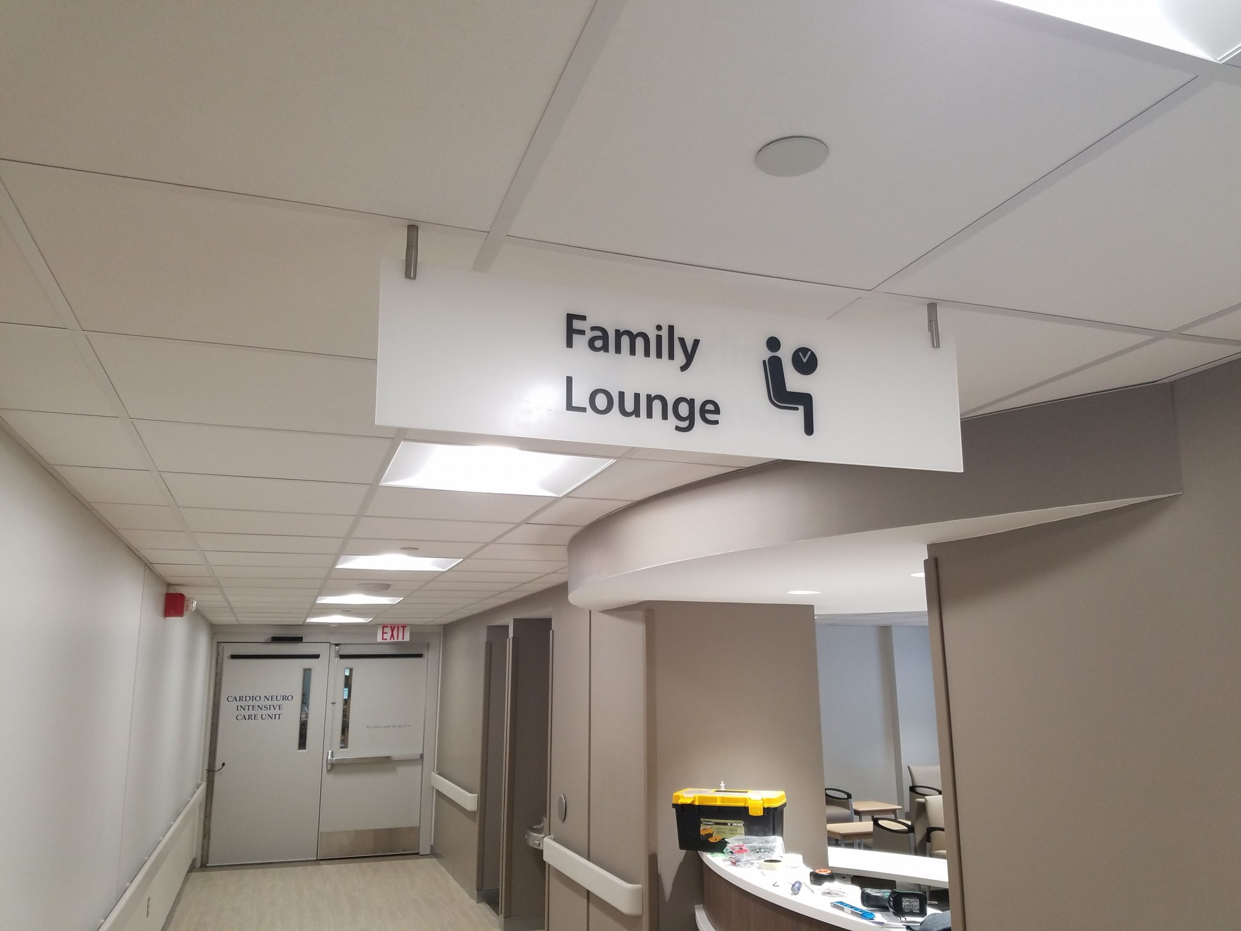
“Having clear signage in the entrance allows customers to feel welcomed and have a sense of direction, even in unfamiliar surroundings,” says Stewart.
Wall, ceiling, and projection-mounted signs work well for entrances for directional and wayfinding purposes.
“The best placement for each of these sign types would be in clear and highly visible locations,” according to Stewart, adding that there isn’t a size requirement, but the signs need to be large enough to ensure the messages are readable from a reasonable distance. “The only drawback would be the inability to create freestanding signage if there is a lack of wall space nearby.”
The structure of the interior space or the complexity of the building layout can dictate choices in the size, placement, and quantity of the signage, Herren says.
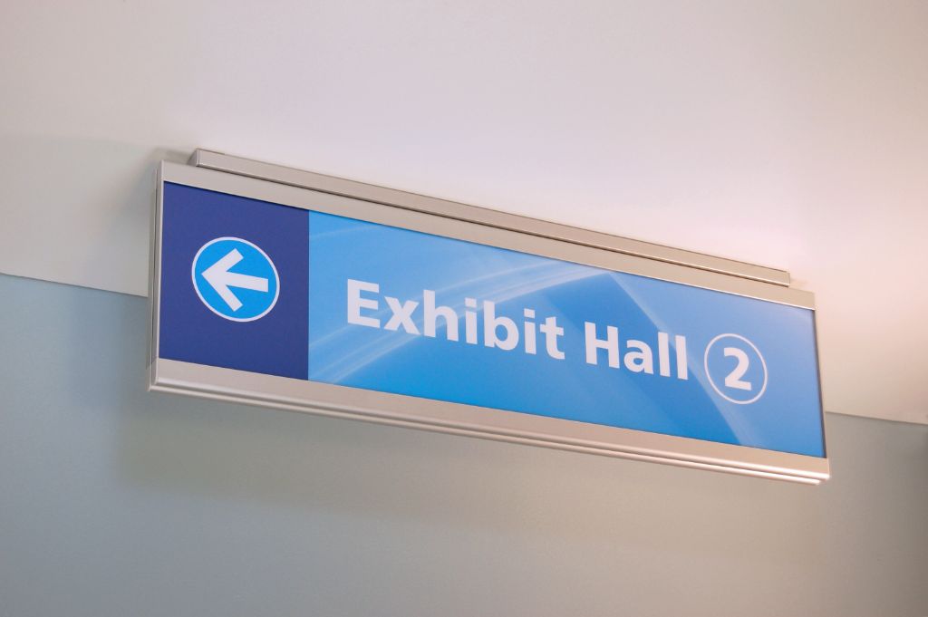
“It depends on the path that the individual needs to take to arrive at their destination. The longer and more complicated the path, the more signs that are needed,” Apter says. “Also, by strategically placing the signs in the most effective locations, fewer signs are needed. … The plan to create a positive atmosphere and brand development might also influence the total number of wayfinding signs.”
As for the placement of the signs, an older building, for example, may have low ceilings, requiring that the signs be mounted on walls to meet ADA requirements and avoid disturbing anything above the ceiling, Herren says. Alternatively, drop ceilings may not provide anchoring points for signs, and narrow hallways may not be suitable for projection signs, which project off the wall or other surface and are more difficult to install than simply screwing in a wall-mounted sign.
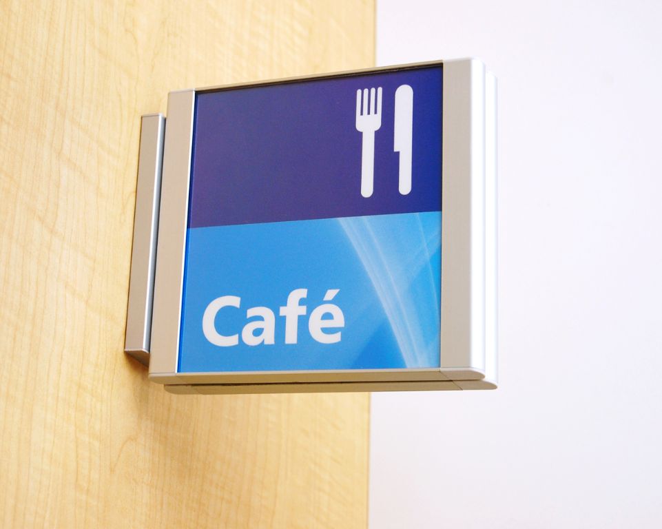
“Sometimes the building itself dictates the type of signage,” Herren says.
The size and number of signs are additional considerations, Bar says. If the sign is too large, the sign gains more importance than the message and can confuse visitors, he says. In the case of directional signage, there needs to be just enough to direct the visitors around the premises without being too few or overwhelming, he says.
“When you plan these sign schedules, you will have the answers coming to you. It should make sense. Don’t let the budget or the type of building dictate your signage,” Bar says. “Choose the right solutions. Do the right thing. Your customer will appreciate it even if it costs a bit more.”
Choosing where to place the signs can be done by identifying where visitors would naturally look for the signs, Bar says.
“Imagine yourself walking in an unfamiliar building with no signs,” Bar says. “At what point are you going to look for the sign and where will your eyes look for it? This will also answer what type of sign goes where. You don’t want to place it where it is comfortable and easy to install. You want to put it where people are going to look for it.”