Some things just feel better when they have that analog swing. Vinyl records, old style film photography, and of course sign painting all have that special something that keeps us interested. The truth is none of these things will ever die for some people because we love them and they rock. Each in turn had their glory years and eventually wound up on life support due to mass-produced digitally-based competition. And now they are all making a comeback because real materials and handcrafted originality can hold their own in the battle for our hearts. Despite the natural goodness inherent in old-school work, the public doesn’t actually know or care how you get to their happy spot, as long as they aren’t paying too much extra and there is a juicy payoff. In this article I will share some tips about how to strike a balance between old-school integrity and making money, even it does aim to deceive the public from time to time.
Hotel Green: Dennis Hopper swiped a simple sign and took it to the French modern artist Marcel Duchamp when he was visiting LA in 1963. He had the notorious artist sign it and viola, the painted sign was instantly transformed into “ready made art.” The original was recently auctioned for $362,500. In 2017, the puzzle artist David Jones had me reproduce the original sign “that had to be done by a real sign painter” so he could make a political statement with it in his current art show.
It came to me with a white background. I aged it by first painting the white with an off-white oil enamel mixed with Chromatic clear flattening paste. I sprinkled on some Modern Masters iron rust paint with a toothbrush, then spritzed over it all with a little rust activator and let that dry. The lettering was done via a pounce pattern and sign lettering quills. The black looks faded because the background shows through like an old exterior sign would. I used satin Rustoleum thinned with 1 Shot Chromoflo 6000 to sell that effect.
Roof Structures: The client had a whole fleet that was previously done by a retired sign painter. There were five new ones they needed “hand painted” a good 20 miles out of my area. I needed to get them done in two or three trips to make a profit. I finally got to make use of some of the casual truck lettering fonts I purchased years ago. I overlaid them onto a photo of the existing examples and they matched fairly closely. I used a paint mask to efficiently knock out the 10 doors. The company specializes in huge glue-lam roofing, so afterward I brushed in some boards and knots onto the yellow area along with some “subliminally” placed initials of each driver. It is quite stunning how painted graphics look noticeably better on a vehicle than vinyl does. Hand lettering work like this needs to be free and easy to look good and pay well, and that just wasn’t going to fit into my time budget.
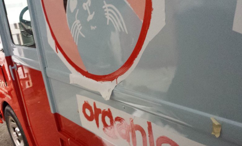
Brown Cap: The client had to have their cute little truck done up with paint. I wanted the job, so I priced it to sell. Brown Cap supplied all of the vector files, which made it possible to offer a quick turnaround using a paint mask for a reasonable price. Whether hand-painted or brush masked, the real-paint effect fit the aesthetic perfectly.
Royal Robbins: The artwork for this project was supplied with a natural wood background rendered in Photoshop. That’s great, but what type of wood should we then knock on? The design called for a light-colored distressed wood. The problem is that the only exterior light-colored wood in common use, is what, maybe white oak? And even on such an expensive heavy wood, the color would change dramatically over time, so what to do? I opted to paint a light-colored faux wood grain finish directly onto marine Hydrotek. The advantage of doing a faux, or “imaginative stain” on real or engineered wood is that there is some wood grain texture to reveal, and that helps the emffect. It also looks more natural than MDO when you hit it with chains and wire brushes because splinters are present in the material. I cut the plywood into strips and gave them a 1/8″ routed edge and then painted each board individually and set them into a steel frame.
Tell Me the Truth office: The client wanted the words Tell Me the Truth to be spelled out in 14 languages. Honestly this should have been hand-painted “Wall Calligraphy,” but the layout and translations alone presented a potential underbid challenge above and beyond lettering them all by hand. On top of that I suggested it be done in a nice copper color, which would have had opacity issues requiring a couple coats. I used high-tack Hexis paint mask and did the entire job with no brushes, only rollers. To tell you the truth I’m a sign painting masker!
Faux Terra Cotta: The truth wasn’t pretty. Some of this storefront tile might not have looked all that great on day one and was very unlikely to clean up well. Step 1: Apply tinted latex bonding primer to the exposed ceramic tile and the sad black oil enamel. Step 2: Paint grout with pearl MM metallic paint. Step 3: Spritz grout lines with spray bottle filled with watery dark brown wash to dull and age them to mimic old masonry. Step 4: Butter up each tile with slow drying MM tintable glaze. Step 5: Paint random “leopard spots” with two colors of latex doctored with more glaze and retarder. Step 6: Feather and blend the two colors together with a brush until softly flowing together.
Ken Lum Conceptual Art: Ken Lum is an internationally respected Chinese-Canadian artist from Vancouver, British Columbia. He did a stint as a sign painter in his youth and continues to create pieces that look like signs, with a twist. He did the classic landmark sign/sculpture conceptual work that labels and towers over the North Vancouver neighborhood that was his old stomping grounds. I was commissioned to collaborate with the California College of the Arts’ Wattis Gallery to do the sign painting for two of his pieces that were originally done in the 1990s. It’s funny, because back then I was working in a sign shop that had a running joke: “Stop fussing around with that sign! It’s not going into a museum!”
Red Oak: Homemade core-ten done with MM rust paint on Alupanel laminate board.


