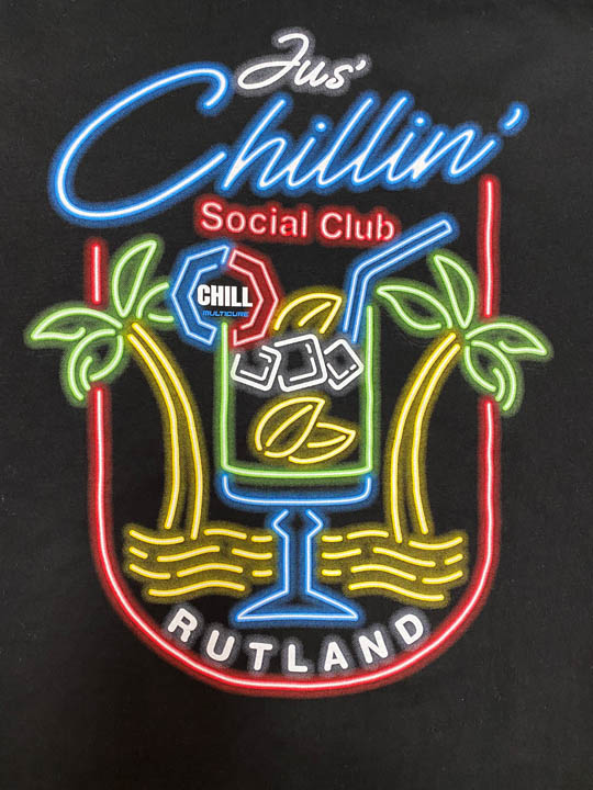
There’s something unmistakable about neon in the way it glows bright and grabs your attention. It’s a technology that speaks in color and hums nostalgia. It’s Las Vegas in the 1960s. It’s the watering hole’s flickering OPEN sign glowing defiantly in the black of night. It sends a clear message, does it not? Neon isn’t just illumination, it’s an attitude. It’s personality in bent glass.
For this project, we weren’t shaping glass tubing, but we were trying to capture that same high-contrast intensity on apparel. The client wanted something bold and bright, a design that looked like it could buzz to life. They asked us to replicate the look and feel of a real neon sign. Obviously, it had to go on a black shirt, too. Duh!
We began in Adobe Photoshop. You might think Illustrator was the natural fit for clean vector lines, but we needed to simulate the subtlety of light emission. We wanted this graphic to pulse and radiate. The lines would need depth and diffusion that we could only get through a bitmap rendering in Photoshop. We started with our 16“ X 20“ artboard at 300 DPI in RGB mode.
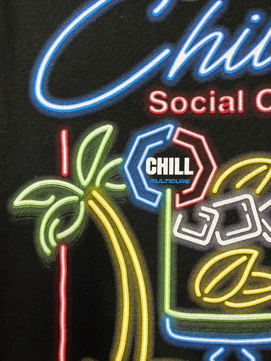
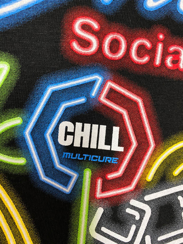
The base design mimicked old-school neon with clean tubing letters and simple geometric shapes. We created each letterform using the Pen Tool on its own layer with stroke simulation, maintaining clean masks within the layers. These were essentially digital tubes. For the glow, each stroke was duplicated and blurred behind itself to simulate inner glow and dispersion of colored light. We used the Gaussian Blur tool with a radius between 3–12 pixels depending on the “wattage” or size we wanted.
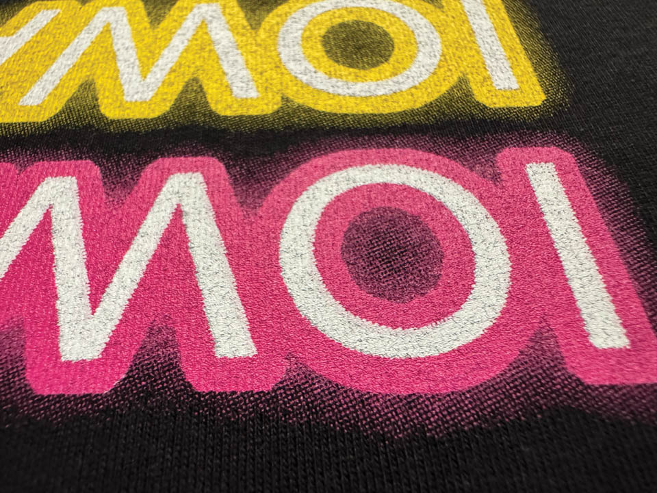
Color intensity dropped incrementally on each layer down the stack. The top or innermost layer and brightest area was solid stroke at 100% opacity. The mid color layer and bright color glow was at 40% to 60% opacity, set to Linear Dodge, and finally, the bottom or dark faded wider area glow was a heavier blur, dialed way back to 5% to 15% opacity, also using Linear Dodge. We masked the glow layers into shadow shapes and transition sections with soft brushes to control falloff to nearly zero.
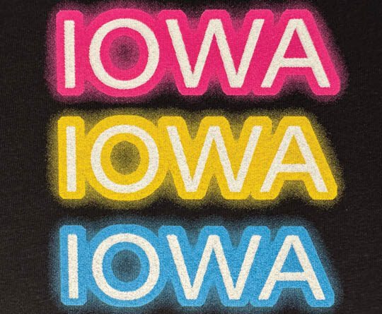
The key was depth. The center line would look hot white, while the glow fades naturally and gradually into the black of night, or in this case, the shirt. Black was our canvas, and we painted light onto it. Color wise, we leaned into realistic neon tubes.
These weren’t primaries. Real neon pink has a slight warmth to it, electric blue trends toward cyan, while neon green has yellow undertones. We referenced actual photos of lit signage to color match.
Of course, the pretty picture on the monitor would need to be color separated for screen printing. We would utilize our layers and convert to channels, a trusted method for simulated process prints. Using Color Range, we isolated each color, hot pink, electric blue, green, orange, yellow, and a highlight white and pasted them into individual alpha channels. Each channel was then adjusted with Levels to enhance contrast, clean up midtones and to manage any anticipated dot gain or loss.
Our glow zones were particularly sensitive. We pushed highlight end points carefully, adjusted and prepped each channel for halftone output. We built a dedicated white printer or underbase channel using a combination of the highlight areas and strategically in some of the color areas. We choked this shape slightly to avoid halos and noise peeking out in the colored glow zones. This allowed the neon effect to pop transparently on top.
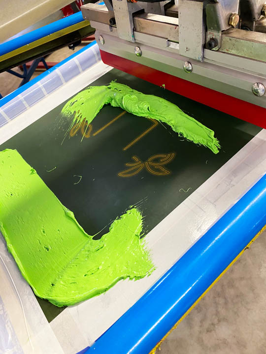
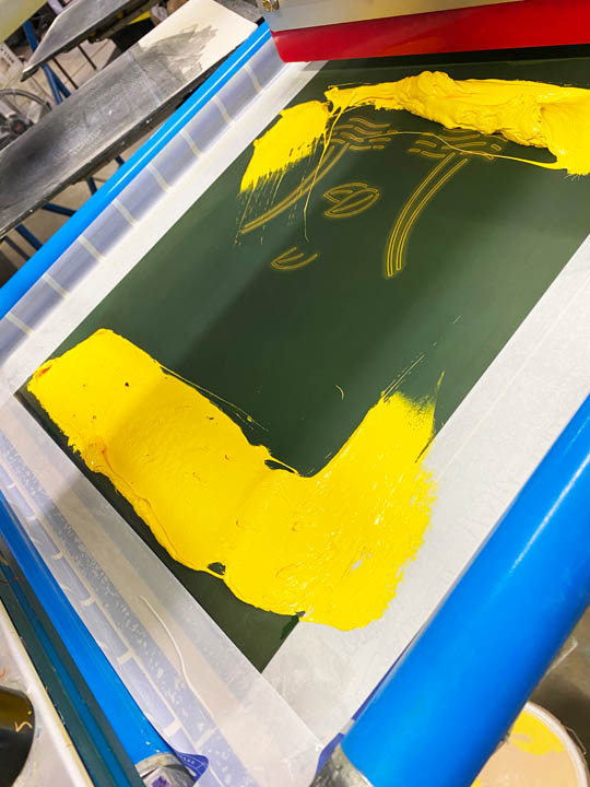
We output to CTS (computer to screen) at a default 55 LPI (lines per inch) round dot at a 22.5-degree angle. Screens were exposed on dual cure emulsion for its superior resolution. Mesh was 230 TPI (threads per inch) for the colors and the highlight white while a 156 TPI was used for the white printer. Every screen was dried, inspected, and tensions were set to 35 N/cm2. We registered them on our auto with a preregistration system averaging a few minutes a screen with just a few fine micro adjustments needed. Everything had to fall into precise place. One misaligned glow, and the whole illusion would break.
For the inks, we were running some low cure tests and chose that series. We mixed custom blends to match our printed color samples. The white printer or underbase was our foundation — figuratively and physically. A single stroke with moderate pressure and speed using a triple-ply duel-durometer 65/90/65 squeegee. We flashed it just enough, at three seconds to reach about 220 F, gelling the surface without curing
the ink.
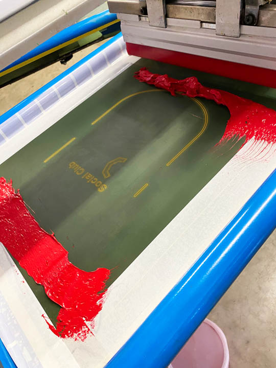
Electric blue went down first, followed by green, red, hot pink, then yellow, and finally highlight white to pop the center of the tubes — all wet on wet. Since this was a low-cure ink, the dryer belt was set so we could reach ink temp at 280 F, and we monitored ink surface and temps with a temp gun and thermoprobe.
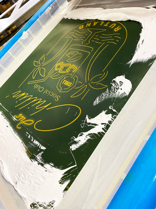
And when we pulled the first finished tees off the belt? They glowed not just visually, but had a feeling. That same sense you get walking past a sign at 2 a.m. The lines looked lit. The shadows looked warm. The shirts felt alive. Hundreds more came off the press, each one a little beacon in the dark.
Neon has been around longer than most of us have, invented in 1910 and made famous in the Roaring ’20s. It lit up cities and changed how we advertise. Neon became part of our cultural DNA. It was art, commerce, nightlife, and rebellion all rolled into one bent tube. This job reminded us that the glow isn’t just in the ink, it’s in the craft. And if we do it right, our prints won’t need electricity to shine. These shirts weren’t filled with gasses, but they hummed all the same.