Miami Vice was an American crime drama television series starring Don Johnson as Sonny Crocket and Phillip Michael Thomas as Rico Tubbs, two detectives working undercover in Miami, Florida. The show ran for five seasons in the 1980s and drew upon that decade’s new-wave culture visuals featuring pop music of the time. It was said to be the first show to look new and different since color TV was invented.
Miami Vice
Most episodes focused on drug trafficking and prostitution and usually ended in gun battles before the criminals were apprehended. An undercurrent of cynicism and futility underlies the entire series. The stars repeatedly refer to the “Whac-A-Mole” nature of drug crimes. There were a fascinating number of industries that revolved around the drug trade, including money laundering, bail bondsmen, and attorneys who service drug smugglers among others. Miami was a sort of Barbary Coast of free enterprise gone berserk.
The series was an instant hit, and its first season saw an unprecedented 15 Emmy Award nominations. While the first few episodes contained elements of standard police procedures, the producers soon abandoned that in favor of a distinctive style. Influenced by an Art Deco revival, no earth tones were used in the production. Each episode of the series cost $2 million to produce and much of it was filmed in Miami’s South Beach area, which at the time was a bit rough and even undesirable.
Some street corners were so run down that the production crews repainted the exterior of buildings before filming. The crew went to great lengths to find the right settings and props. Miami Vice is credited with a wave of support for preserving Miami’s famous Art Deco architecture. Many of the buildings and beachfront hotels have been renovated, making South Beach a popular destination for tourists and celebrities.
The Oasis
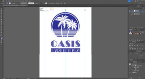 The Oasis opened in 2004 in Broomfield, Colorado, as a premier volleyball facility with seven indoor and three outdoor sand courts along with a full restaurant and bar. The Oasis offers year-round league play and tournaments for all levels of volleyball player, from recreational to competitive. The team at The Oasis has worked hard on the details — from the beach chairs in the sand to the music playing throughout the building. That brings us to our story — a new design for the fall and early winter.
Direction for this project was straight forward: “Want to use the Miami Vice logo and sub in Oasis Volley for the type.” Can do.
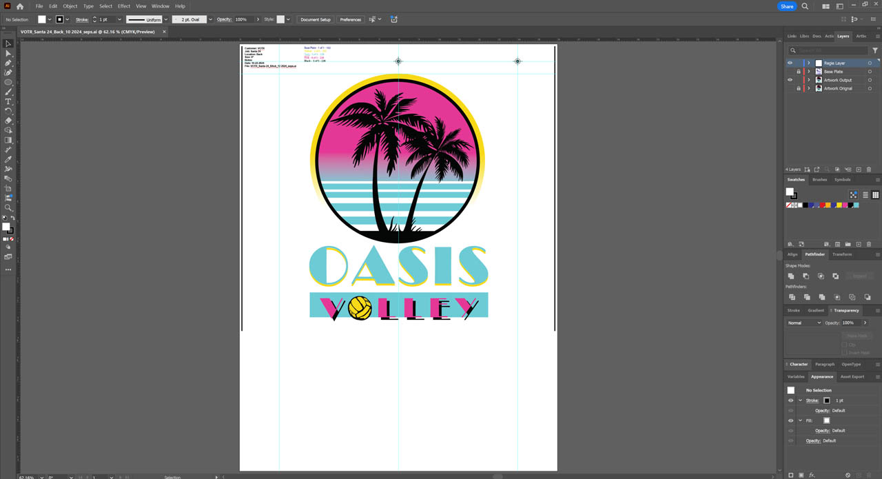
We did need some reference, however. We took to Google and found the traditional Miami Vice logo. We imported a version into Adobe Illustrator. This layout guided our composition. The bright colors would draw strong contrast against the substrates. With transparency pushed way back, we could start drawing and coloring.
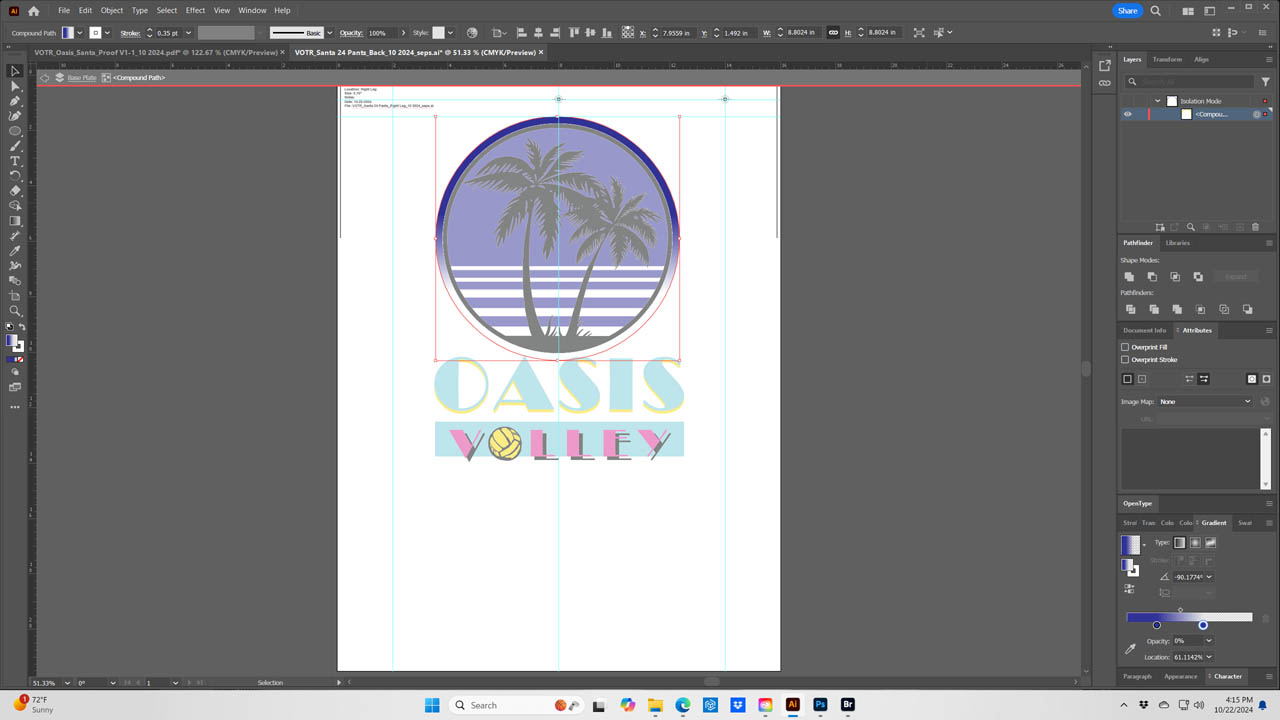
The shapes were easy to build using the rectangle and oval tools. First, we worked on the yellow ring with the fade drop off. We selected the ring and opened the Gradient Menu with “linear gradient” set from the build and spot color at 100% opacity and transition of the same color at zero. We had the drop off at zero opacity and 66% on the location. While selected, we took our base plate designated spot color and drug it to the gradient slider and set it for 100% opacity and repeated the process for the other 0%.
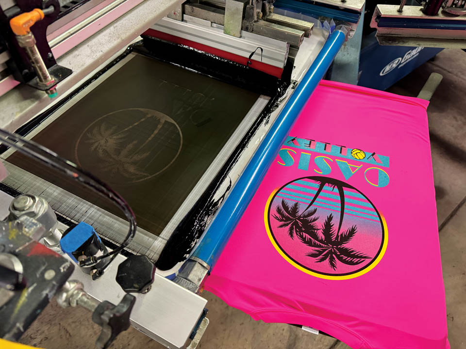
We didn’t want our white printer or base stopping at the same place as our color, so we slid the opacities to 5% to 61%, tucking the base back a bit so the color would overlap. Since we had such bright colors, we had to get creative on how these colors lift during wet-on-wet printing. We sacrificed the turquoise and, to avoid a stucco texture from the ink split, we chose those areas in the transparency menu and set the opacity to a 60% halftone, allowing some of the turquoise ink to fall onto the shirt directly.
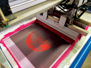
Finally, we gave some gutter room for the inks to stay clean. We selected the base (less the black), went to the stroke menu, added a 0.35 point stroke, and designated 100% white, which would not output. We then adjusted to our favorite gutter settings. For Cap we selected “round cap,” on “corner” we selected “round corner,” on “align stroke” we selected “align stroke to inside.” Magic. Though the white printer or base plate wasn’t technically a color (really more of a support system) it had a very necessary role and the biggest part to play. We reduced the amount of base where it counted and kept it solid where we wanted opacity and vibrancy.
Once our seps were complete on layers and in spot colors, we placed the file on our Illustrator art board where our registration marks, grayscale spies, and job information live and outputted on CTS (computer to screen) with a frequency of 45 lpi half-tone at a 22.5 degree angle and a round shape. Screens were work hardened beginning with the N-166 threads per inch followed by a flash and heated smoothing screen. The colors were on N-272s and all at 45 N/cm2. We used 65/90/65 triple ply, duel durometer squeegees with flood and print speeds moderate with minimal pressures.
A film adaptation based on the Miami Vice series was released in 2006 and had the same director. The conception of the show may have simply been “MTV cops.” The initial idea was for a movie about a pair of vice cops in Miami originally titled Gold Coast was ultimately renamed Miami Vice.
