GRAPHICS PRO EXPO (GPX) has hosted WRAPSCON over the last several years, most recently in Long Beach, California. Graphics installers, leading manufacturers, dealers, and distributors in the business all come together under one roof, with a national audience, to share tips and tricks, installation techniques, and the latest products to help boost this rapidly growing market segment.
GPX showcases the latest in digital printing, vinyl technology, lamination, vehicle templates, wrap-specific artwork, and tools, plus an expert educational panel, thrilling competition, and more. GPX featuring WRAPSCON including the Wrap Olympics is back in Long Beach in 2024!
Graphic Elephants has done all the apparel merchandise for WRAPSCON since its inception. After making the event look like it had powers and abilities far beyond those of mortal events, we created and printed WRAPSCON Man. This superhero was faster than knifeless tape, more powerful than a radiant heat gun, and had the ability to wrap tall buildings in a single sheet. But I digress.
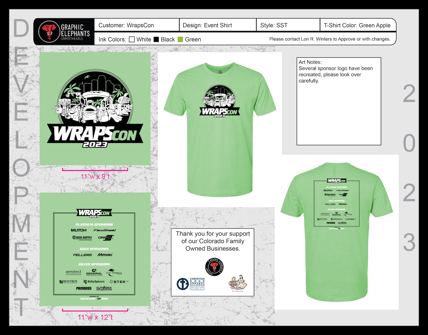
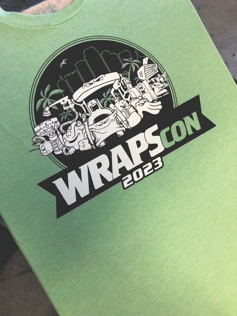
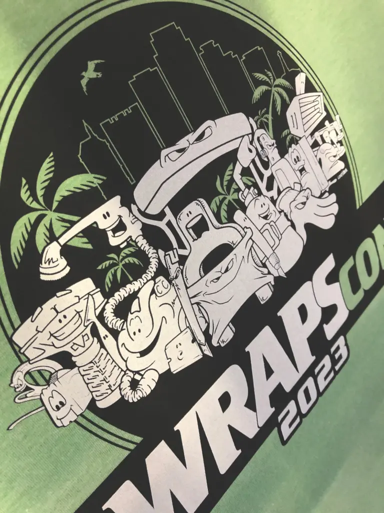
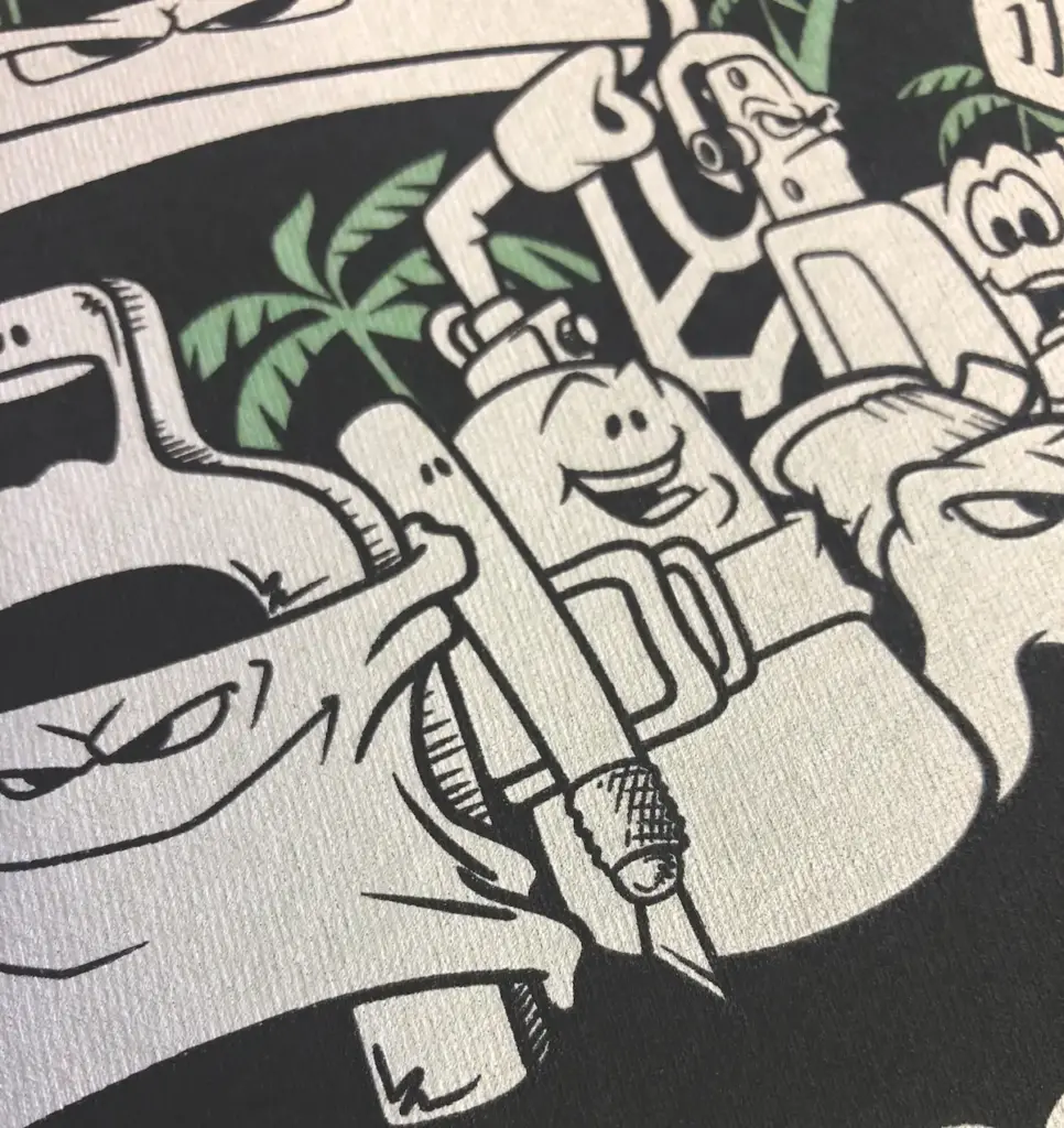
The last few years have featured art in a line work characterization of the tools of the trade, giving these critical instruments their very own unique and clever personalities and attitudes. 2023’s comic-book-style design was to be printed on T-shirts because, well, that’s what we do. Let us not forget the Wrap Olympics competitor gear as well. That is more logo-driven.
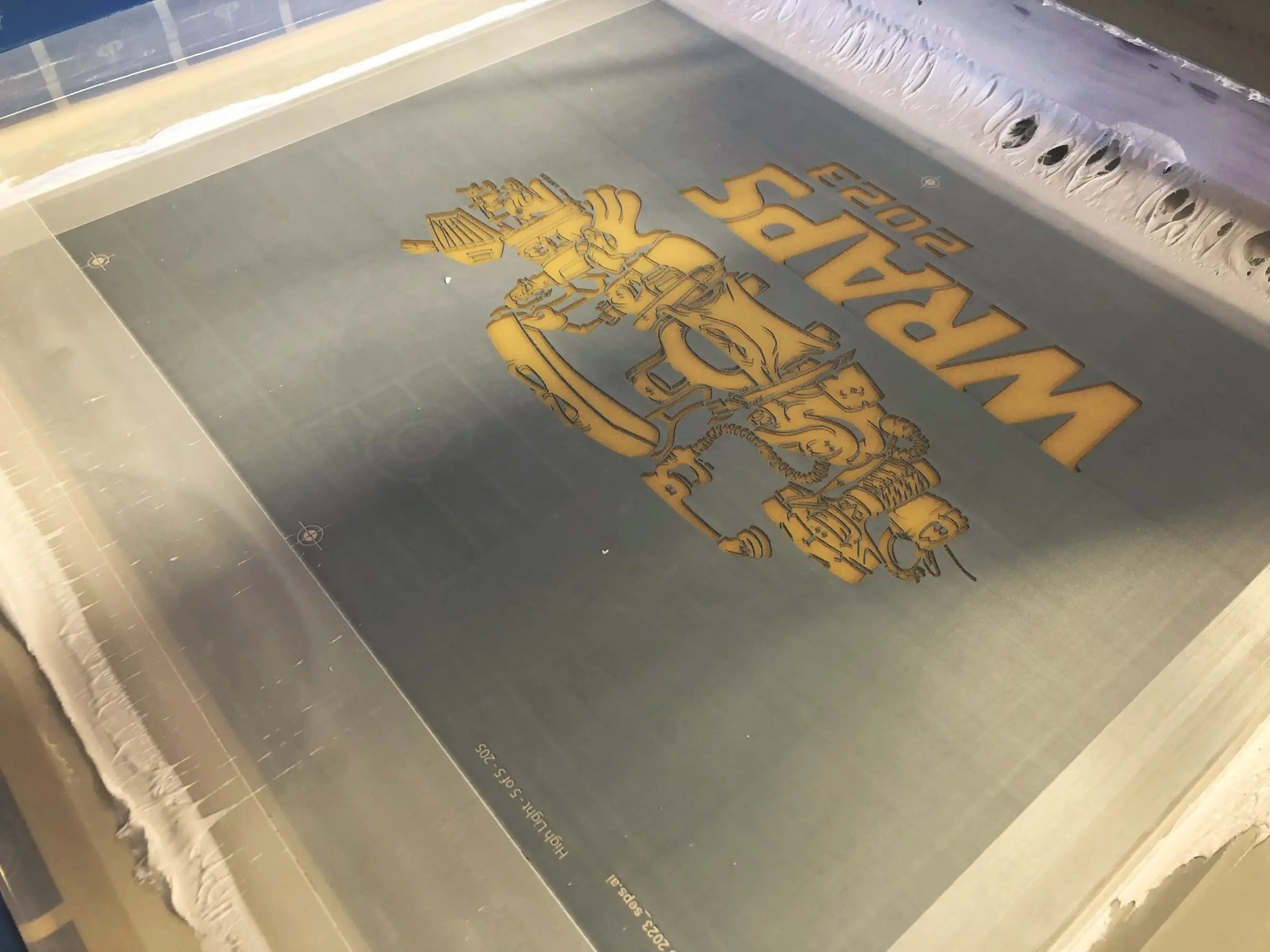
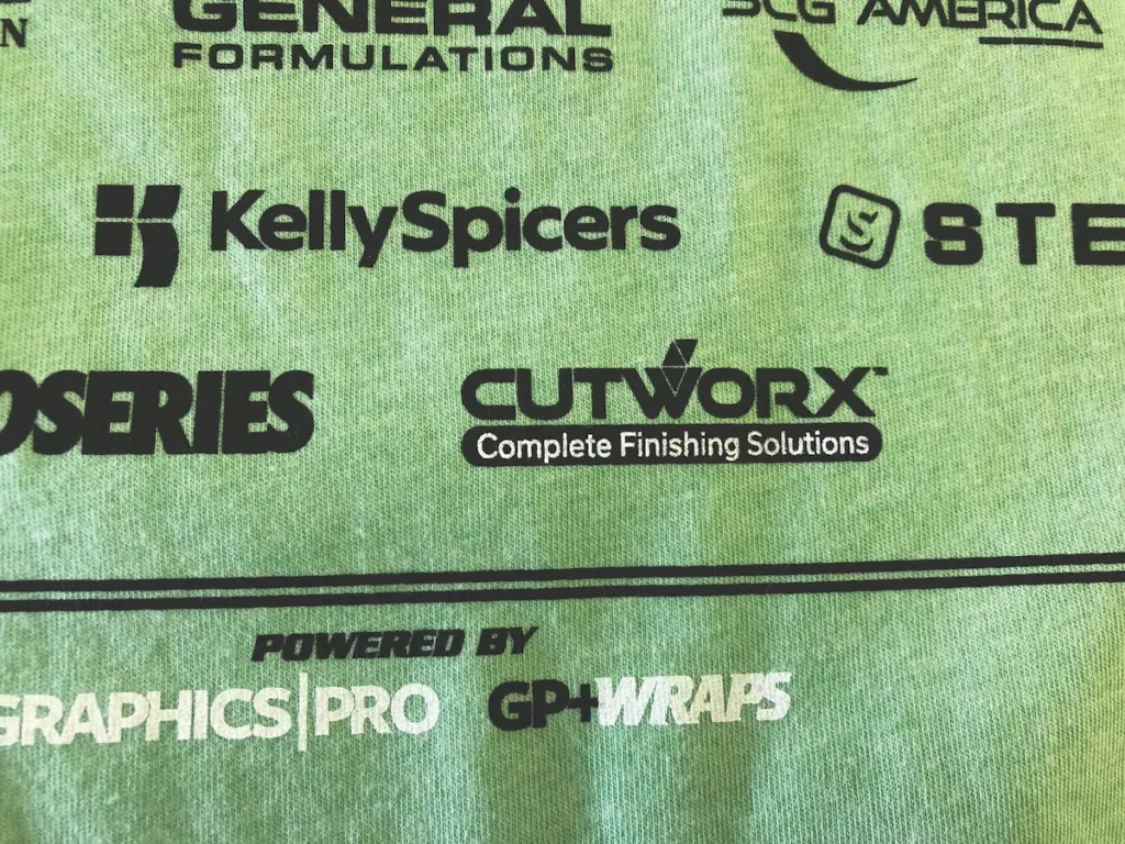
Though we are sure the source files exist somewhere — they always do — the files for this project came to us flattened, which made the process a little more difficult for separations used for screen printing. A layered file at 300 dpi to size is certainly preferred. When we downloaded the art, we found more problems. While everything looked fine on the monitor, we could tell that the very thin black lines would fill in on press using two whites for a bright white finish. We spent what seemed like hours going in and manually opening up the backline after a trace in Photoshop. WRAPSCON also challenged us with the sponsors on the back of the Wrap Olympics shirts. This is common. A multitude of supporting sponsors’ logos filled up the back of the T-shirt design.
“Sponsor” as a noun is defined as a person or organization that provides funds for a project or activity carried out by another, in particular. For example: “The money came from sponsors.” “Sponsor” as a verb means to provide funds for a project or activity or the person carrying it out. As in, “Joe is being sponsored by his church.” This might seem simple to the organizers, but we knew we might struggle with it. Sponsorship sections are always event-based and time-sensitive, and recreating the “sponsors” back has challenges.
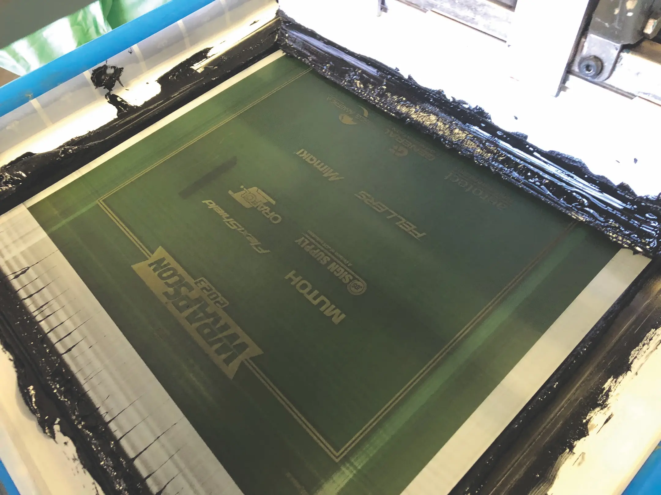
While the files have improved considerably over the years, they’re never easy to manage. In this case, the sponsors’ individual logos were collected and sent as a combined PDF. After opening the file in Illustrator, we realized it had several linked files and low-res JPEGs. Some logos were vector and some not. We ran a trace on the less-than-perfect logos in need of vector conversion. The colors were identified with spot colors. Selective white printer or under-base and highlight white were necessary as the shirts were dark in color. We selectively placed certain parts of the logos on the base and removed them from the highlight, and vice-versa. To maintain clarity, we made adjustments by opening up very small negative spaces and increasing line weights in very small positive areas, much like we did for the event shirts. We also dropped some outlines, increased spacing, and increased the size of trademarks (™) and registration marks (®).
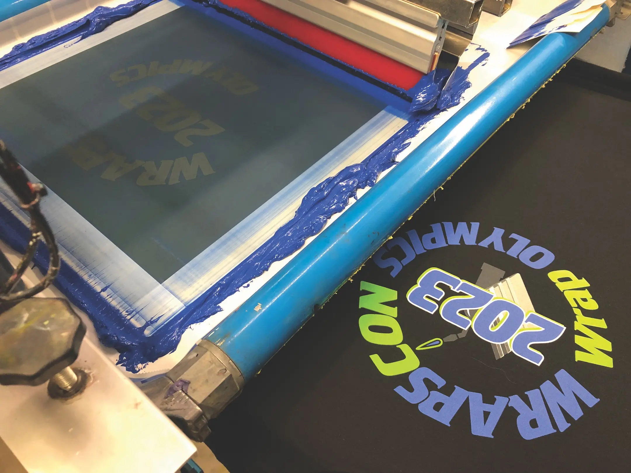
The Wrap Olympics layout was circular in shape and gave center stage to the main event. We used the top and bottom for secondary elements and information. The process was simple but effective. We added a texture overlay to help create more interest for a pretty simple three-color design. We did this in Adobe Illustrator for clean, sharp, strong graphic, vector results.
The choke for the white baseplate was fairly straightforward. We added a stroke to the entire make-up of the image after creating a composite layer. The overlay colors had a slight increase due to the stroke we placed around the white printer and would print a touch larger. Invisible to the eye, this would keep white from peeking out.
Once seps were completed, we outputted on CTS (computer to screen) with a frequency of 45 lpi (lines per inch) halftone at a 22.5-degree angle. We ran the white printer on a 156 tpi screen at 35 N/cm2 followed by a flash and smoothing heated iron in a Teflon screen. Next, the colored inks followed by the highlight white ran wet on wet on 230s at the same tension using all 65/90/65 triple-ply, dual-durometer squeegees. Of course, the cartoon image printed on the same meshes and we flashed after the white printer and the black before applying the hi-white. Set up was right on using our preregistration system. Just a couple of micro adjustments and we were good to go. Runs were substantial at over 1,000 each.
WRAPSCON was a huge success again this year, and we assume we will take care of the merch for next year’s event!
