We try to remember where it all came from, as we have been quite blessed. To do our part, as you may or may not know, we have a retail brand and outreach program known as Christian Edge Apparel. Tons of church, youth, school, and other programs fall under this umbrella.
We all are members of various churches across the front range here in Colorado as well. A couple of us have been members of Trinity Lutheran for over 30 years. Welcome to Trinity! These are the first words you see
on the website as well as on the front door. The mission of Trinity Lutheran Church and School is to connect our community to Jesus. ‘Nuf said, don’t ya think? Worship, Discipleship, and Partnerships. In its humble beginnings in 1981, a handful of families gathered in a local elementary school for worship. Today, Trinity has a thriving congregation as well as an accredited school, pre-K through 8th grade.
Recently, Trinity put on a golf tournament. It was a four-person team Shamble! Not a typo. We used the best drive, played our own ball in, and recorded the two best scores for that hole. Bet you didn’t know we are golfers. We’ll use that term loosely. Did not place was our official finish.
Trinity’s Annual Golf for Missions is its No. 1 mission trip fundraiser. In 2023, the tournament helped support the 2024 Alaska Mission Team, High School Summer Mission Trip, and the Denver area Family Mission Trip. Other trips hoped to be supported include sending a team to Africa as well as a disaster relief and rebuild team. These mission trips wouldn’t be possible without the Golf for Missions Tournament, the golfers, sponsors, and supporters.
Simple design and directions
Well, we can be a sponsor, right? Can’t have a golf tournament without a swag bag. The organizers didn’t even know that was a thing. We assured them that it is indeed a thing, and we had their back. We are apparel decorators, so we stuck to apparel.
We could get them a substantial value that would be right in our wheelhouse. Gotta have the bag to house the rest of the swag. We chose a canvas grocery bag (we all need them these days). We did the appropriate golf towel with grommet and clip and, of course, a T-shirt. These would all be screen printed. How ‘bout a mesh back hat with a leather patch? Gotta have that. And the apex item, a hooded quarter zip rain windbreaker. Way cool!
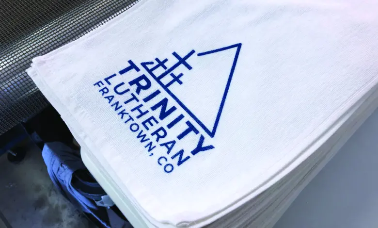
We’ve said it before. There is something to be said for keeping things simple. Simple can be super clean and sharp. Since this was an event sponsorship and we weren’t printing thousands of items each, more like 120, we kept it to one color. You might be thinking, “One color? Boring!” So, how do you make one-color images interesting? Not sure you can, but we can really make them pop and merchandise well together.
We began with layout and composition in Adobe Illustrator for vector components. We would take the full-color logo used for marketing and simplify it further. A simple type and logo solution using the original’s components.
All vector elements were set in place after some sizing adjustments. We opened a new document. Using the type tool, we set up Trinity Lutheran in the center of the template. With it selected, we could go through our fonts and choose the one we liked. We selected a thin, clean font. We also sized it appropriately. Still selected, we changed our font to outlines so we could work with it further. We reshaped it a bit, manipulated it into place, and locked the original. With it still selected, we made it into a spot color. Trinity was looking for something clean. Certainly basic in its concept.
We created the triangle shape to simulate the multiple triangles of the original logo. The color pallet for Trinity is white, black, navy, silver, and an awful green. We’d stay away from the green but would incorporate all the other colors in one way or another.
A simple design using the garment for show-through and negative space, completing the images on each item. Once the art was approved and the apparel selected, it was time to move on to the separations. This single color was created in Illustrator using layers and spot colors. Done.
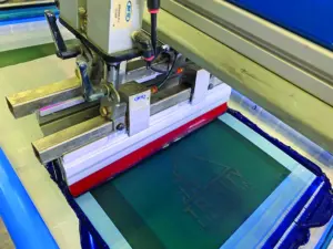
We placed the vector file in Illustrator and output on our template to CTS (Computer to Screen). We had multiple sizes plus darks and lights, so several screens were made. For a clean and or opaque print, our screens would be 156 tpi (thread per inch) stretched to 30 N/cm perpendicular and parallel on work-hardened retensionable frames.
A quick setup on-press using our pre-registration system and lasers for perfect location, and we were ready to run each item. Bags would get navy ink, and so did the towels. We went with white flash white on the Heavy Metal Ts. Heavy Metal is our new favorite color, by the way. To keep the ink deposits thin and minimize any
smearing, the squeegees were 75/95/75 triple-ply dual durometer at medium pace and 15-degree angles. Screen print portion complete.
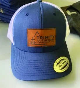
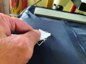
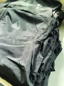
We ordered some hybrid direct-to-film transfers for the jackets. We made them quite small as this is the trend. Placement was a little tricky, and we had to get creative with pads and pillows to prevent any heat press marks. We also ordered hat patches in simulated suede. Application of those is easy breezy with a heated lower platen. We used a pad on top to keep from mashing the patch. Mashing is a technical term. We love hat patches!
All the items were individually folded and bagged. Trinity was extremely grateful for our gift. A great time was had by all on a fabulous Colorado Mountain golf course. And they raised a big chunk of change for missions.
