As summer fast approaches, we finish this month’s column on the last day of spring. Our apologies to our esteemed GRAPHICS PRO executive editor. We are supposed to finish by the 15th of each month. Thank you for your patience.
It is that time of year for all multitudes of outdoor events. We are involved in a number of western and country events, what with the whole outdoor Colorado thing. After last month’s addition featuring our Blue Mustang, we take a slight deviation from cowboys and horses. We will share with you… Mule Days!
Mule Days
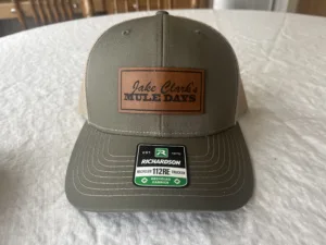
Jake Clark’s Mule Days was established in 1997 and highlights the diverse ability of the American saddle mule. The mule has become quite popular as an animal great to use on trails, in the mountains, and on the ranch as well as in the arena.
The mules show off their abilities at the all-mule rodeo, jackpot team roping, and barrel racing. Mounted shooting seminars and additional competitions joined the event in 2007. We get to enjoy the all-mule parade, a great steak dinner, a barn dance, and finally, and most well-known, The Auction. This popular auction has become nationally known as America’s Finest Select Saddle Mule Auction. Trust us… it’s kind of a big deal!
We began working with the Mule Days folks a decade or so ago. This has got to be our 10th or 11th year we have put together the event shirts. Every year it seems like it is manic and last minute. We usually have to send shirts overnight to reach the deadline. No matter how hard we try, it’s the way these folks (and customers in general) like to work. Oh well…it’s what we do.
We met with the good folks at Mule Days in January and February, to be proactive, and tried to nail down some ideas (this was for a June event). We called a few times, left a few messages, dropped a few e-mails. We followed up again in May to try to start working, and again with little response.
Finally, we received a voice message on a Friday. The apparel needed to ship the following week, so they would have the goods in time for the event.
There is something to be said for keeping things simple, but it doesn’t have to be boring. Since we were out of time and probably weren’t going to be printing thousands of garments, we kept it to a one-color design. You might be thinking, “One color; kind of boring.” Of course, there are exceptions. The Nike Swoosh is printed as a one-color and has become iconic. How did we make our one-color idea interesting?
Layout and composition
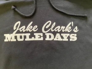
Like anything, we began with layout and composition. Simple. We would take the two-color logo they used for embroidery and dumb it down so to speak. A simple type solution using the logo components. Construction began in Adobe Illustrator for the vector components. Using the Lasso Tool, we isolated the imagery and traced the type components in a single color, then filled it.
We cleaned it up a bit and added thickness by duplicating the font and placing it some distance behind, and using the Blending Tool. The trick was to use the Blending Tool on the same point on both solutions so that it stepped from point A to point B to render the desired weight.
All systems go
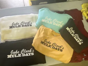
Once everything was in place and the customer gave us the final approval, we could move forward. We knew she wanted this printed on various colored shirts but wasn’t sure which ones she wanted to go with.
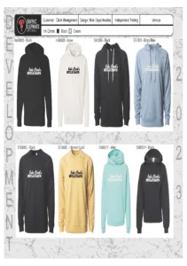
We showed her the art on various colored backgrounds that matched shirt colors as closely as possible in various locations. This helped to give her an idea of how the image would look. Once the art was approved and shirt colors selected, it was time to move on to the separations.
Hello! It was a one-color job built in Illustrator using layers and spot colors. Seps were done. No reason for any chokes on the white printer or base plate in this instance. Our client made the assumption that we would print black on lights and white on darks.
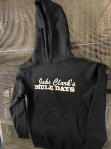
After choosing some great fleece options in multiple colors we noticed something we could work from. The bulk would be black and ivory hoods and crews. The other colored fleece had ivory drawstrings. The ivory garments would be printed in black and the black and other colors in ivory. Brilliant! We thought so anyway.
We placed the file in Illustrator to output on our template with registration marks and specs. Of course, we wouldn’t need the reggies, ha! For this graphic, we output at our default 55 lpi (lines per inch) frequency at a 22.5 degrees angle with elliptical-shaped halftones. It didn’t really matter in this case.
Screens were built on retensionable frames with 230 tpi (threads per inch) with a typical, standard T or 48-micron thread for the two ink colors. The ivory ink also printed on a 156 / 54, and all at 30 N/cm as its base rather than white.
Each stencil was constructed using a high-quality dual-cure emulsion coated three over two finishing on the squeegee side and dried substrate side down to get us our desired 15% EOM (Emulsion Over Mesh) stencil thickness for optimal ink deposit. Only the first ivory was flashed on the black garments.
Since we were using a fashion fleece, we pressed the surface in station one with a heated iron and a Teflon screen. The ink printed nicely once the fibers were matted down. Then we flashed and followed up with a roller smoothing screen to ensure an ultra-smooth final print.
Squeegees were triple-ply dual durometer 65/90/65’s and ran at a consistent medium pace with a little extra pressure for fabric penetration and bridging using a 15-degree angle.
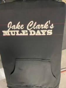
Determining the location of the design was a bit tricky, but we ended up printing level with and above the armpits. In the end, the prints were really nice, and the customer was extremely pleased with the sweatshirts. They certainly merchandised nicely. Many times, simple is better.

