New year, new approach to apparel sales? That’s what savvy decorators are doing. A great place to start is to learn the color trends and excite your clients. They want you to be their decorated-apparel expert. If you don’t have time to research, we’ve got you covered. Get all the top trends in this color roundup.
This year’s color crazes
“After two years of video meetings and working from home, the world is ready for bright colors, excitement, and joy,” says Gabby Eckert, personal stylist, image consultant, and CEO at Brave and Beautiful Boutique. “Bright colors instantly lift a mood, and there’s much to be said about the psychology behind colors and how they affect us. Your clients want to feel alive and happy this year, so what better way than to surround yourself with beautiful bold, bright colors in your apparel and decorations in 2022?”
Here’s a rundown of some of the colors you should present to your clients for 2022.
1. Notable colors for 2022
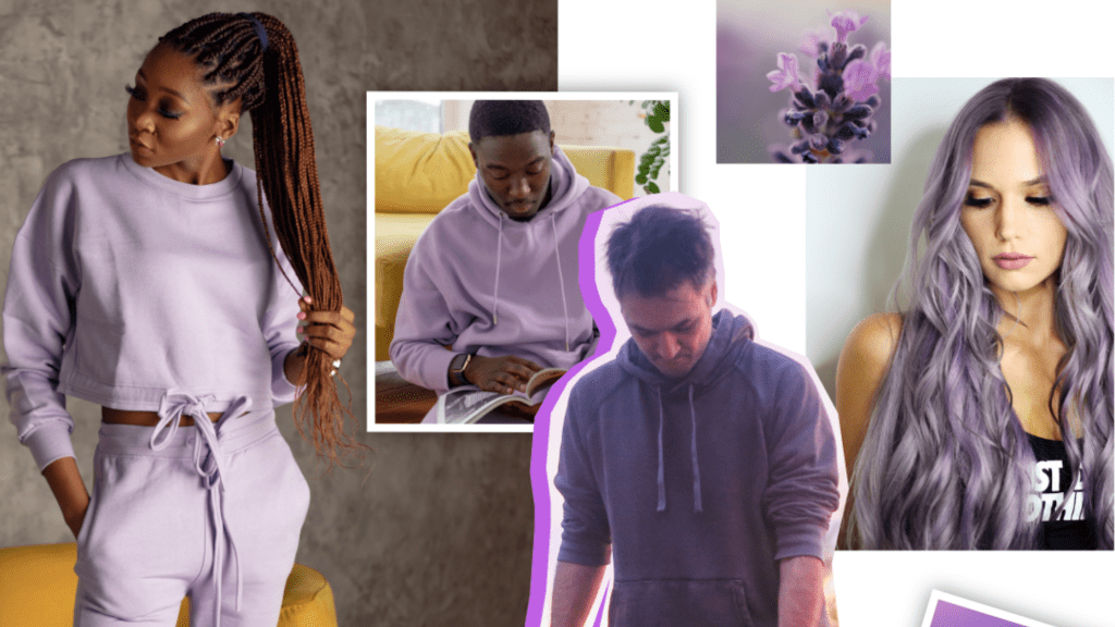
Two of this year’s signature hues are in the bluish-purple and purple family. “These bluish-purple hues reflect feelings of openness, pride, creativity, communication, confidence, and strength,” says Gregory Jerome, owner of Gregory Jerome Image Consulting. “I always advise my corporate clients to offer their employees or customers a range of complementary colors that reflect the brand as well as flatter each wearer’s skin tone.”
First up, Pantone’s Color of the Year 2022, Very Peri, which it describes as “blending the faithfulness and constancy of blue with the energy and excitement of red.” Next, WGSN’s Color of the Year 2022, Orchid Flower, is a saturated bright magenta color that’s about both positivity and escapism.
“I love Very Peri, a periwinkle blue hue with a violet red undertone,” says Mandy Scanlon, a fashion stylist, hair and makeup artist, and confidence coach. “It’s such a happy color that will have everyone smiling this year. Any age or gender can wear this shade. This color will be hot this spring and summer, from sneakers to dresses. Louis Vuitton has bags coming out in this hue as well.”
2. The neutrals
Key to every apparel decorator or distributor’s apparel color palette, neutrals appeal to many companies and wearers, especially for wardrobe staples. Here are the Pantone shades to watch:
- Snow White, “a clean and pure white,” reflects our need for inner peace
- Coca Mocha, a deep brown, mirrors a rich cup of energizing java
- Perfectly Pale, a sandy hue that recalls the warmth of a sunny beach
- Northern Droplet, a gray hue that’s the shade of quiet, overcast days
- Poppy Seed, a deeper, timeless gray that will be around for years to come
3. The pinks, purple, and red
“These hues run the gamut between pinks that communicate love, calm, kindness, and even romance,” Jerome says. “Red is always a very powerful color, which communicates dignity and pride. You always need to think about the vibe your client wants to give out.”
Pay attention to these Pantone shades:
- Gossamer Pink, a shade of sophisticated powdery that’s both grown-up and tender
- Innuendo, a bright pink that sparks a “wonderful jolt of energy”
- Dahlia, a bright purple color that’s risk-taking and dynamic
- Poinciana, a “heated” red meant to be worn by the bold among us
View this post on Instagram
4. The all-moods blues
“Wearing blue promotes happiness, refreshment, rejuvenation, and transformation,” Jerome says. “Plus, it fosters communication and stronger analytical thinking.”
Since blue is a staple color, show your clients these four Pantone shades that run the spectrum:
- Spun Sugar, a pastel blue shade that mimics fresh air
- Glacier Lake, a powdery, calm blue hue, references the cold, crisp Arctic
- Harbor Blue, a blue-green color, is about “longing for a safe space”
- Skydiver, a blue hue that’s brighter and more attractive than other calming blue colors
View this post on Instagram
5. One bright, bright yellow
Pantone’s bright yellow shade, Daffodil, reflects the “spontaneity of a spring garden,” the color predictor says. “Keep this color in your quiver since it promotes happiness more than any other color,” Jerome says. “Yellow represents rebirth and hope and connects us to the planet.”
View this post on Instagram
Your takeaways
Of course, when you’re working with a brand, you’ll work within its guidelines to choose the right color palette for apparel and decoration. However, there’s room to create a color story using this year’s brights and neutrals to create a unique experience for a brand’s employees and customers. Don’t be afraid to dive deep or take a chance during your sales presentations!


