
If you don’t already have a good pulse on your art department’s efficiency, yesterday would be a good time to start. Let’s take a look at some apparel decorating art hacks to help your art department and print crew live happy little tree lives.
“Garbage in, garbage out”
This might be one you’ve heard before, and it’s for a good reason. Remember that racecar image Hank wanted you to use for his race team merch? The one he took on his Nokia walkie-talkie phone. No amount of magic will fix bad quality from the start. As a shop owner, you don’t need the best art department in the world either; just provide resources like Adobe Stock and encourage the use of high-quality elements. If you’re outputting good quality to the production team, it makes their job more fun when it all comes together.
Don’t touch
When possible, try and keep the colors in a design from butting up to one another. I say this for two main reasons:
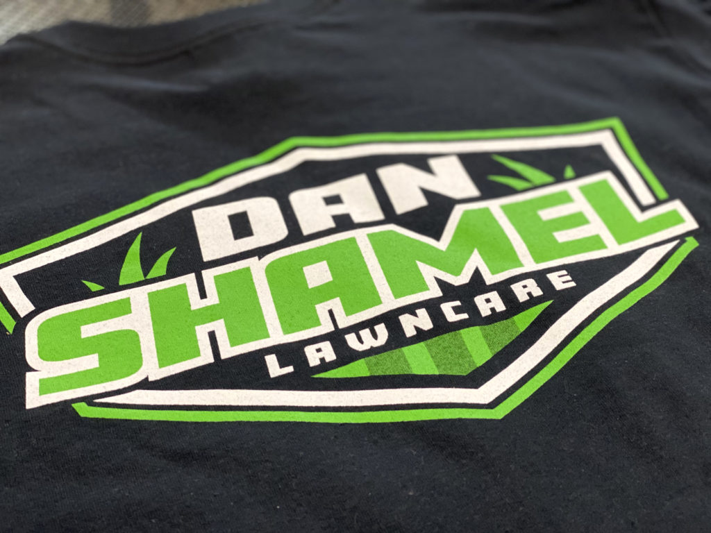
- When the ink colors have room on all four sides, you have a little more wiggle room with registration.
- Also, when you have a flashed underbase, the last thing an operator wants to see is any wet-on-wet printing on that base.
The top colors have nowhere to go after the underbase gutter, and you only have so many flashes on your press.
Pro tip: If you must have touching spot colors, it sucks less when one of them prints directly into the substrate. Also, study your mesh. The higher the mesh, the less ink that gets laid down. Single stokes, minimal flashing, clean prints, cruise control. Your printers will thank you for remembering this one.
Our rocket ships have doors
Hang in there, this will make sense in a second. Last year, my art staff and I had a couple of consecutive rough days where we missed really easy stuff that caused production to stop and question us. When I say “really easy stuff,” I’m talking about accidentally labeling two different screens top white, calling out poly inks when we didn’t need to, or forgetting to send our underbase separation along with the rest of the files for a job. We had nailed all the tough designs and separations but whiffed on the easy procedural stuff.
Our print team’s productivity was affected by our lack of attention to the easy details in every instance. I remember saying, “What the heck? It’s like we’re building these complex rocket ships but forgetting to build a simple door to get back inside.” We ended up writing an SOP (standard operating procedure) checklist for signing off on artwork before it goes to the production crews. The moral of the story: Make sure you’re quickly double-checking your files before sending them to a production team.
Selective spot color underbase
The underbase plays a critical role in color accuracy and opaqueness. You likely already know this, so we’re going to focus on hacking a simple spot color underbase to visually add more print colors. We’re going to pick and choose which elements to underbase or at what percentage to underbase them. This allows us to hit tones between the ink color and substrate color.
Set some time aside and do your own testing with this technique. What really happens here is you end up with added value for your customers and less screens for your production crew to expose, tape, ink, register, and reclaim.
Pro tip: You can halftone the top color and get even more depth in your spot color shading effects.
Production training
This is the holy grail of tips. Nothing helps streamline your art department’s efficiency like training with the production crews. When we hire a new artist at Kidd Company, they spend their first two full weeks with production. They get to experience everything from pre-press exposures to on-press registration to reclaim.
This type of training does two things for your shop.
- It sets the tone for mutual respect, which leads to high morale.
- It broadens the perspective of your artists to see past the computer screen when prepping artwork for production.
With great power comes great responsibility.
– Uncle Ben
