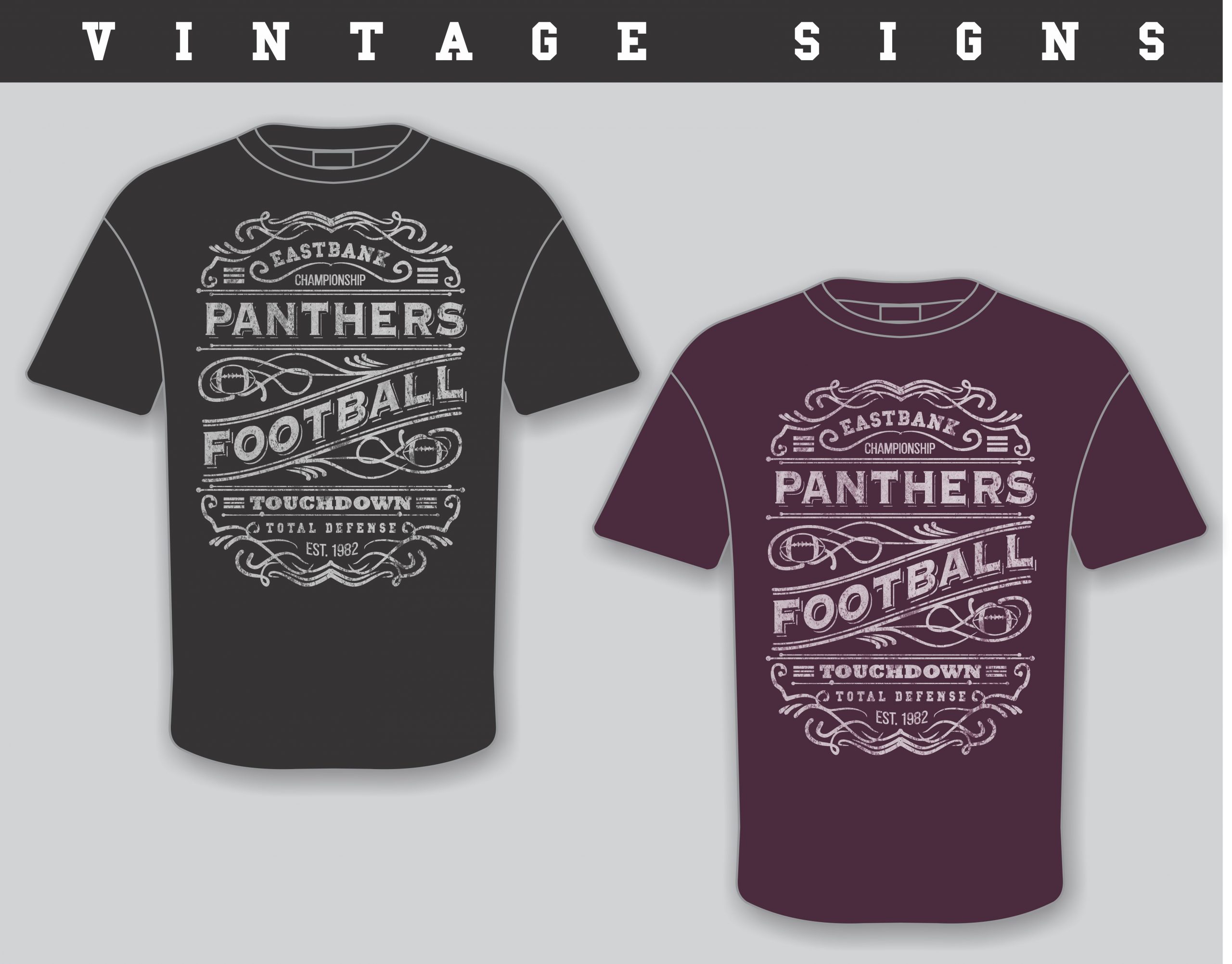
What is a vintage sign logo style print?
The vintage sign logo style has become common in recent years. The look started as a common solution for type-based designs with funny sayings, quotes, or tongue-in-cheek graphics. This design template is a little more difficult to create well because it requires the design to look amateur and a bit awkward on purpose. You can think of this style as a menu item that is drawn on a corner deli chalkboard.

To get this look, there has to be a consistent gritty overlay that makes the whole graphic look hand-drawn, and many of the graphic elements need to have the same weight line work and style as any fonts that were chosen. The good news on this template style is that it works with most sports teams. Once you have a good template, it is quick to create, and the final print is rarely more than a couple of colors.
—The M&R Companies