Featured Project: ER2 Flexes its Creative Muscles In-House
Given they're in the creative graphics industry, bare white walls weren't going to cut it for ER2 Image Group.


This featured project comes to us from Hanover Park, Illinois-based ER2 Image Group, a full-service grand-format printing company. On its blog, the company writes of being very excited to move into its new office space, with its much more efficient design and layout and larger space. But there was one problem: “All those plain, white, empty walls staring back at us!
“It would be like working in a big, blank canvas. Being graphic arts professionals, this was unacceptable … and impossible to ignore. It was time to call in the best large-format graphics company in the business for a consultation. Yup, we hired ourselves!”
The company says it wanted to use the graphics to emphasize the “fun” part of working there, but also to help with employees’ moods. For instance, create a calming effect in the café, while inspiring creative juices in the design room.
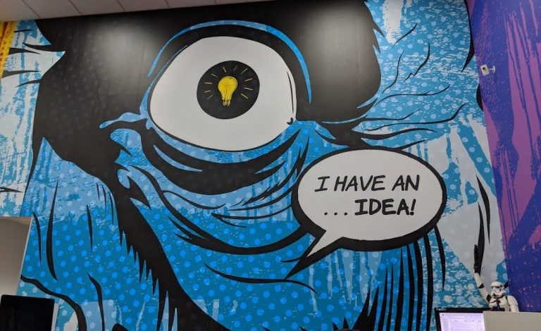
“For the designer’s room we definitely wanted to have a lot of bold color that wouldn’t be seen anywhere else in the building,” says graphic designer Dan Gray. “The idea of doing a ‘pop art’ theme was first introduced with some street art elements. I saw the large walls and immediately thought ‘giant monster.'”
Vice president Alan Schellerer thought that creating a peaceful, natural environment, where people could unwind, would be great for the café so the idea of a forest was handed off to Gray.
For three of the café walls Gray created his own forest from scratch. This meant making many different trees so the image repetition wasn’t obvious. For the signature wall, Gray and his crew put in a plank wall with the “CAFÉ” lettering over it. He says that even if you look closely, you can’t tell the wall planks are not actually wood, but different thicknesses of PVC wrapped in 3M DI-NOC film.
“We’ve never seen this done before, so of course we had to give it a try! It’s a very unique application that looks like it just came from the sawmill.”
The CAFÉ letters are Chemetal Satin Copper laminates mounted to 19mm PVC and stud mounted to the Di-Noc Plank wall.
“The café design wound up being difficult to execute, but it’s really my favorite part of the building,” Gray says. “Plus, it really shows the capabilities of our design department when faced with a custom project.”
He adds, “Both the café and design room walls were designed as one piece. We wanted to ensure that each side of the wall flowed into the next. This was especially important for the café, where we wanted to give the illusion that you’re in the middle of a forest.”
Installation was surprisingly quick, he says, and the space was all ready for move-in.
“The design is only as good as the final product and I’m constantly amazed at what our guys can do,” says Gray.