Images straight out of the scanner or captured with a digital camera usually need a bit of processing to maximize their impact. Raw, unretouched images are frequently deficient in several critical areas of tonality. But with a few easy adjustments, a lack-luster image can be transformed into a picture that really pops!
Image enhancing techniques are available in all image-editing software packages. Where and when to apply them and to what degree depends mostly on your ability to determine what’s good and what’s bad about an image. Because each image has its own unique set of problems, you’ll need to develop a unique correction strategy for each picture that you capture. Worry not! Image deficiencies are typically related to the removal of unwanted areas, poor contrast, shifts of color, and inadequate focus – problems that can be easily corrected with a few simple techniques.
Color Management
While an image may look good on screen, its printed output may be disappointing. Before you begin making specific adjustments to a picture, manage the color working space so that the adjustments will be consistent with the capabilities of your printer. Color management is a separate topic too large for this article; however, Sign & Digital Graphics published my article on color management that you can use as a reference for setting up your color working space.
Content Removal
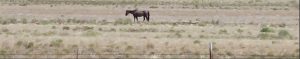
When there are unwanted areas that need to be removed, a variety of techniques are available in Photoshop. If the areas are large, you’ll need to drag out the heavy artillery and use the Content Aware Fill command combined with cloning and compositing techniques to remove and replace content. If you’re lucky, and the areas are small like the fence posts in Figure 1A, they can be quickly eliminated with the Spot Healing brush. It’s
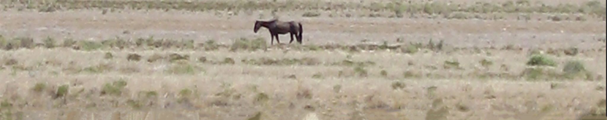
simply a matter of choosing the brush size, depressing the mouse button and dragging over the unwanted pixels. The brush should be soft and slightly larger than the area to be removed. An easy technique to remove straight lines, like the barbed wire for example, is to click on one end of the line, press the Shift key move the curser to the other end of the line and click again. See Figure 1B
Contrast
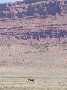
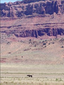
Let’s address the most common deficiency – contrast. Correcting an image that has aesthetic potential but inadequate contrast (Figure 2) can vastly improve image quality. Looking at the image on screen is one way to tell if the contrast is deficient especially if the image is in dire need of a radical adjustment. If the problem is subtle however, looks can be deceiving. The image may appear OK to the untrained eye but even a slight adjustment can show significant improvement. The best way to determine what adjustments are needed is to measure the contrast.
Histograms
A histogram is a graph that displays the brightness levels of pixels in an image.
Photoshop has a dedicated histogram panel. To view the Histogram panel, choose Window > Histogram. The graph is composed of lines that show the relative number and distribution of tonal values within an image. The lines may appear to look like a mountain range, that’s because they are so close together on the graph.
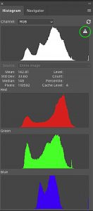
In the Panel Options menu select Expanded View and All Channels View and Show Channels in Color. Also click the triangle with the exclamation point to display the uncached histogram. (Figure 3). The left side of the histogram represents dark pixels with low values called shadows. The right side of the graph represents light pixels or highlights. The central areas of the graph represent the image’s midtones. When an image is deficient in contrast the left and right sides of the graph are void of lines.
Correcting Contrast
The easiest method for improving contrast is to apply a quick Levels adjustment. First click on the Levels icon in the Adjustments panel to generate a Levels adjustment layer. I recommend that you always use adjustment layers for these types of corrections so that you can later refine your adjustments if necessary. The Properties panel displays the Levels control that also displays a histogram. The Levels properties panel enables you to reconfigure the graph, and therefore the image’s brightness levels by dragging Shadow, Midtone and Highlight sliders.
Brighter Brights, Darker Darks
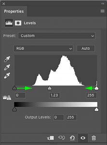
Poor contrast is a result of lighter colors not being light enough and the darker colors not being dark enough. Pictures with poor contrast have a grayish tinge because the brightness values of the image are clustered in the center of the histogram. What you want is brighter highlights and darker shadows and this can be achieved by extending the range of the graph. Drag the right highlight slider to the left until it touches the right side of the histogram’s lines. Conversely, drag the left shadow slider to the right until it touches the left side of the histogram’s lines. (Figure 4A) You can also adjust the overall brightness by dragging the midtone slider. Viola! Contrast improved! (Figure 4B)
This is the quickest fix for adjusting contrast. There are more detailed and sophisticated methods that map the images brightness to specific white and black points, or adjustments to targeted ranges of color by applying a dedicated curves adjustment and these techniques require broader knowledge of the nature of digital color. The method described above however is fast and simple and almost always provides a vast improvement to image contrast.
Color Deficiencies
More times than not, a contrast adjustment isn’t enough. If the contrast has been adjusted and the colors seem to be a bit out-of-whack then a targeted color adjustment will correct the color values and make the image “pop”. This fix requires a slightly more complex Curves adjustment.
Dangerous Curves
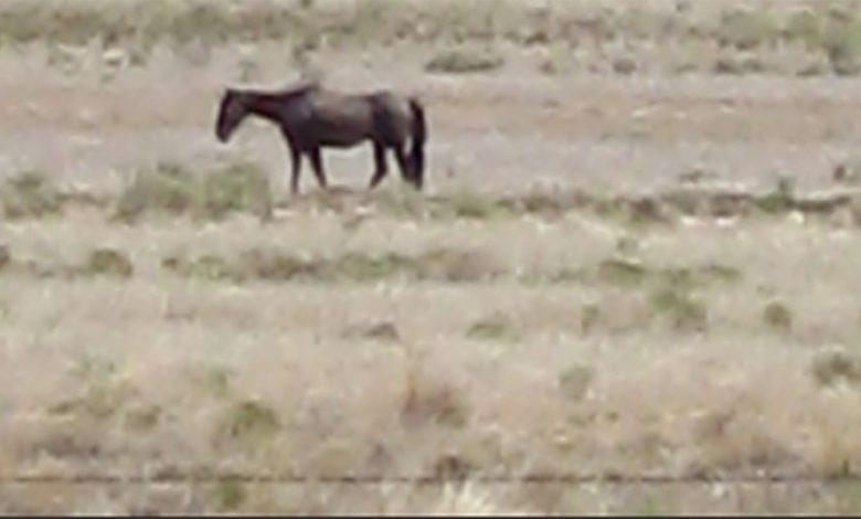
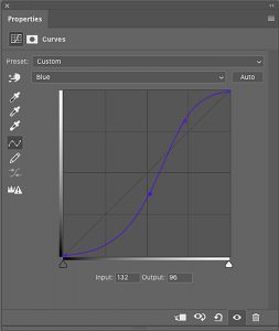
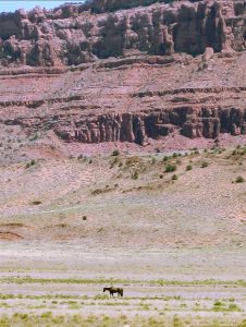
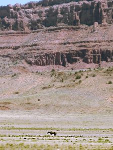
In the case of the Lone Horse image, I think the cliffs are a little too blue. Click the Curves icon in the Adjustment panel display the Curves Properties panel. (Figure 5) Although a similar effect can be achieved using Levels, we’re using Curves because it offers a bit more control over the color range. This time you’ll access a color channel to reduce levels of blue to achieve just the right amount of earth tone. Click the menu labeled RGB and scroll down to the blue channel. You’ll see a graph with a blue line. Drag the middle part of the line downward until the blue in the cliffs diminishes. It may not take a lot to achieve this effect, just a tweak. The further downward the line is drawn, the yellower the image becomes, so be careful not to overdo it. Let’s add a little blue to the highlights so that the image isn’t quite so yellow. Drag the top right part of the line upward above the median line until the color balances. Try to find the perfect balance of overall color. What will result is a blue “S curve” and an image free of the blue color cast. (Figures 6A and 6B)
Unsharp Mask
It would be nice if the horse was a little more prominent in the image. Granted, the horse is a very small element in the entire picture, but it’s the key subject of the image and therefore should be emphasized. First, we’ll convert the Background layer to a Smart Object so that we can apply a dynamic filter that can later be masked and adjusted. In the Layers panel, target the Background layer. From the Layers panel Options menu choose Convert to Smart Object.
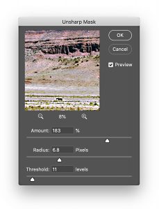
Next, choose Filter > Unsharp Mask. Drag the Amount slider to 183 percent, the Radius slider to 6.8 and the Threshold slider to 11. (Figure 7) Keep an eye on the image as it sharpens and experiment with different settings until you’re satisfied, then click OK.
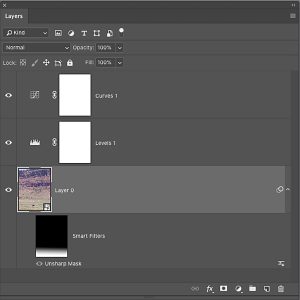
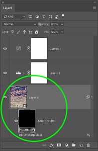
We want to emphasis the horse and the foreground at the bottom of the image and diminish the sharpening on the cliffs. In the Layers panel you’ll see a mask under the smart object layer. Click the mask and choose the Gradient tool. With black as the foreground color and white as the background color, drag the tool vertically from top to bottom starting a little above the horse. The gradient mask conceals the sharpening effect from the cliffs and applies it to the horse and foreground. (Figure 8). At any time, you can click Unsharp Mask under the gradient mask and display the filter interface where you can tweak the adjustment.
Finally, to create even more emphasis on the horse, you can paint out some of the sharpening effect by painting with black on the mask with a low opacity brush to diminish some of the sharpening on the grass around the horse. (Figures 9A and 9B).
That’s That
Five quick steps transform an image from a drab, low-contrast, colorcast image to color-balanced image that is print ready. These adjustments can be quite subtle but vastly improve the quality of the picture. Simple techniques like these are standard practice for scanned images, pictures taken with a digital camera or even cell phone pix. The workflow is fast, taking only a few minutes to perform. So why settle for less when the quick-fix is at your fingertips? Your images will be greatly improved with a minimal investment in time.