How to Create a Good-Looking Title Block
Discover what you should include in a title block and why
It’s the type of sales meeting you have attended dozens of times; the customer has asked his new building construction manager to attend the meeting so that your installation details can be reviewed. You show up early with all of your files in hand, both electronic and printed versions. The meeting starts and your installation details page quickly becomes the focus of discussion. “Where is your blah blah blah, and your call outs for this blah blah blah. What scale is this drawn at and not to mention we need a page with blah blah blah on it too.”
You quickly realize that your drawing packet really isn’t a packet at all, and it certainly doesn’t follow any sort of logical or systematic layout or format. The one page detailing what you are offering doesn’t have the right title block layout, hence the details are hard for anyone but you to find. It’s obvious that your title block design and in-house implementation of it needs to be revisited and revamped before the next meeting.
Does your title block compliment or hinder your companies image when presented to a savvy customer who is used to looking at title blocks all day long?
Does your title block serve a purpose or is it treated like a picture frame where most of the boxes get left blank? Do the items you have listed really matter in your day-to-day operations? Have you explored your in-house process to determine how the title block can help eliminate errors?
What is the purpose of a title block anyway?
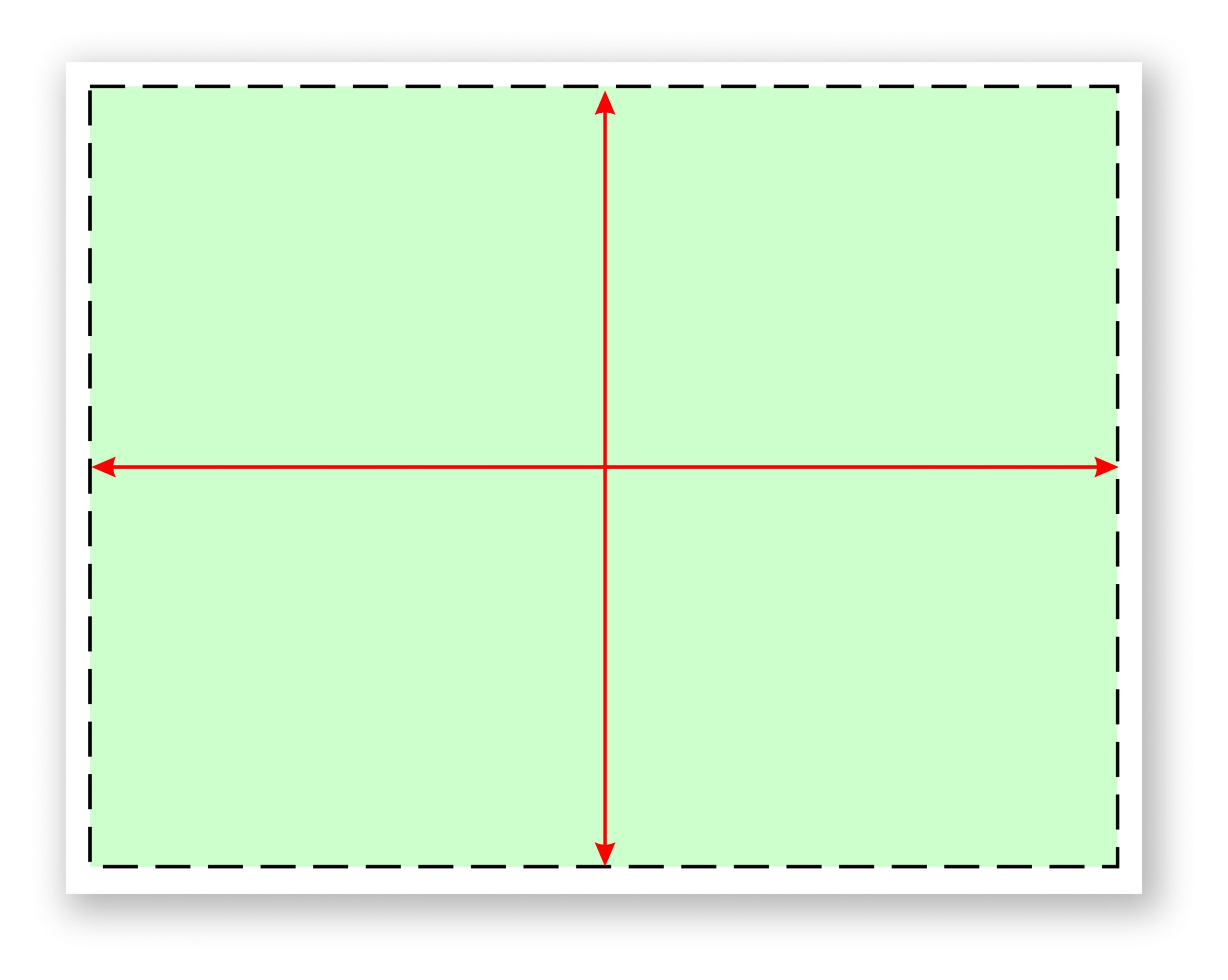
You’ve got limited real estate on your page, so you need to know what should be included, what shouldn’t be included, and why. (See Fig. 1) These are the questions you must ask yourself as you start to explore the title block development process. The basics are easy; Your logo, address, phone number, a copyright notice and those official looking little logos that tell everyone which associations you belong to.
But how do you keep track of the important working details that actually make a difference when the file is presented to the client or when it’s used by your in-house team? In order to build a title block, you must first understand what must be included, where on the page, and why. It’s too easy to simply build a template, call it good and move on. There is a process to follow and a trial period where you will fine-tune the template to work with a majority of your project scenarios. You may decide to build templates that are sign-type specific — one for monuments, one for pylons, one for channel letters, etc.
For now, let’s assume you have your in-house team together for a meeting, you have discussed the needs of your in-house process and you are in the process of deciding which elements to include on which title block pages. Here is a step-by-step guide to assist in the discovery and design process.
Step 1: To border or not to border—what look are you going for?
Let’s start with the first step in designing your title block, and that is the border or lack thereof. Do you prefer a thin or thick line border that encompasses the drawing on the page or do you prefer an open border page? If you prefer a border, make sure that your border doesn’t dominate the page. I bring this up because in my experience a thick, heavy or “fancy” border can actually detract from the message on the page. Whichever page framing method you choose, develop a theme and be consistent with your theme throughout the document. (See Fig. 2 and 3)


Step 2: Your logo and contact info
I recommend you keep your logo small so that it doesn’t dominate the page. Considering the limited space on the page, you might want to look at a 1″ wide logo. A large dominant logo on the page can take away from the look of the presentation and can take the focus off of the sign.
What about your contact info? Ask yourself this question: Do you really need your full mailing and or physical plant address along with your phone and fax number on every single page? With a website that can list your contact info in greater detail, what purpose does having your address on every page really serve? Is there someone viewing that page who might want to send you a letter via snail mail, or visit your office without calling for an appointment? The question is, “Would just your logo and web address be sufficient?” With a properly designed cover page and title block, there won’t be any question as to whom the presentation belongs.
Step 3: The disclaimers
How much do you need to say to get someone to understand that your drawing cannot be copied? Isn’t that a universal understanding of our industry? Perhaps not. But let’s face it, if someone wants to copy your design, regardless of the threat you present, they will. Copyright – schmopyright. In my opinion, when it comes to sign design, threats of penalties don’t do much to deter the unscrupulous. That being said, in the interest of saving real estate on your page, could your disclaimer be as simple as the basic copyright notice that every other product uses? (Such as Copyright C Charboneau Signs 2016) It’s a one-line statement that was designed to notify others that the item is protected against being copied. It sort of says it all; however, you and or your legal counsel may feel differently about your specific projects or market exposure… protect your design work but use as little title block space as you possibly can.
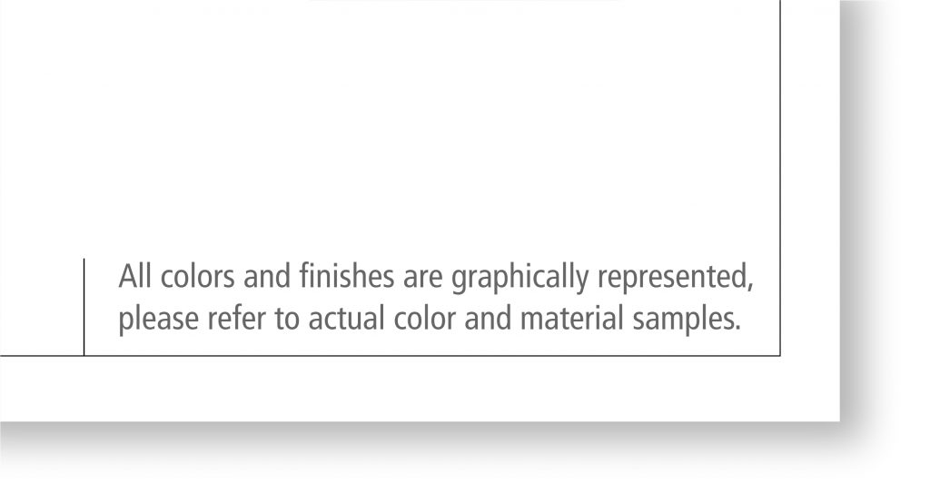
Regarding the Color and Texture disclaimer, I think this is one of the most important items on the whole page. It doesn’t have to be dominant, but simply stated, clear and easy to find in a large enough type that it’s easy to read. For those of us who have many years in the business, this disclaimer can become an insurance policy that will protect you from those customers who might want an “after the install” discount because the finished sign is a slightly darker green than it shows on the illustration. Stating that all colors and textures are conceptual and not meant to be 100 percent accurate pretty much covers you from becoming a victim of these types of opportunists. (See Fig. 4)
Step 4: Affiliations, awards, and shameless horn-blowing
Badges, buttons, awards, and accolades are awesome for marketing your company; however, by the time you have gotten to the illustration stage of the sales process, do they really make any notable impact on the customer’s opinion about the sign design you are presenting? Is the presentation page about how qualified your sign company is, or is it about the sign you designed to address the customer’s sign needs? Because real estate on the page is so coveted, the icons might be better used on other marketing materials such as your website, business card, emails, etc., where each affiliation can be listed prominently, rather than teeny-tiny and tucked into the corner of the title block.
Step 5: The customer, the installation site, signatures, and approvals
Who is the customer? Who is signing the agreement? What is their title? Whether it’s handwritten or electronic, it’s always a good idea to get your clients signature on every page of the presentation document. But do you really need a signature box for this when most people just scribble their initials somewhere on the page or approve it via email? Would a small approval box be sufficient?
How about listing the address of the signs installation location and the location of the home office for invoicing and permitting? This is usually mandatory for permitting with most municipalities, so it should be listed somewhere within the presentation, preferably on the “Installation or Estimation Page.” Should it be listed on every single page of your presentation? (as would occur with a single design title block page) or would it be OK to list it once, on one page? Creating an “Installation Only” page might provide you more room for accurately listing the address and exact location of the sign, as well as city-required site plans and elevation details.
Step 6: Planning the flow of your pages
OK, up until this point the content we have covered has focused on clerical details. Name, title, address, location, approvals, etc. But what about the cover page and any subsequent pages? Do you currently use a cover page? At this stage, you might review your sales and presentation process and determine how the title block packet might be most useful to the salespeople. What would they like to see? What would help the presentation compete more effectively in the marketplace?
Try to look at the title block for its functionality and purpose as it relates to the in-house flow of the job. What types of tracking details should be included on the title block? Should each departments info be on every page? How many of your pages end up with duplicate details or specifications information? Who uses the information provided on the title block and how do they use it? Does your in-house title block need to show a check-off list that addresses the tasks of each department? How about permitting details?
Development of a “packet” approach with a cover page, intro page and design pages is helpful in developing a process that addresses the needs of each department, hence a title block page for each set of details so they are most easily located without being redundant.
And I repeat…. develop a system that avoids repetitious details
There is nothing worse for a designer than being told that X, Y and Z need to be changed, and that those repetitive details must be made across several different pages. It’s so very easy for a designer to miss one, especially if they must hunt and search for the instances where those details are listed. It’s better to develop a title block system that contains all the “specific need details” associated with that aspect of the project on one page. (See Fig. 5)
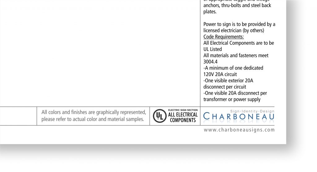
Such as all dimensioning details for estimation and fabrication should be on one page. If an installation detail has changed, it’s much easier to make that change on one drawing page, rather than having to hunt for it and change it on several pages. Granted, major revisions require adjustments to every page; however, all revisions can be made easier and faster when details are compartmentalized onto one page.
Beyond the basic pages
Now that we have expanded beyond the one-page presentation, you can now make your template process look and feel more like an “agency style” working document. Following the cover page, you may consider developing a “Why use us” page, or a “Parameters page” (which showcases the limitations and opportunities of the project.) The possibilities on building your presentation title block packet are endless. You may find that you do not need to clutter your up-front presentation pages with a busy detailed title block. Save those title blocks for the pages that illustrate detailed specifications and try using just your ID in one corner of the page… nothing more… just your logo and your website and whatever border you have decided on. It presents a clean, neat, professional appearance that states who you are without pounding it into the customers face.
Naming the pages
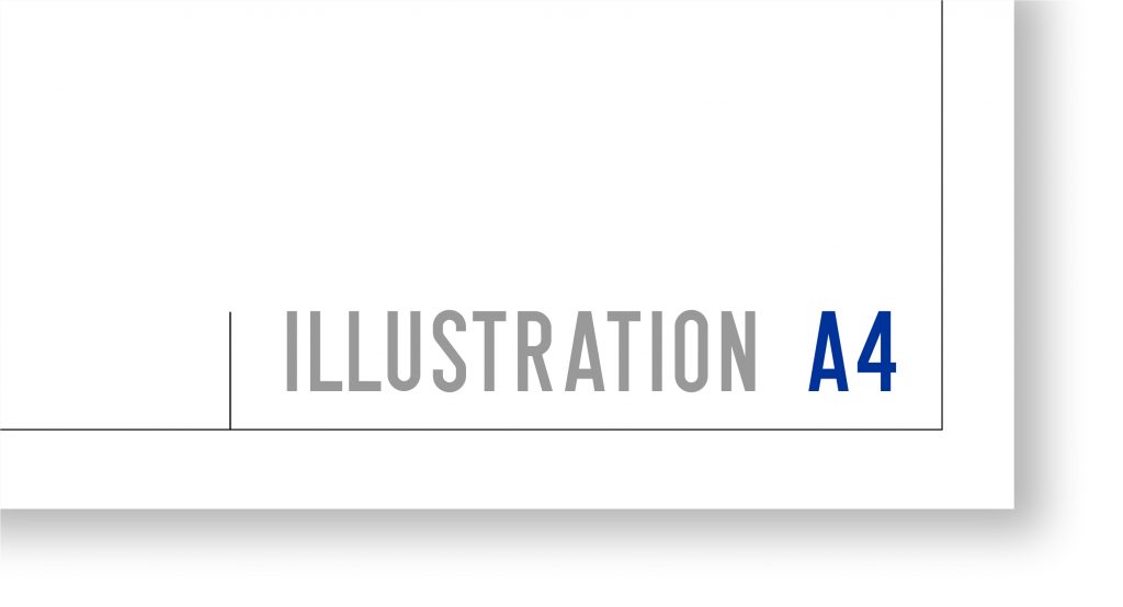
Start with your Illustration page. You can call it anything you want, but most importantly if you have multiple presentation pages, these pages need to be numbered or labeled somehow to keep them identified and organized. (See Fig. 6) Developing a consistent layout and system for labeling the pages is important for referencing.
CorelDRAW Tip: When using CorelDRAW, remember to set your “Page Title Text” to the appropriate left- or right-hand justification setting before you save. It makes for easier left- or right-hand justified text changes later.
Benefits of a boiler-plate presentation process
As you can probably see already, a well-designed title block presentation packet can simplify the flow of information both internally and externally, such as with sub-contractors, permitting departments, etc. If a job is small, you can select which single boiler plate page is most appropriate for that customer and job. If the project warrants a more involved presentation, or any level in between, your new boiler plate process will help you maintain your company’s image in the marketplace and improve your team’s understanding of where to find the info they need.
For the sign designer
Setting up your “Packet” can be done with boilerplates that are ready to go. I recommend setting up one packet set for channel letters, one for monuments, pylons, wall signs, etc. (See Fig. 7) In this way, you simply open the template and start working. All of the call outs, details and specifications needed for the job can be included and then are easily customized for the sign. This can be a huge time saver because all the pertinent details, graphic section views and general call-outs can be stored within the packet set.
The final word
Fortunately, for our industry, we have the ability to design templates and title blocks in-house, which makes changes and revisions a fairly painless process. You probably won’t land on the perfect title block on your first try. It will take a little bit of trial and error to know if the boxes provided will have enough space for the information required. Are the details too small to read once it is reduced from 11×17 to fit onto an 8×11 page? Where is the best place to put that disclaimer for the colors and textures? The key is to bring everybody affected by the title block to the table to discuss its usefulness, function, and purpose. You may decide that yes, you do want your address and phone number on the title block because the permitting department in your city requires it. Details like this are why it’s important to spend time with each department affected by the title block, and build them accordingly.