Creating Standout T-Shirt Graphics
When it comes to creating standout T-shirt graphics, one of the main places to start is with art basics
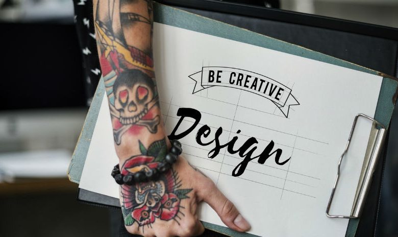
When it comes to creating standout T-shirt graphics, one of the main places to start is with art basics. Creating a good overall composition and taking into consideration all the fundamentals that go into that is a good place to start.
Think about all the elements you want to include in your layout and how they can be positioned together. What will your focal point be? Choosing a particular element and making it stand out either by size, color, or placement in comparison to all the other elements will result in a much more interesting design. Usually, the first thing people think of when creating a focal point is to make one element larger than the others. While this is one option, there are many other ways to achieve the same results. Making something smaller than everything else in the layout can draw your eye towards it in the same manner.
The use of color can also help to create a particular area of interest. Create a grayscale or monochromatic image in varying shades of a single color. Select a particular element or area in the design and make it a different color. When you look at the design as a whole, the area created in a different color will pop from the rest making it the focal point.
The placement of objects in the layout can help to draw your eye to a particular area. Position a certain item away from the others, or try overlapping elements. The item layered on top will be the first to capture your eye. It also helps to create a feeling of depth and space in the design resulting in a much more interesting layout.
Outside of the art basics for starting with a good composition, there are some things you can do to help dress up your layout. The use of a distressed texture is a popular technique for adding some interest to your design. Simple one- to two-color layouts, in particular, can be enhanced by the use of this technique. You’ll see it in all the retail stores to create layouts with a vintage look.
Dressing up your type can help to enhance your designs as well. Simple things such as the use of gradients, adding multiple outline colors, or drop shadows can take your designs to another level. Placing your type on a curve or the use of envelopes to position your type in preset shapes is much more interesting than simply placing a line of type above or below an image. Photoshop has a quick and easy function called Layer Styles and with the simple click of a button, you can add bevels, textures, gradients, shadows, and outlines.
While the use of just one of these options can create a better layout, the implementation of more than one at the same time will help you create a layout that will stand out from the rest.