Creating Color Gradients with Thread
We all want a seamless transition between colors that doesn’t weigh down the garment, while also achieving the perfectly embroidered gradient. Despite seeming like the best use for automation, there’s no standard tool that can take multiple colors and blend them precisely. Automated tools can create gradient effects, but not the smooth transition you might expect. Using just two colors, the threads take shape and create a set of opposing fills. The results often suffer from show-through and never create areas of uninterrupted pure color from either of the chosen threads. The uneven densities and imprecise fit from one layer to the next make for misplaced or deflected lines of stitching and openings in the fill.
Even on felt with no interface from texture or weave, the automatic blend has areas of the background materials showing through, and the smoothness of a blend with these dissimilar colors. Even though they are both very warm, makes for a less than convincing gradient. (All images courtesy Erich Campbell)
Though automated tools can be useful, the perfect multicolor blend isn’t yet available at the click of a button. That said, you can create smooth blends with even the most basic digitizing tools. You can do this if you’re willing to plan, analyze art, execute the elements manually, and carefully choose colors. Moreover, we can create them while maintaining a pliable hand that drapes and feels as good as it looks.
Know the thread
Thread is not ink. You obviously can’t mix or blend it, nor can you render tiny halftone dots that trick the eye. What you can learn from the halftone dot is that the illusion of colors not present in the pigments is possible through the arrangement of colored objects, as well as how close they are together and how they relate to others in their midst. You can place our stitches in a way that creates the illusion of the blend.
Filling out
Fills are the perfect place for the creation of blend. You need to calculate how to interchange lines of color to create patterns that fool the eye. Luckily, it’s not as difficult as one might imagine. Without automated settings or variables, our imaginations and a little common sense will suffice. Here’s an analogy that has helped a number of my students grasp the concept.
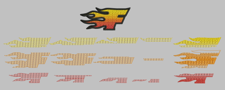
Imagine each stitched line as a colored pencil. A full-density fill is like a layer of pencils laid side by side to cover a surface. If you had red, orange, and yellow pencils and wanted to lay out a smooth transition from red to yellow, you might start with solid areas consisting of a band of yellow on the top, a strip of orange in the middle, and a band of red at the bottom. You’d divide the space between these solid areas to create a blend.
Analyze the art
Find the angle: Gradient stitching generally follows a single stitch angle. As lines from each layer of the thread must be interspersed and ‘sink’ into open spaces left by the previous colors, angles must match. If they don’t, the upper colors will sit atop earlier fills like underlay. This angle should run perpendicular to the change in color on the gradient.
Select thread colors: Raster images often have dithered areas with mixed dots of color between bands of solid color in the gradient. These solid areas hint at potential thread colors, though you’ll probably want to use fewer threads than seen in the solid bands to reduce the color count. Keep colors similar in tone and pay attention to whether your undertones are cool or warm. Match them to reduce the contrast between neighboring threads-the less contrast, the smoother the gradient.
Divide the area: In gradual blends, you will divide the area between solid bands of color evenly according to the number of steps needed. If using 1/4-density steps, you’ll have three steps between the solid color bands, meaning that, including the solid color bands, the two-color section of the blend will have five total steps. Draw evenly spaced guidelines to mark the edges of these steps in a color that contrasts your art. These lines will help create and place the segments of your blend. If you have trouble remembering your ratios of one color to the other, you can always note them beside each section.
Digitizing
With threads selected and guidelines in place, you can digitize. We’ll explore two methods here: overlapping light density fills and manual point-to-point digitizing.
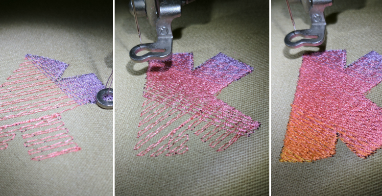
Building fills: In this method, you overlap multiple layers of light-density fill to achieve a target density, interchanging colors and allowing top layers to ‘sink in’ to those below so each section arrives at the proper color ratio and coverage. You may start by digitizing a light underlay as needed in a medium color from the gradient that won’t overly contrast with other colors in the blend. I use an open fill at 2-4mm density, depending on the texture and color of the ground fabric.
You’ll start digitizing the blend itself with the medium color to create a fill that covers all areas in which the color appears with a 1/4-density fill. For a .4mm full density, that would be 1.6mm. Next, you’ll travel as needed with straight stitches along the fill’s edge and then create a shape covering areas with half or more coverage of the same color as a second 1/4-density fill. You’ll offset this from the position of the last fill by .4mm to leave space for the next color’s lines, avoiding doubled lines that will form ‘stripes’ in the blend. You’ll keep creating smaller fills atop the previous layers for the 75% coverage area and the 100% pure area of this color, offsetting them so the lines of stitching are spaced in that pure area as they would be in a standard, single-color fill.
You’ll repeat this process with every color, making sure that the stitch lines in each fill align as much as possible with the spaces left in the previous color. This method can sometimes lead to stepped or brick-like patterns when stitch penetrations align. You want to alter the fill pattern or add a user-defined pattern of penetrations to arrive at a pleasing texture in that event.
Here you see the 1/4-density layers as they were created with each pass stitched over the one below to build full density in each color.
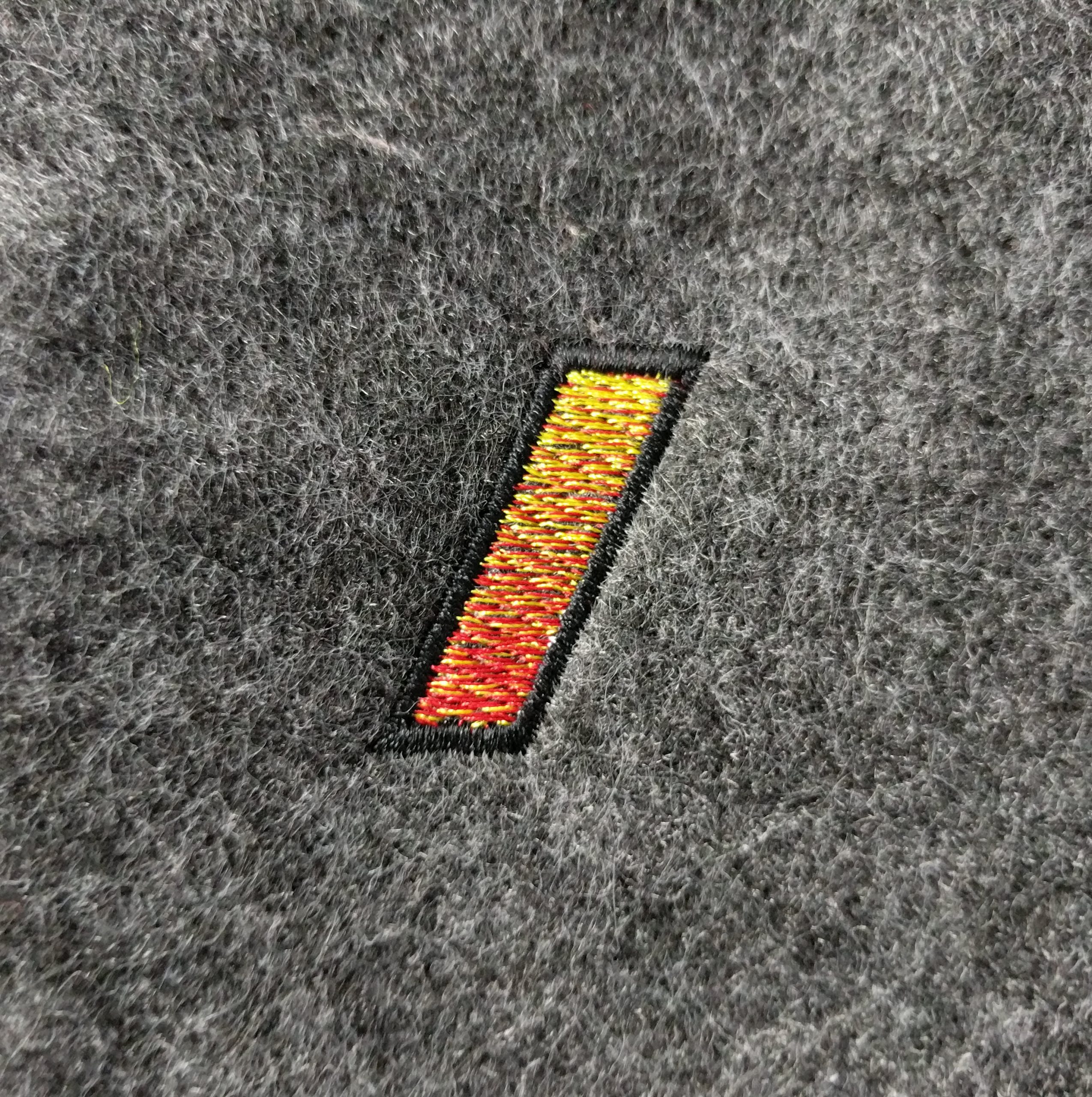
The manual method: Plotting stitches individually gives you the control necessary for the smoothest possible transitions, making it ideal for tight, multicolor blends. With manual digitizing, you can create a fill while varying density throughout by using sub-steps between the ratios described above.
The blend starts at the 3:1 ratio but can pass through a 2:1 transition before the 1:1 blend, softening the blend without additional segments or layers. Your guidelines help you decide these ratios, but you can adjust by eye as you digitize. Moreover, each color stitches in a single, unbroken pass removing travel stitches and overlaps for a more efficient run and a cleaner edge in blended areas, all while leaving perfect open spaces for the next color in the sequence for exacting finished densities. Like many things in machine embroidery, extra time in digitizing makes for more efficient stitching.
Guides & results
I create a standard full-density fill atop my prepared artwork to use as a guide, setting penetration points to visible and locking it before digitizing. This fill helps me select stitch length and position while my division guides and the art to help me choose line spacing. Each stitch is manually placed tracing the angle and length of the stitches in the ‘guide’ fill. The 25% coverage means one of every four lines is covered, 50% covers every other line, etc. On subsequent colors, I’ll follow the lines left purposefully empty on the previous color in the sequence to end with a perfectly aligned, single-layer blended fill.
While this seemingly anachronistic method may not be cost-effective for large areas or small-quantity runs unless the customer is willing to pay for the time investment, it’s hard to argue with the smoothness of the resulting blend.
The bottom line
For hints of blending or subtle shading, you can cope with the slightly higher densities and distortion caused by layering light shades over a full-density fill. For production (and profit), small areas of shading, or uncomplicated blending shouldn’t require so much analysis and manual execution. That said, if a critical customer is adamant on a multicolor gradient on light garments, you need to know how to execute the least dense, smoothest gradient with full coverage. This skills will set your shop apart. It may seem costly, but that unique finish has value.