5 Font Rules to Follow When Designing
Keep these basic rules to in mind
Because choosing the right font for your project is important, you’ll want to have a basic understanding of appropriate font usage. Here are some basic rules to follow:
- Pick a font that complements the design. Your font choice should be different if you’re designing something for a child’s birthday versus a memorial gift for a loved one.
- Thicker, bolder fonts tend to be used for headlines, titles, or attention-getting verbiage, and thinner fonts may be used for larger blocks or text or for more detailed information.
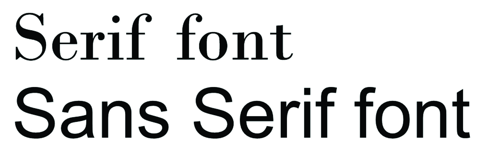
- Serif fonts are those with added strokes at the end points or terminals of the letters. Sans serif fonts do not have these features and are considered a more modern font. Large blocks of text are often said to be easier to read if they are in a sans serif font.
- Try not to use too many fonts – it can make the design look confusing. Generally, two or three fonts is a good rule. However, this rule, like most rules, can be broken if the design calls for it.
- If you do use more than one font, use fonts that contrast with one another. There’s no reason to use Helvetica and Arial together, as they are too similar.